

Waterloo Public Library: Relaunching a library’s digital presence
Project Background
Waterloo Public Library (WPL) is a cornerstone of the Waterloo community, dedicated to fostering lifelong learning and inclusivity for its more than 150,000 residents. With multiple branches offering extensive collections, digital resources, and a diverse array of programs, WPL is a vital hub for knowledge and discovery.
In need of a digital overhaul, the WPL team enlisted Stryve’s expertise to relaunch their website.
The Challenge
When we began our collaboration with the WPL team, it was clear that their website was often more of a hindrance than a help. Users, both library visitors and staff, struggled to find what they were looking for due to poor organization and unintuitive navigation. This not only frustrated users but also hindered the library’s mission to provide accessible information and services for the community
There were also technical challenges to overcome. The website was running on an outdated version of Drupal that would frequently break and was hard to manage and update, especially for WPL’s non-technical staff.
And because of this, their blog was on a separate domain running on WordPress, making it just one more thing to manage. They wanted to move it to their main domain and make it cohesive with the rest of the site.
Our shared goal for this project was to create a website with a great user experience that would prioritize being organized, accessible, and intuitive while being easy for library staff to update and manage.
The Solution
To address these multifaceted challenges, we started with a comprehensive audit of the existing website structure.
We reviewed the current sitemap and collection of pages, uncovering hidden content and identifying gaps where new pages were needed or pages with thin content that could be consolidated. This analysis allowed us to create a better-structured sitemap that prioritized logical organization and user flow, ensuring that essential resources were easily accessible.
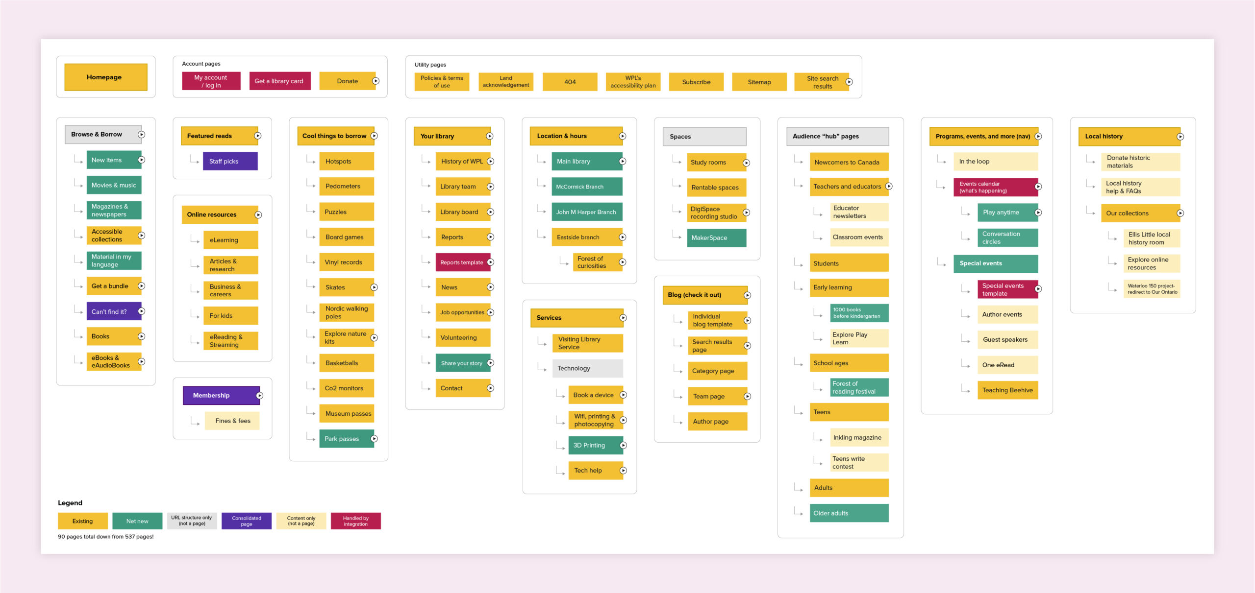
With a newly organized and consolidated sitemap in place, we turned our attention to the main navigation—an essential element for enhancing user experience. To help guide the user through a significant number of pages and content, we crafted a mega-menu which was complemented by an eyebrow navigation bar. We also gave them an optional ‘announcements bar’ for quickly surfacing critical information to users.
This new structure provides users with clear pathways to find information quickly and intuitively.
Designing the new digital library
Visually, the existing WPL site felt uninviting and overwhelming. The walls of text and lack of appealing imagery made the digital front door to the library feel more like a barrier than an invitation. For the new site, we chose to add large, vibrant imagery, pops of the brand colours, and subtle design elements to create a brighter, friendlier, and modern aesthetic.
Creating an accessible experience for all
From a usability standpoint, the new website needed to be accessible to all community members. This meant keeping accessibility top of mind during the wireframe, design and development stages. These decisions lead to choosing the dyslexia-friendly font, Lexend, and incorporating large text and icons to enhance readability for all users.
To provide the most accessible experience, even well after site launch, we installed Userway. This accessibility tool places a widget in the bottom corner of the website that allows the user to tailor the experience to their accessibility needs. By prioritizing accessibility in all our choices, we ensured that everyone, regardless of ability, could fully engage with the library’s digital offerings.
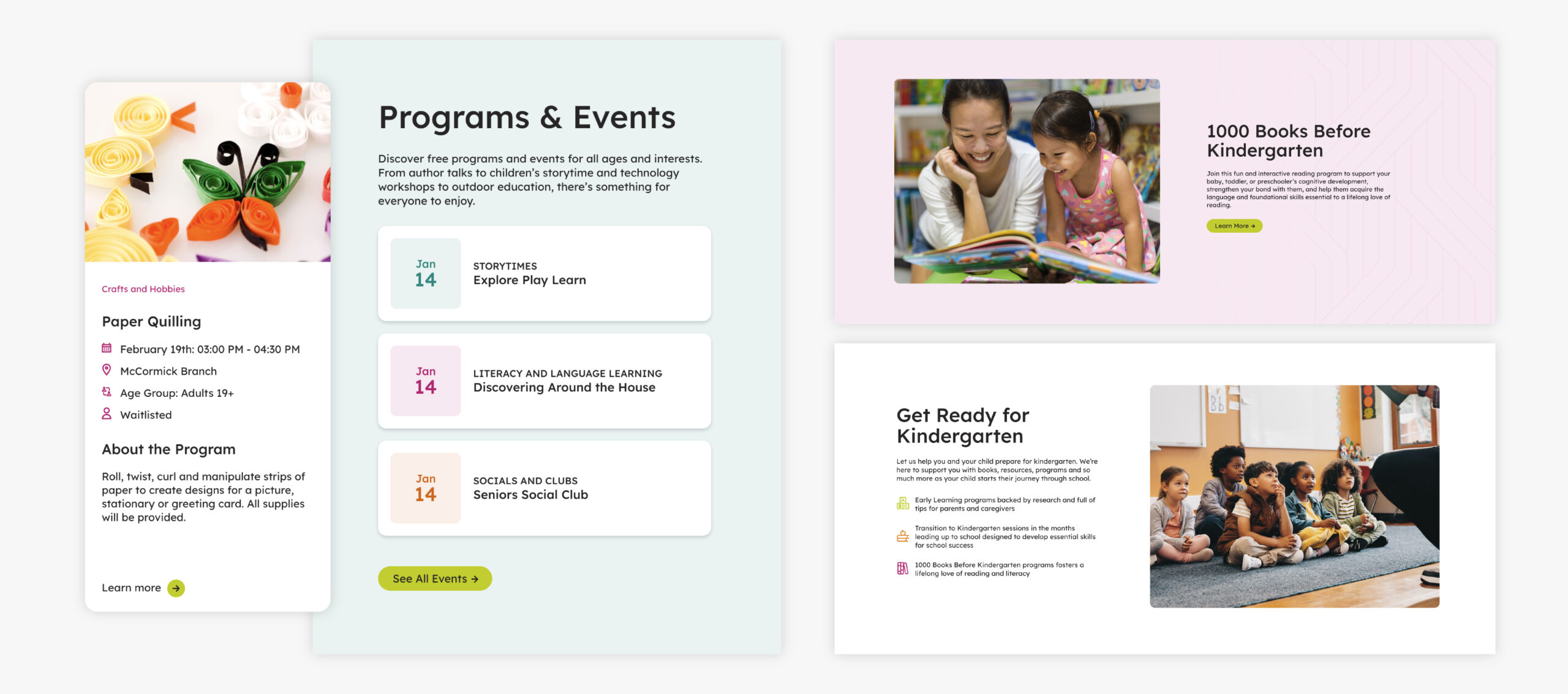
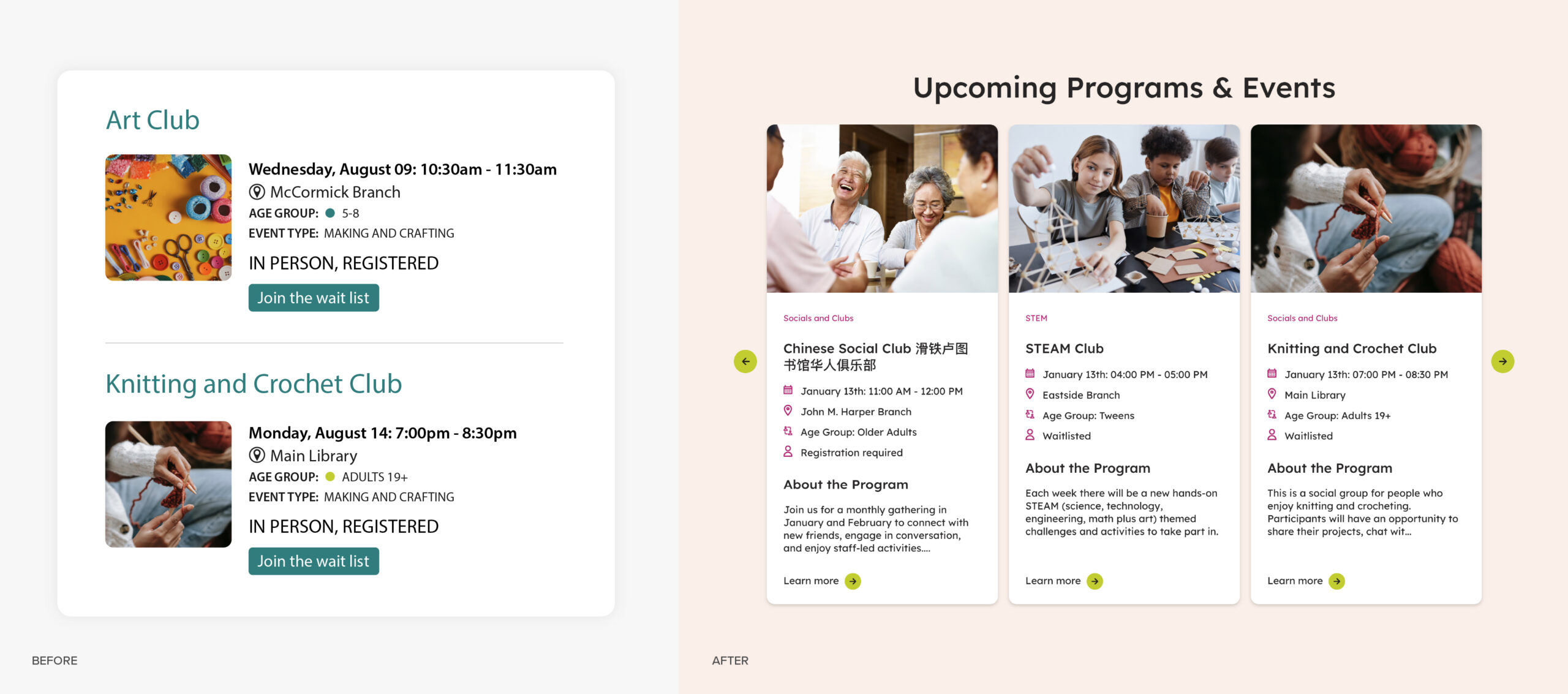
Prioritizing programs and events
Programs and events are a big part of WPL’s offering so an important priority for the website redesign was driving more engagement with them, and ultimately, increasing attendance. To achieve this goal, we did several things.
First, working within the constraints of the API, we redesigned the styling of the event cards to make them more skimmable and enticing. We also added a short description to help users quickly understand what the event entails, meaning fewer clicks for a user when browsing through events.
We then made it easier to include events throughout the site. For example, we added the ability to embed events in blogs and designed a filterable event carousel to be used on any site page.
Lastly, we created a special event module for the homepage, just below the fold, that showcased the next three upcoming events with a CTA to browse all events. This location high on the homepage means that more users discover upcoming events while making the homepage more dynamic.
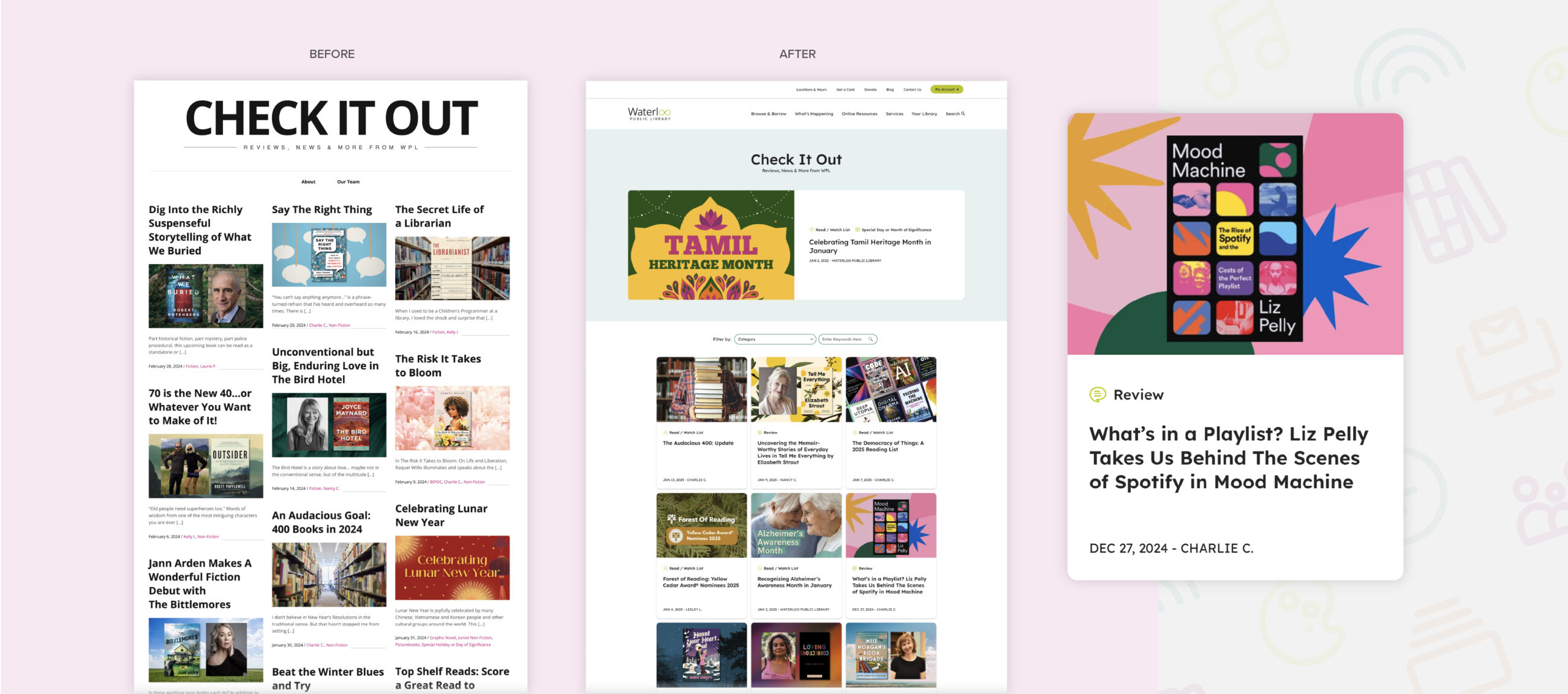
Overhauling the blog and moving it to the main site domain
Another major priority for the redesign was to move their blog, which was already on WordPress but hosted externally, onto their main domain.
This meant more than just moving some files around—it presented an opportunity to create a more functional and engaging blog that feels like a cohesive part of the main website in design and functionality.
Not only was the blog given a major facelift to match the design of the rest of the website, but we also added new tagging taxonomy so that blogs could be filtered on other pages, new easy-to-use functionality within the blogs to enable WPL to embed events, book recommendations, and more, creating blogs that provide much more value to their audience.
With the blog and website now combined on one CMS and domain, managing the many user accounts is much simpler.
Creating audience-centric hub pages
WPL serves everyone in the Waterloo community, however, there are some distinct user groups with unique needs, such as students, newcomers to Canada, and educators.
To make it easier for these groups of users to find and access the most relevant resources, services, events, and more, we created 8 new audience pages tailored to their needs.
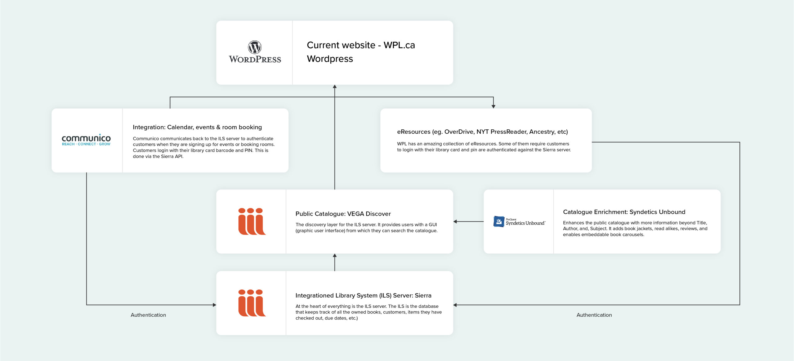
CMS & Tech Integrations
WPL’s content management system (CMS), an old version of Drupal, was holding them back. It was making updates a frustrating and time-consuming task and needed constant bug fixes. With new items, events, and posts coming in almost daily, the library team found themselves bogged down by inefficiencies that turned simple updates into lengthy processes. After moving the site to WordPress, we reintegrated important features like the library catalogue and events calendar, ensuring a seamless experience for users.
The outcome
The culmination of our efforts resulted in a website that exceeded WPL’s expectations and was well received by the Waterloo community.
- Users now enjoy intuitive navigation that allows them to effortlessly find information—whether they are searching for the latest bestseller or looking for upcoming community events.
- The WPL team can now manage website updates with ease, significantly improving their efficiency and ensuring that community members are always informed about library offerings.
- Accessibility improvements have transformed WPL’s commitment to inclusivity into reality; all visitors can now fully engage with the library’s resources without barriers.
- The redesigned site features a clean, modern aesthetic that reflects the vibrancy of WPL itself while inviting users into an engaging digital space.
- The information architecture has made discovering library resources quick and easy. Clear categorization and an intuitive layout enable users to quickly locate what they need while also exploring additional offerings they may not have known existed.
The website also won a 2024 Gold award from MarCom Awards in 2024.
Your Digital Transformation Awaits
A thoughtful, intuitive, and well-designed website can go a long way towards enhancing user engagement and streamline operations for your team. Whether you’re trying to drive leads (or book borrows!) or simply modernizing your look, we’re here to help, let’s talk.