Sphere: Crafting a cohesive manufacturing brand
The Client
Sphere Manufacturing is a Kitchener-based manufacturing company made of up of three local firms (RJB Machining Ltd., Eldorado Tool & Manufacturing Co. Ltd. and KW Anodizing Ltd.) working together to produce high-quality solutions for challenges in manufacturing.
The Mission
As a net new company, the Sphere team was looking to create and launch a new, unified, and cohesive brand that positions themselves as a forward-thinking and innovative company.
The Outcome
The creation of a new company logo, website, branded collateral, and brand guidelines.
The Impact
- Sphere's new dynamic brand stands out in the crowded manufacturing industry.
- Brand guidelines have ensured consistent branding across key marketing and sales touchpoints.
- The new website has allowed Sphere to reach new audiences, generate more inbound leads, and reinforce brand values.
- The easy to use custom-webpage builder allows for easy updates, content changes, and code-free customization.
Creating a bold new logo
Despite being made up of three existing companies, the Sphere team wanted their new brand to stand alone. With the new logo, Sphere wanted to visually communicate its core values of strength, precision, and competence. As we dove deeper into what each of those values meant to the organization, we began brainstorming. First, with words–neat, bold, high tech, abstract, etc., then worked with design elements like shape, balance, and typography.
As this is an innovative and future-focused company, we opted for complex geometric themes and patterns to complement the word Sphere rather than mirror it. This helped communicate that Sphere is a multifaceted brand. Clean and simple, but also smart, innovative, and ready to grow as technology develops.
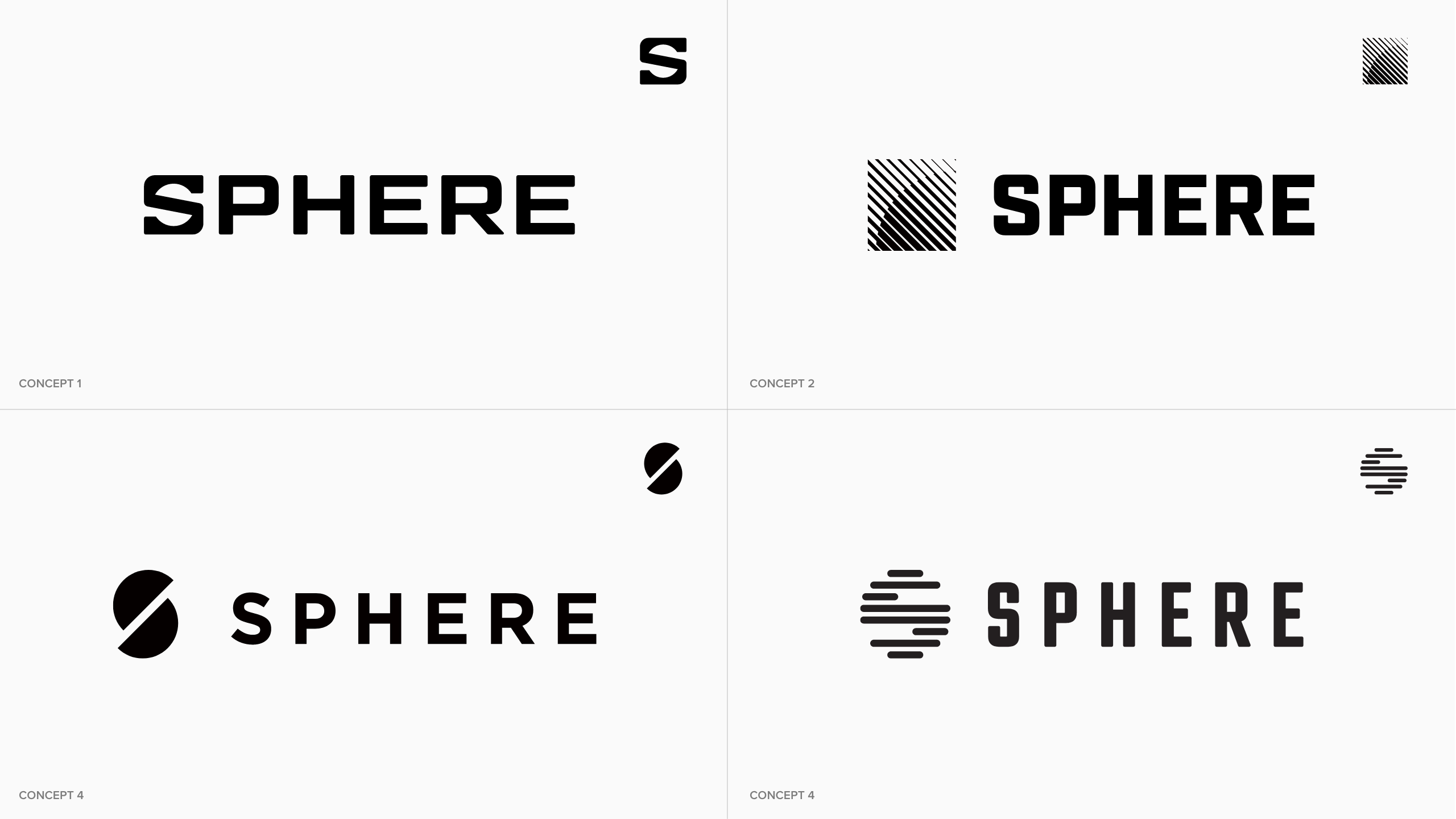
After several rounds of mock-ups, feedback, and discussion, the final decision came down to the four iterations below.
While there were parts of each design that were appreciated, Concept 1 stuck out as a clear winner. The Sphere team cited Concept 1’s impactful, subtle, and strong appearance. With the design approved, it was time to add some colour.
An eye-catching colour palette
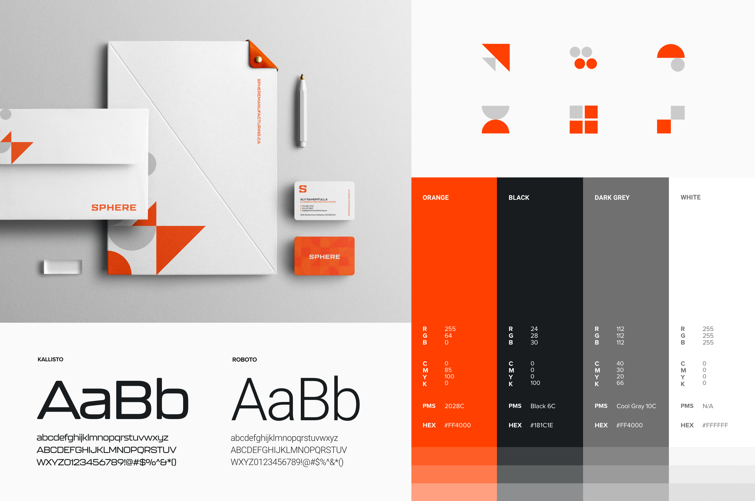
Choosing the right colours for your brand is an important decision. Colours can significantly impact how people perceive, remember, and emotionally react to your brand. Honing in on Sphere’s brand’s values, personality, and competition, Orange was ultimately selected as the primary colour with black, grey, and white acting as supplementary accents. The colour orange is bold, bright, attention-grabbing, but not aggressive. From a brand psychology perspective, orange represents innovation, energy, confidence, and warmth – all key characteristics of the newly founded brand.
As it always is, deciding on company colours proved difficult. After narrowing down the choice between orange and black as primary colours, we were at a standstill. Both looked great. In the end, Sphere wanted to be different. In a sea of companies with muted, earthy, and dark tones, Sphere chose orange and stood out.
The final look
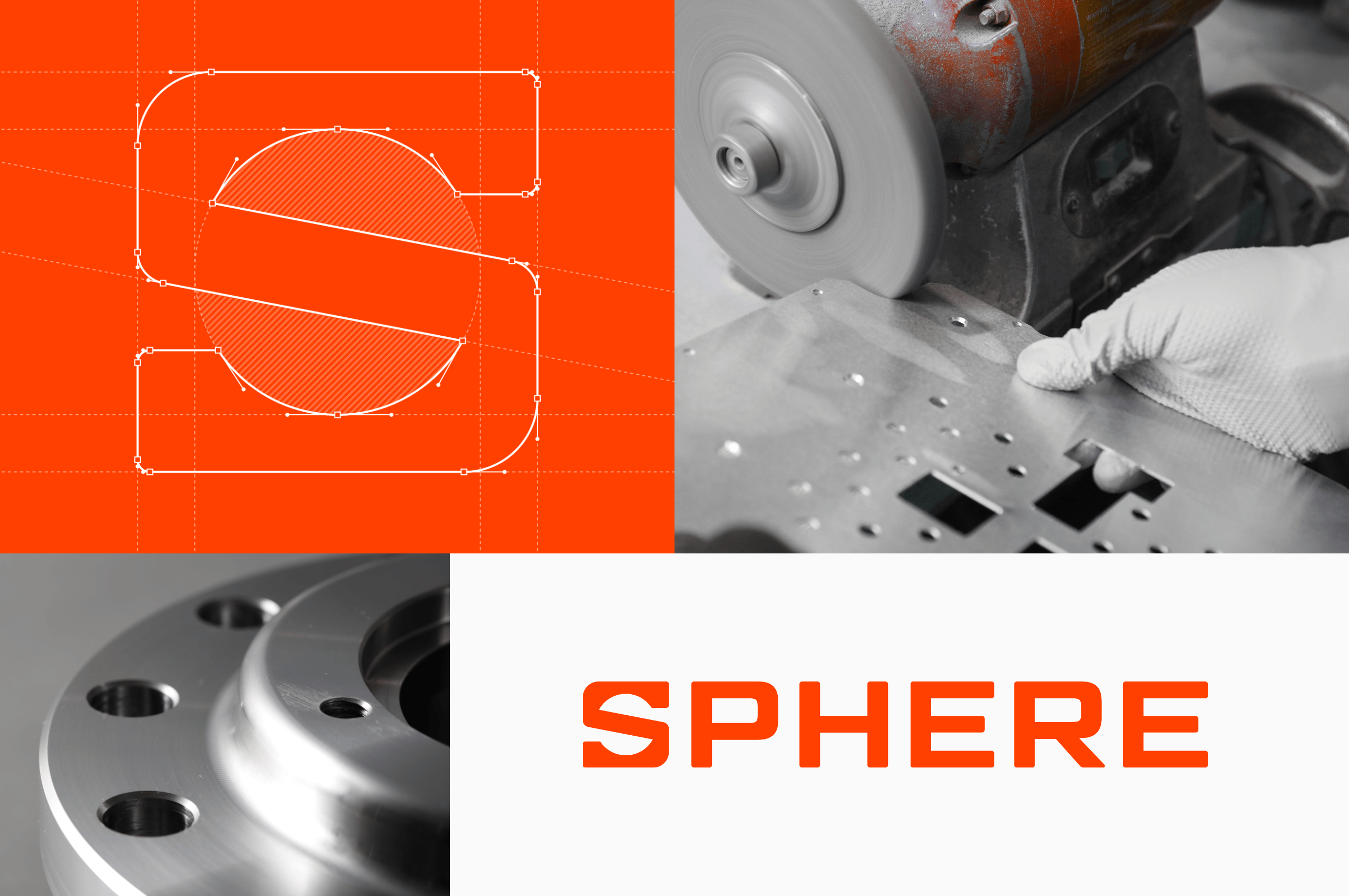
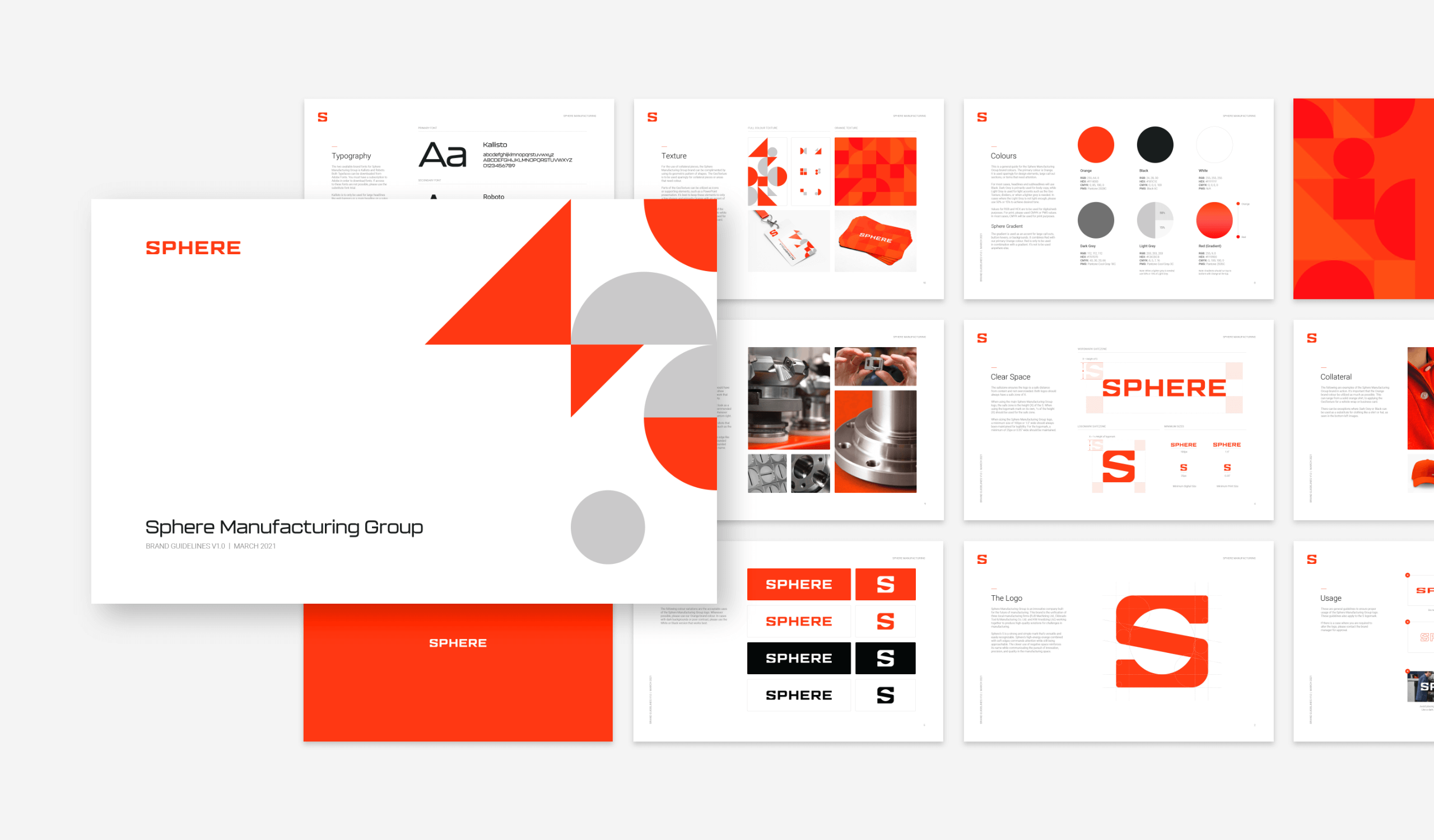
The final choices had been made, the Sphere wordmark would be the primary logo, and the S logomark would function as the secondary option. Sphere’s S is a strong and simple mark that’s versatile and easily recognizable. Sphere’s high-energy orange combined with soft edges commands attention while still being approachable. The clever use of negative space reinforces its name while communicating the pursuit of innovation, precision, and quality in the manufacturing space.
Brand guidelines & collateral
After putting in the work to create these design elements, staying consistent with them is important. With every branding project we do, we provide a brand guidelines document with easy-to-follow and specific use cases for your brand. Not sure which font to use? Don’t know how to leverage the logo for Social media? Need some collateral inspiration? It’s all in there, ready to go, Day 1.
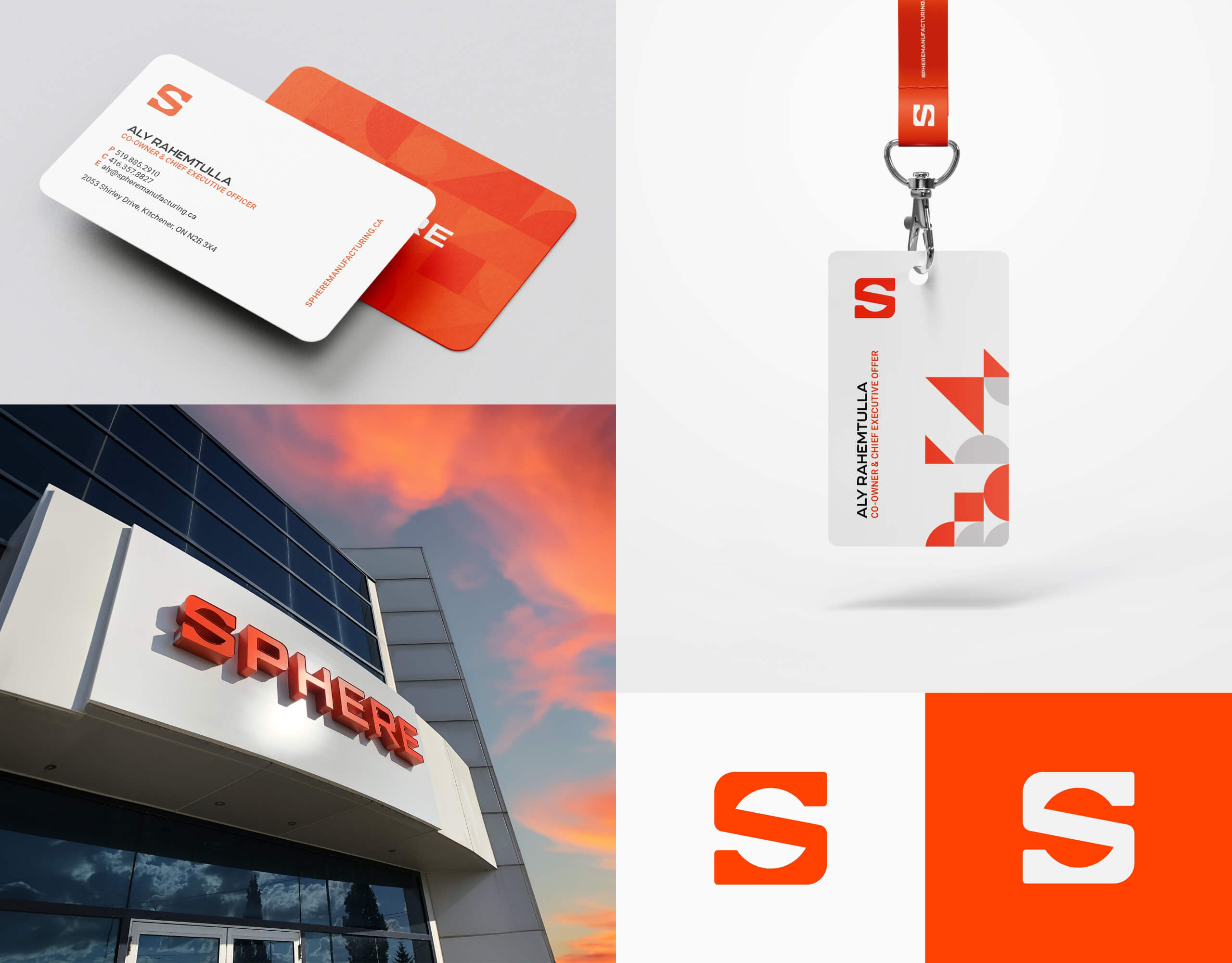
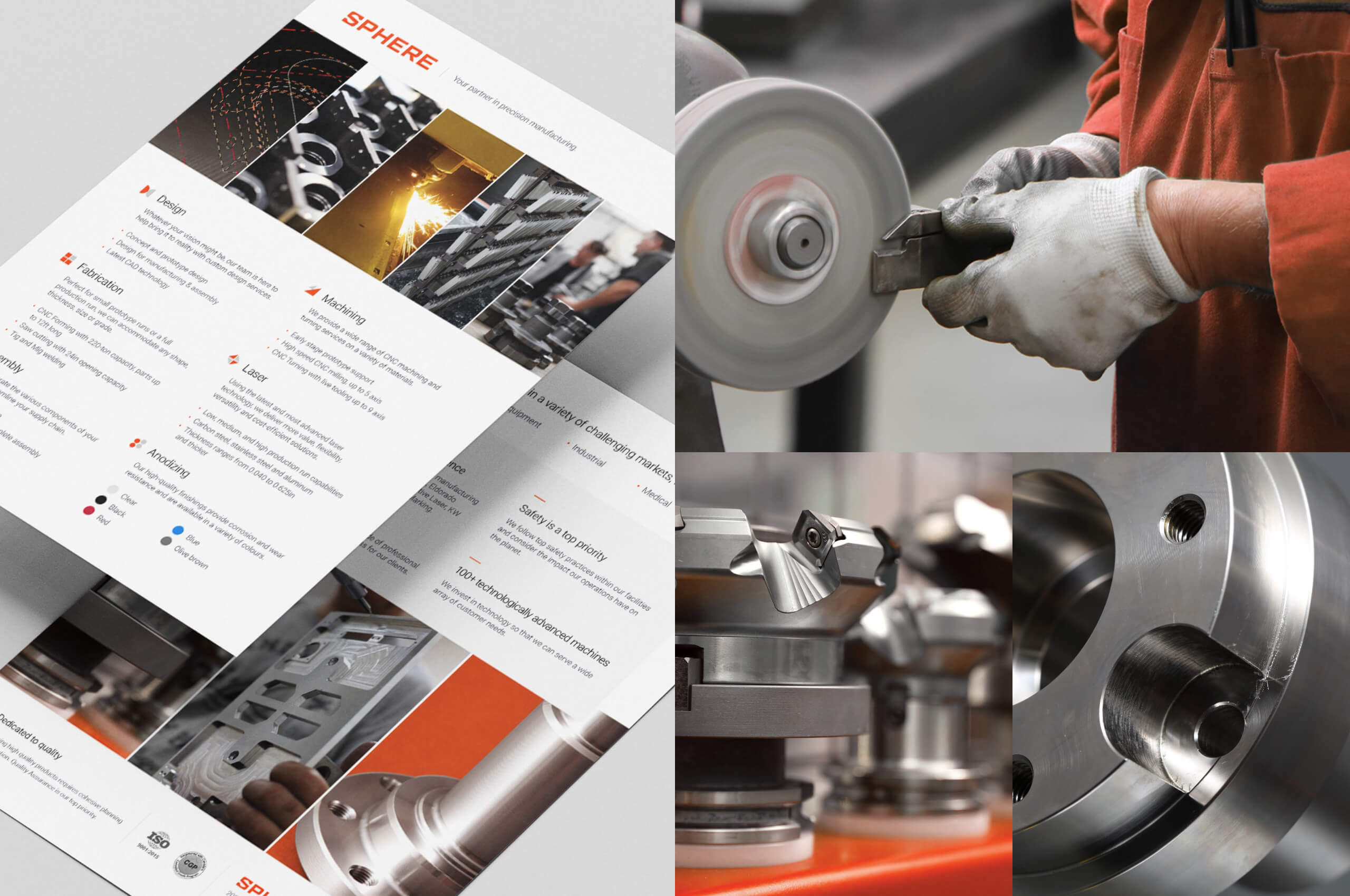
Speaking of Collateral, Sphere’s new brand identity was brought to life through an array of branded essentials, including business cards, lanyards, stationery, building signage, and sales sheets—each as consistent and on-brand as the last.
Designing a cutting-edge website
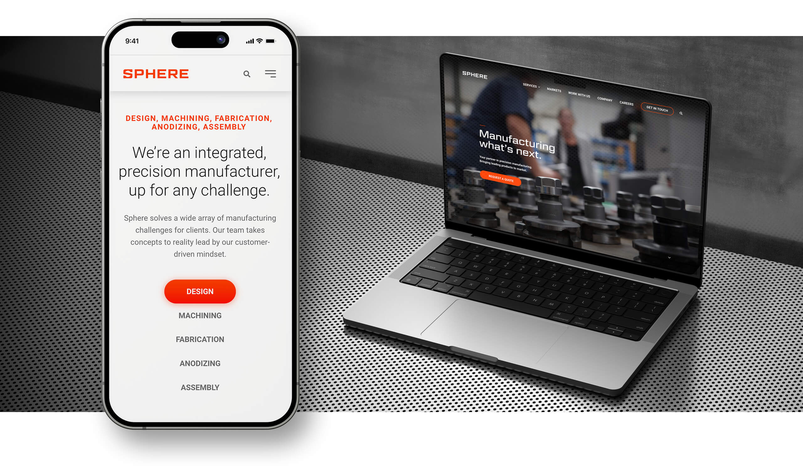
Devoid of any public-facing marketing, Sphere recognized the urgency of establishing a website as a key sales and marketing touchpoint. The role of the website was clear—create a user-friendly experience that communicates Sphere’s value, highlights its capabilities, and generates inbound leads.
From a design perspective, the website needed a similar look and feel to the brand elements above. Sleek, clean, and impactful. That’s why you’ll notice whitespace carefully used throughout the site to create an easy user flow and feeling of cleanliness.
For a website that wasn’t going to have an overwhelming amount of information, photography needed to play a large role in the way the brand was perceived. Knowing this, a photoshoot was set up on-site to capture stunning visuals. This included close-up shots of machinery in use and workers in action to help show off the craftsmanship and quality of Sphere’s work. These shots all work together to create a feeling of innovation and highlight the high-tech nature of the business.
Messaging
‘Manufacturing What’s Next’ isn’t simply the homepage headline, it’s the tone setter for the entire website. Sphere’s brand is built on creating high-quality solutions for the most complex problems by constantly evolving, investing in new technology, and offering new services. This innovation-first way of operating was the guiding light for all communications throughout the website.
The call to action
In addition to highlighting its brand and capabilities, Sphere wanted the website to create leads for the sales and marketing teams. With a large portion of the company’s business stemming from word of mouth/referrals and existing relationships, there was a clear desire to expand the company’s clientele and enter new markets. This is why the website’s main calls to action are ‘Get in Touch’ and ‘Request a Quote’. The sales cycle for a manufacturing business like Sphere’s isn’t short. This isn’t an online retail store where a user might stumble upon the website and instantly make a purchase. The focus was establishing contact, generating interest, and allowing Sphere’s sales team to take it from there.
The impact
Ultimately, Sphere wanted its website and brand to be customer-focused. That’s why from the beginning, all design, navigation, and messaging decisions had to answer the simple question: ‘Does this make the user experience better? With that mindset, the results of the project were dynamic and the Sphere team was thrilled with the results:
“At the beginning of the project I said we want to launch a brand and website that all stakeholders can feel excited about. I’m confident we’ve done that. Thank you.”
-Aly Rahemtulla, CEO & Co-Founder of Sphere Manufacturing
Coming to Stryve with a name and vision, our partnership resulted in the creation of a cohesive brand identity equipped with a cutting-edge logo, a sleek lead-generating website, branded collateral, and brand guidelines that will guide their use into the future.
If you’re looking to give your brand a much-needed makeover, give us a shout!
