Sentinel: Creating a compelling value analysis committee package
The Mission
Sentinel Medical Technologies was founded to advance the standard of care through a growing suite of innovative pressure-based monitoring devices that suit a variety of disease states. However, they were struggling to effectively convey the compelling narrative and cost-effectiveness of their TraumaGuard device. Acknowledging the necessity for a more comprehensive and persuasive tool that would resonate with Value Analysis Committees (VAC), Sentinel engaged our expertise in communication design to create a ‘VAC Pack’, a document outlining the clinical and economic benefits of acquiring TraumaGuard for hospitals across America.
The Outcome
- Equipped Sentinel’s team with a thorough document positioning the TraumaGuard System as a compelling solution for hospitals.
- Enabled Sentinel’s sales team to improve communication with diverse stakeholders during the sales process by providing evidence of product value.
- Simplified complex product use cases and evidence-based studies to support physicians championing TraumaGuard in their hospitals.
The Impact
Stryve’s skills in information design, data visualization, storytelling, and graphic design brought to life Sentinel’s VAC Pack, a compelling 50-page document positioning the product’s patient, practitioner, and economic benefits.
The Project
In healthcare, where resources are limited and the demand for care feels endless, hospitals are hyper-critical of the products they adopt. To get products into a hospital, most medical technology companies will need to pass through a hospital’s Value Analysis Committee (VAC), a multidisciplinary team that’s responsible for approving hospital purchases by analyzing the overall value, cost-effectiveness, and impacts on the quality of care.
Despite having an innovative, FDA approved product that’s backed by clinical studies, Sentinel was struggling to effectively communicate with the wide range of VAC members ranging from clinicians and nurses to business admin. The original VAC Pack was a disparate collection of marketing and sales collateral that didn’t tell a cohesive and progressive story. It was particularly challenging for Sentinel to justify the initial unit cost of their product in comparison to alternatives. Recognizing the need for a comprehensive and persuasive document, Sentinel turned to us to craft a solution tailored specifically for engaging VAC members during the sales process.
Planning information: getting the facts and understanding our audience
To help Sentinel, we needed to understand their product as well as the common objections they received when discussing their product within hospitals.
We embarked on a journey of discovery and research, conducting interviews with Sentinel’s team, meticulously gathering information, and aggregating existing materials to understand the intricacies of their product and its value proposition. We proactively tackled any potential objections head on in the VAC Pack by holding workshop sessions with their in-field team who are boots to the ground arming us with insights.
With supply chain, clinical, and financial stakeholders conducting value analysis, the document needed to clearly answer their questions from multiple angles. We first aimed to answer the following questions:
- Who are the members of the Value Analysis Committee and what are their needs and motivations?
- How will the VAC Pack be used?
- What information do the stakeholders reading the document require?
From there, we determined that the VAC Pack needed to include:
- Product information
- Clinical evidence
- Cost analysis
- Comparative analysis
- Testimonials
- Supporting documentation ranging from research articles to studies and certificates
- Visual aids to support various sections
Organizing content: mapping the narrative flow
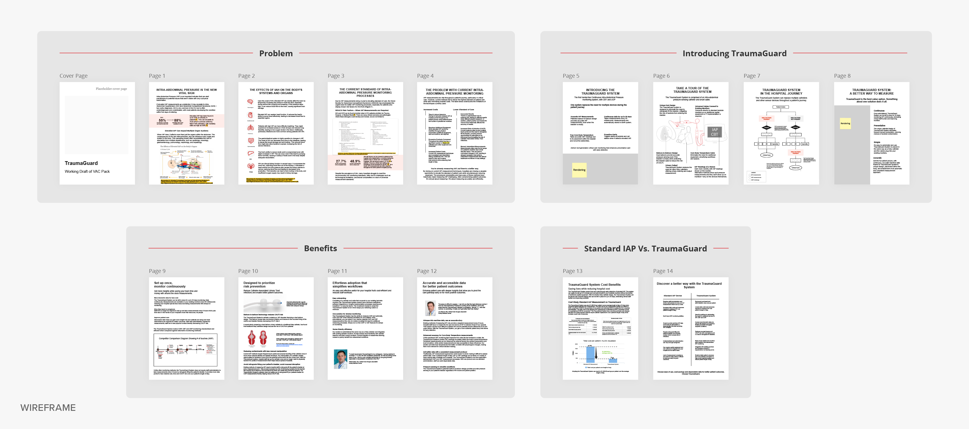
With so much to explain in one document, Sentinel needed a systematic approach to organize the vast array of information required in the VAC Pack. After conducting interviews and gathering information, the next step of the information design process was to create a rough outline of the story.
At this stage, we focused on high-level organization of sections and themes. Key points and themes were grouped together, and we focused on crafting a logical progression of the content. Once approved, we went one layer deeper by organizing information within each page. This incremental approach to content architecture provided opportunities to check in regularly with the Sentinel team to ensure the narrative would be persuasive and clear.
Crafting compelling copy appealing to VACs
Once we had established the story architecture and wireframed the flow, we began drafting copy. We went through several iterations of refining the content. The goal was to ensure we provided clear responses to common questions and objections.
It was integral we use language and terminology that resonates with healthcare professionals and administrators while explaining technical complexities without overwhelming jargon.
Designing pages, data visualization and diagramming
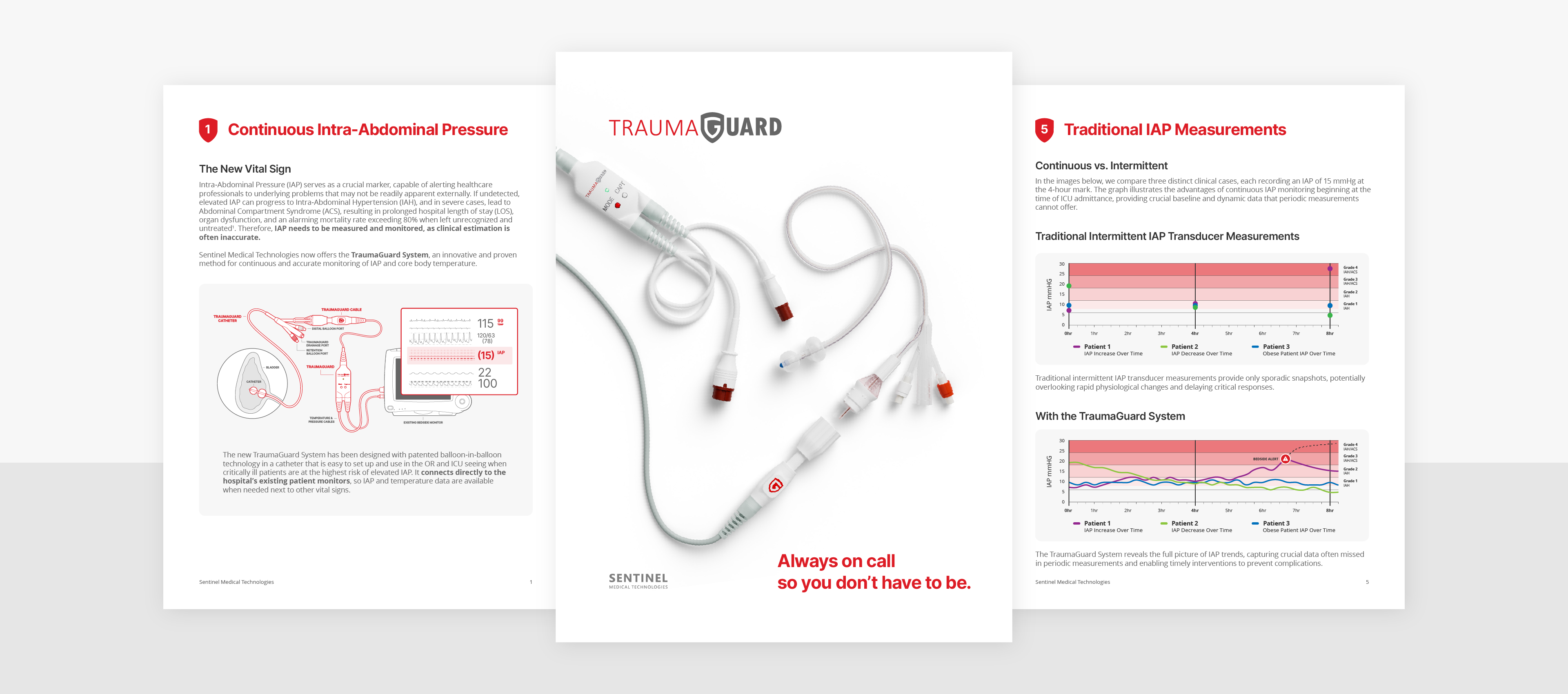
Since medical technology can be highly technical and not all members of VAC committees may be as familiar with clinical workflows or processes, it was imperative to include visual aids within the VAC Pack.
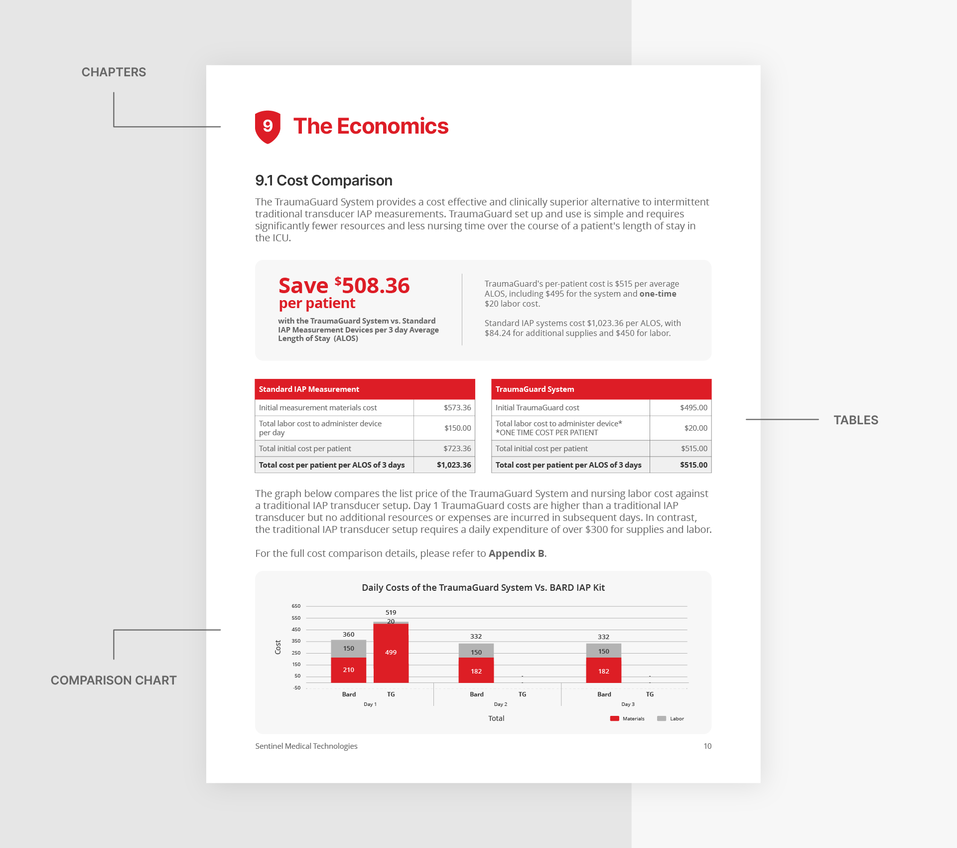
For our design approach, we wanted to ensure the document didn’t feel intimidating. We took a clean and clinical approach with chapter–like sections that grouped information into easily digestible parts.
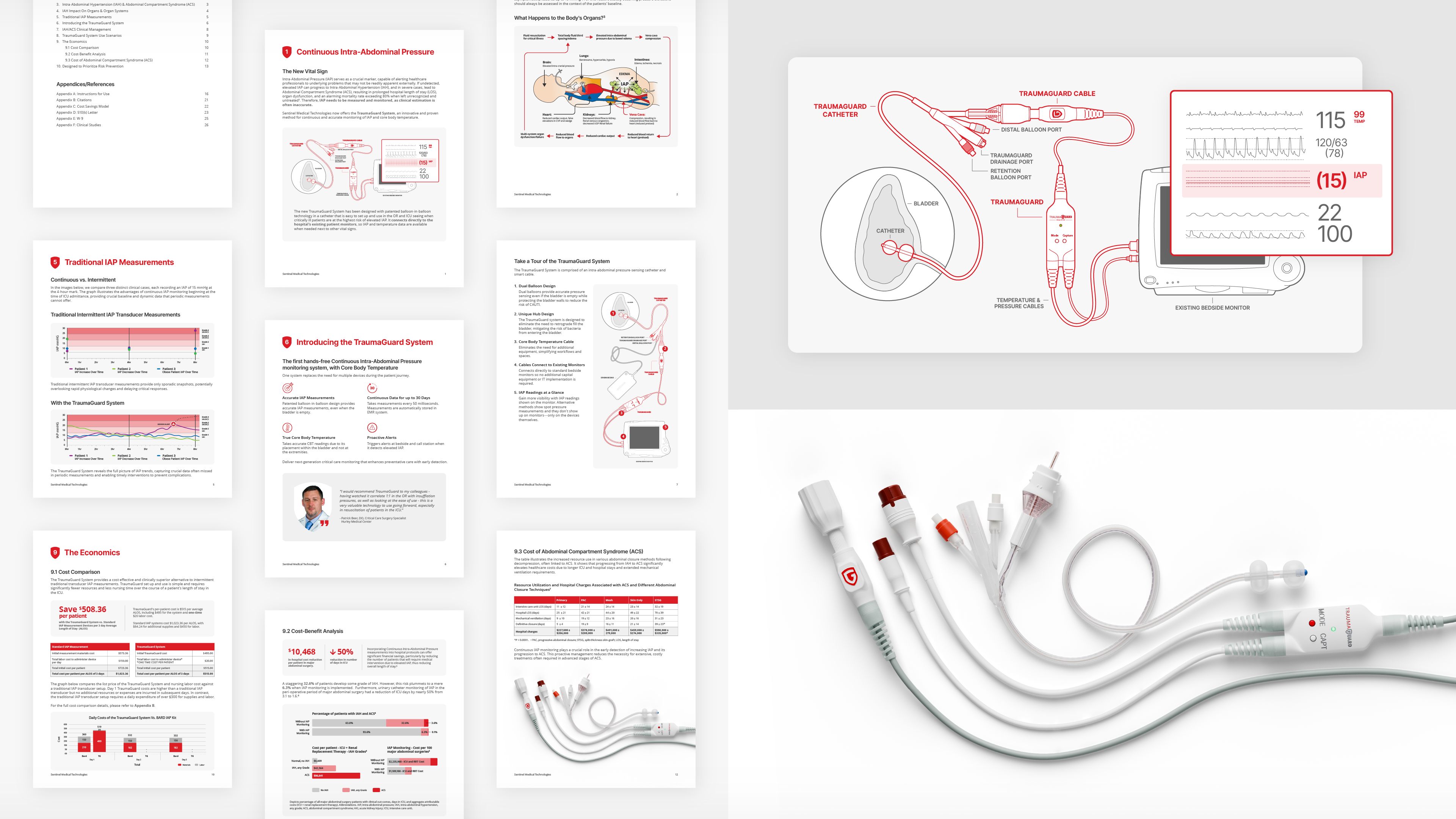
We visualized a variety of processes and conditions to make complex ideas easier for readers to understand. These visualizations included:
- TraumaGuard set-up and connectors
- Impact of IAP (Intra-Abdominal Pressure) on organs
- Graphs and measurement data
- Patient statistics
- Unique features of product design
- Tables and comparison charts
Overcoming product visualization challenges
Given the unique nature of TraumaGuard as a catheter and cable which is placed within the body, we needed to find creative ways to showcase its functionality without being graphic or displaying sensitive body parts. To address this challenge, we created detailed technical line-drawings that depicted the complete system. Additionally, we collaborated with a vendor to produce 3D renders, balancing clarity and visual appeal while maintaining professionalism and sensitivity.
Enhanced clarity for VACs
By transforming Sentinel’s VAC Pack, we effectively showcased the TraumaGuard System’s functionality and enhanced Sentinel’s communication with diverse stakeholders, empowering their sales team and positioning the TraumaGuard System as a compelling solution for hospitals.


