Daggerwing: Creating a website fit for a top 10 global consultancy
THE MISSION
The Daggerwing team felt their online presence was not accurately reflecting their global brand in look or feel. Our mission was to refresh their visual brand and help them communicate their value to prospective employees and clients all over the world.
THE OUTCOME
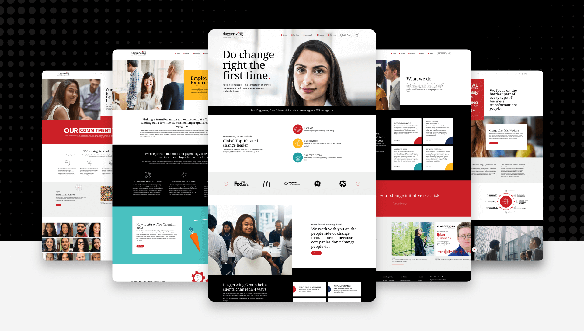
Daggerwing’s website was re-imagined. Through innovative design and human-centric storytelling, we built a website and content hub that helps educate and reaffirm Daggerwing’s standing as a global leader in the consultancy space.
THE IMPACT
- A more cohesive and intuitive website that clearly articulates Daggerwing brand and core values.
- A content hub that highlights Daggerwing’s expertise and brings together leaders from around the world.
- Since launch, visitors are bouncing 21% less, spending 35% longer, and engaging with nearly 10% more content.
- Custom-built page builders ensure brand consistency and allow for instant updates, content changes, and code-free customization.
The Project
For many business leaders, change is difficult to create and implement in an organization. In fact, one in three CEOs fails to achieve the desired outcome of transformation initiatives. This is where Daggerwing comes in. With teams across North America, EMEA, and APAC, Daggerwing is truly a global change consultancy. Partnering with Fortune 500 firms, they assist with organization’s greatest transformation challenges—from operating model changes and mergers & acquisitions to major culture shifts and enhancing the employee experience.
Daggerwing came to Stryve as a top 10 globally ranked consultancy that believed their online presence was not living up to that cachet. The existing website was not reflective of the brand, the expertise, and the reputation they had worked so hard to create. The imagery, the design, the messaging, the functionality—it wasn’t telling the right story. During our kickoff call, Daggerwing President & Co-Founder, Cheryl Ferguson, explained why they felt the need to address the website now:
“Our website does not look top 10. Our brand does not look top 10. How can we close the gap between our brand promise and the online experience?”
Together, we set out to answer that question. With prospective clients and employees from all over the world coming to the site on a daily basis, we needed to achieve three key objectives:
- Differentiate from the competition in look and feel
- Communicate Daggerwing’s authentic human-centric brand
- Highlight global leadership and scale
Site Architecture & Design
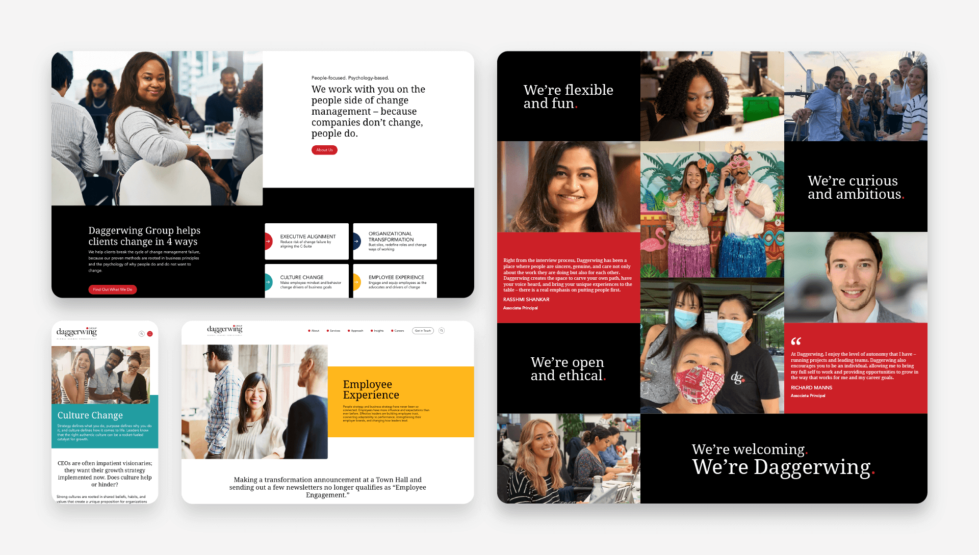
Daggerwing’s existing website felt more like a blog, with a modular, card-based design. This limited the user’s ability to intuitively navigate through the site. With storytelling being such an important element of the new site, a larger emphasis was placed on white space, dynamic hovers, and interactive elements. Large, human-centric photos were also included to break up content and establish the core focus of Daggerwing—people. In the navigation, existing menu options titled: “Who”, “What” and “Why” were replaced with clearer names like “About”, “Services” and “Approach” with drop-downs to secondary pages to provide additional context as to where they were going. Finally, to introduce a dynamic feel, a hover effect featuring Daggerwing’s signature red dot was introduced to make the experience of navigating to a page feel more modern and interactive.
From a design standpoint, the Daggerwing team wanted to use existing brand elements in new, simpler ways that would make the site feel familiar but revitalized. Prior to coming to Stryve, Daggerwing felt that they had too many brand colours and they weren’t being used consistently. The new website uses red, black and teal as its primary colours, with yellow and navy blue used sparingly. Red and black have long been the colours Daggerwing is known for, so they were present throughout the new site, while teal was added to make the palette feel more dynamic, fresh, modern, and human.
Differentiation through authenticity
Daggerwing wanted to be different. But what did that mean? Different from who? What does different look like? What kind of images, messaging, and tone were competitors using?
After performing a competitive analysis and having in-depth discussions about the brand, it became apparent that Daggerwing’s differentiator was their people-focused philosophy. Competitors in the industry utilized large cityscapes and fast-paced technological imagery on their websites to convey the speed and scale at which they operate. This wasn’t the Daggerwing way. They aren’t architects or software developers. They’re people, helping people—and their website needed to reflect that. Daggerwing’s Marketing & Brand Manager, Lauren Southard, had this to say about their people-focused brand:
“One of Daggerwing’s most important strengths is how we work with clients and each other. Our brand needs to capture the way we care about the work and care about all people—our clients, their customers, and our own employees. It needs to show that we are comfortable bringing our own humanity to work”.
Selecting photos to articulate this wasn’t an easy process, but it was an important one. Starting with photo concepts and stock photography, we began to plan out what kind of images were going to connect most with their audience. Engagement and connection were most important to the Daggerwing team, so photos with people looking and connecting directly with the camera were used often throughout the site. Daggerwing didn’t want to be passive observers, but rather actively engaged with their audience. Change consulting is a partnership and the photos selected communicate a calm and compassionate team ready to help.
Global Leadership & Doing Change Right
Daggerwing is a globally recognized consultancy, not a small, boutique agency. Scale, credibility, and leadership were three words that came up consistently throughout this process. For Daggerwing, much of their thought leadership and ‘reason to believe’ came in the form of timely and expert content. This content was living on their ‘insights’ page and the initial plan was to simply give this page a facelift, make it filterable and a bit more engaging. The more we discussed this idea, however, it became clear this shouldn’t be limited to one page. With so much high-quality content and opportunity for interaction and engagement, the decision was made to create a secondary website as a content hub where Daggerwing’s expertise could shine through. DoChangeRight.com is dedicated to sharing change management ideas and expertise from practitioners, partners, influencers, and academics. Powered by Daggerwing, this hub encourages discussion, exploration, and learning from leaders all over the world.
Using news websites as inspiration, the content hub serves as an ongoing dialogue and discussion for those interested in learning about and engaging with top industry stories in a virtual newsroom-type setting. Similar to the main site, the content hub went through a few different iterations and layouts as shown in the below wireframes and mockups. The final product grew out of our many discussions around layout, content, and behavioural flow. The navigation provides multiple ways to filter their content (topic, type) while the UX centers around providing different ways for users to find what is helpful for them and options for sorting (like “the latest” and “the greatest”). Having this content-focused site has supported Daggerwing’s efforts in sharing its globally recognized expertise and insights.
The Results
The new website and content hub have helped transform Daggerwing’s online presence into one fit for a top 10 global consultancy. The new site is simple, clean, modern, and human-centric. The design, imagery, and messaging are all rooted in Daggerwing’s authentic brand and highlight their human-centric approach and expertise. When prospective employees or clients visit their websites it is clear what they do, how they do it, and why they do it.
From a functionality standpoint, the website and content hub are both built with custom themes and page builders. These builders ensure brand consistency and the easy-to-use modules allow Daggerwing to launch new content in days instead of weeks with easy-to-use and code-less customization.
The new website and content hub have had a meaningful impact on Daggerwing’s business. Year-over-year, Daggerwing saw session duration increase by 35%, bounce rates decrease by 21%, and pages per session increase by nearly 10%. Users are now staying on the website for longer, engaging more with the content, and exploring more pages overall.
Ongoing Work
We strive to set up every client with systems that can be easily managed once the project is delivered. We enjoy handing the keys over to a client who can confidently maintain what we have built together. In this case, Daggerwing saw the benefit of retaining Stryve on a monthly retainer to not only perform monthly webops maintenance on the new site and content hub but to provide feedback and insights into how to expand their audience overall. Through weekly calls, we stay closely aligned with all of Daggerwing’s marketing activities and can quickly act on requests, make suggestions, and execute them.
Stryve has been working with Daggerwing since January 2019, a partnership that continues to this day. What started as a content amplification project grew into strategic consultation, graphic design, social media strategy, content creation, digital campaigns, and a website project. Our close relationship allows us to provide a holistic marketing strategy because everything we do, from website maintenance to paid campaigns, is all connected. This has been a very successful partnership for both teams. But don’t take our word for it, hear it straight from the Daggerwing team’s Clutch Review:
“Stryve has helped us have a consistent flow of content and reach new audiences. They are true marketing partners and always push us to try new strategies and methods to expand our brand reach.”
-Lauren Southard, Director of Marketing & Brand Management, Daggerwing
Head on over to Daggerwing’s new website to see the final product.

