Website typography mistakes you’re making (and what to do instead)
By: Abagail Maxwell
May 1, 2024 | Reading Time: 6 mins
Eighty-eight percent of consumers are less likely to return to a website after a bad experience and a big part of that experience is typography. Type can make a website visually appealing and ensures readability for smooth UX. But what is considered “good” or “bad” when it comes to web typography? We’re going to break down some common mistakes to avoid.
What are legibility and readability?
Before we go through all the mistakes, let’s get a brief overview of legibility and readability. These are two characteristics you want to look for in web typography and they are slightly different.
- Legibility is how distinct the characters are. Legibility can be determined by factors such as x-height, counter size, and stroke width.
- Readability is how easily the blocks of text can be read. It’s impacted by elements like line length, line height, and alignment.
Website typography mistakes to avoid
1. Don’t pick hard-to-read fonts
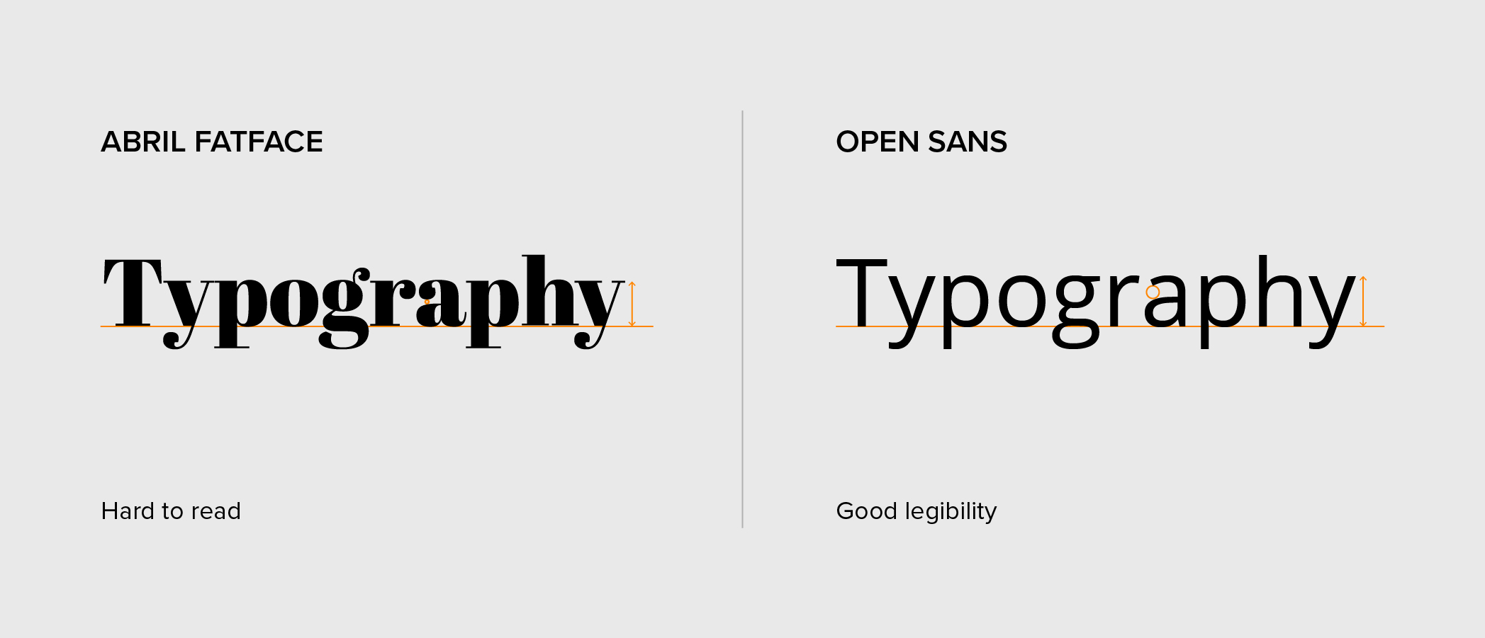
Okay, this one sounds obvious but it has to be said: Don’t pick a font that is too difficult to read. When you visit a website you want to be able to easily read the content on the screen. In certain cases, typography can be purely ornamental and intended for visual flourish. The content isn’t important in those cases—but that’s a unique case for specific designs. Choosing a font that’s hard to read will make this challenging and cause people to get frustrated and spend less time on the page. Imagine a blog post written entirely in Jokerman or Comic Sans—I wouldn’t want to read that.
Font legibility is important because it’s a pillar of accessibility that allows people to read through a website’s content seamlessly. When searching for a legible website font, there are a few things you should consider. First, check if the font has a large x-height. A typeface with a large x-height will look larger than one with a small x-height. Additionally, make sure the characters are open and distinguishable from one another. This will make it easier to differentiate between letters. Make sure to keep this in mind if you are creating your own type as well.
Many website designers also opt for sans-serif fonts because they are easy to read at small sizes and on mobile screens due to their clean, simple design. If you need ideas, some cool and easy-to-read fonts for websites are Proxima Nova (we’re a little biased, that’s the font you’re seeing right now), Benton Modern, Benton Sans, FF Mark, Neue Haas Grotesk, and Sentinel.
2. Don’t use too many fonts
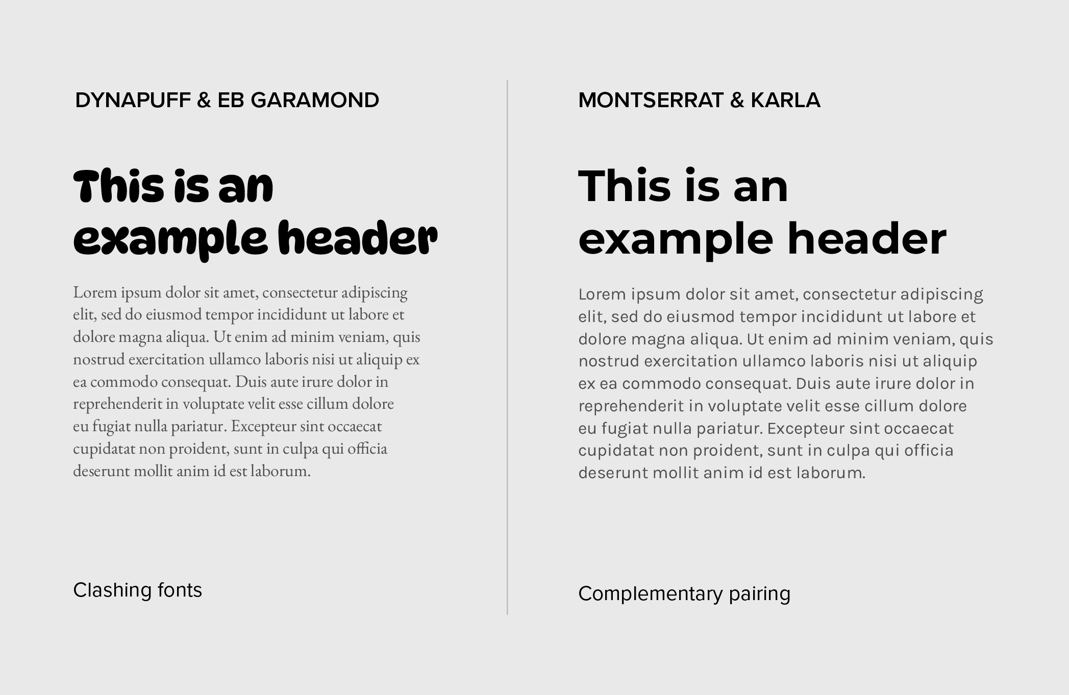
“The more the merrier” may be your mantra when throwing a raging party but it should not be your mantra for selecting fonts. Having too many typefaces on your website can make it hard to follow. Limiting the number of fonts helps maintain a cohesive look and prevents the page from becoming too busy.
It’s generally recommended the number of typefaces used on a website be kept to a minimum. It’s completely possible to stick with one font family and add hierarchy to the copy using different weights. For instance, a heading can be bold while the body copy is at a regular weight.
If you’re going to go down the route of choosing fonts from different font families, you must choose a complementary pairing. One way you could go about this is by choosing fonts with a similar mood or tone. Alternatively, you could pick fonts that contrast in weight. If you need some inspiration check out fontpair, which has tons of free Google font pairings. And if you’re an Adobe Fonts user you may also be familiar with their recommended font pairings.
3. Don’t use teeny, tiny body copy
Reading web copy should never feel like trying to read an ant’s tracks. If people are squinting their eyes trying to read the text on a website then that is a good indicator that it may be too small. Font sizes that are too tiny can strain the eyes and sizes that are too large can make text hard to follow. Ultimately, this creates a poor user experience that could cause readers to leave the site.
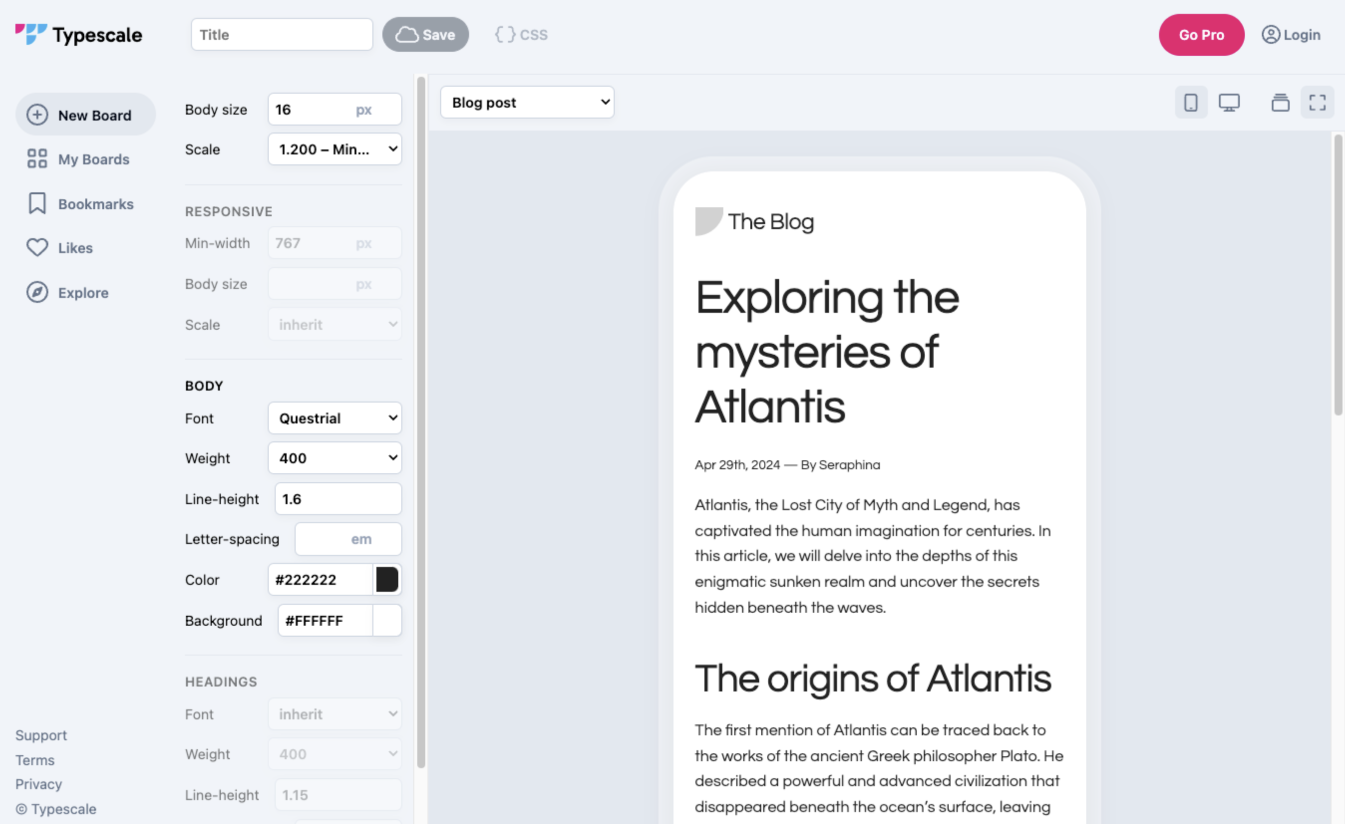
Using the appropriate size for text is important to ensure users can read effortlessly. Computers sit further away from us compared to books or phones, so it makes sense that their type should be larger. Whereas the type on mobile devices can be slightly smaller because there’s less reading distance. Generally, around 16px to 20px is a good range for desktop body copy, but it’s important to test it out! The specific font can also impact the size you choose, for example, 16px in one font will look slightly different in another.
You can use websites like Typescale to check the size of your fonts on mobile and desktop devices. Remember that you want to achieve POUR (perceivable, operable, understandable, robust) on your website.
4. Don’t overlook colour contrast
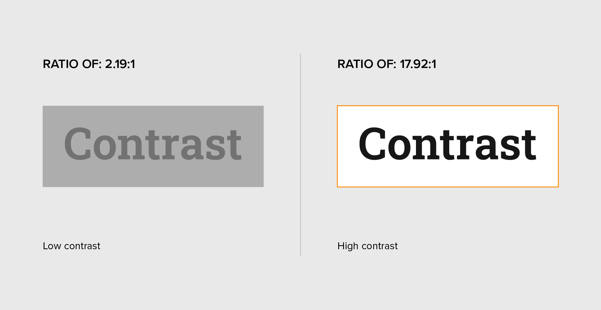
Even if you choose the most legible font at the perfect size, poor choice of colour can be your downfall. Low colour contrast can make text difficult and sometimes almost impossible to read. Colours with similar values are not accessible.
Using high-contrast colours for your type will help ensure it’s readable for everyone, including those with visual impairments. There are web accessibility standards, such as the Web Content Accessibility Guidelines (WCAG) that outline what measures to follow when it comes to colour contrast to maintain accessibility. For normal text, WCAG 2.0 level AA requires a contrast ratio of at least 4.5:1 while Level AAA requires a contrast ratio of at least 7:1.
A comfortable colour combo you can’t go wrong with is off-black text on a white background. There are also many online resources to help find great colour palettes. WebAIM is a great resource for checking the contrast of colours for type and graphical elements. It will even tell you if the colours pass accessibility standards.
5. Don’t layout text using extreme line lengths
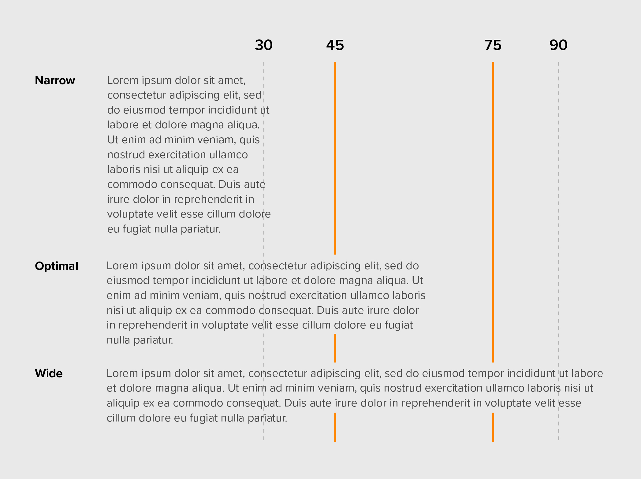
Be mindful of the line length (aka the width of a block of text). Paragraph width should not span as far as the eye can see nor should it be too short. Short lines can cause people to jump to the next line too quickly, while long lines are intimidating and can cause readers to get tired.
You want to aim for a comfortable middle ground when it comes to line length to keep people engaged and avoid reader fatigue. Between 45 to 75 characters is considered optimal for website line length.
6. Don’t limit line height
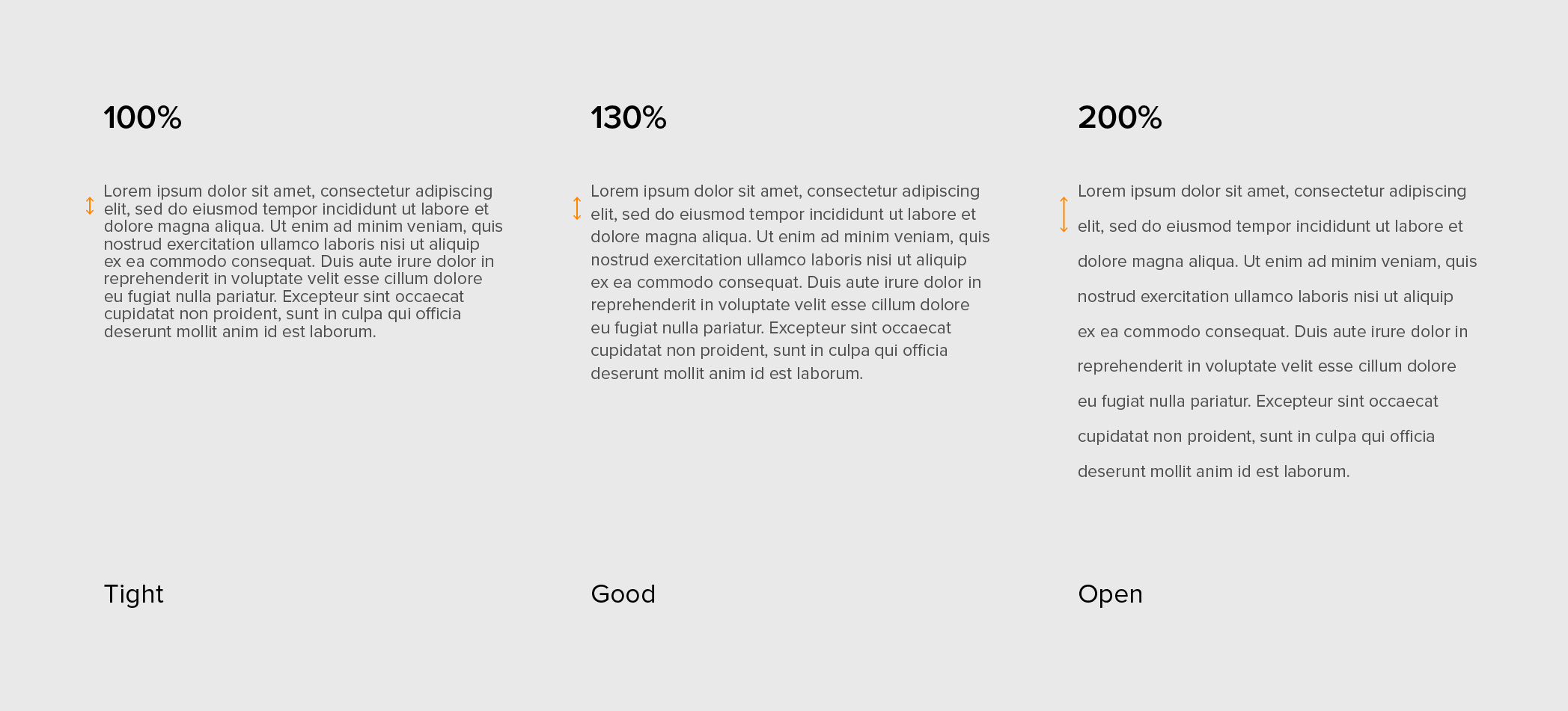
Line height refers to the vertical spacing of text (also known as line spacing or leading). When this spacing is too tight or open, it can affect the readability of the copy, especially in longer blocks of type.
Tight spacing can create a sense of urgency, while open spacing gives a more relaxed look. With line height, you want to aim for a comfortable distance that is easy to read. Spacing set to around 150% is common for screens.
Websites that heavily focus on articles and blogs may want to opt for a slightly higher line height to achieve a more comfortable reading experience. The x-height of the specific font should also be taken into consideration because it can affect how the line height appears.
Better web typography means better web experiences
Choose your type wisely! May your fonts be legible, your paragraphs well-proportioned, and your line heights as harmonious as a well-orchestrated symphony. Remember that all of these things impact the user experience of a website. Avoiding these mistakes not only creates a visually appealing website but also improves readability so you can clearly communicate your business’s message.
