Browsing a website with unclear navigation is like trying to find your way around a new city that’s missing street signs—how do you know where to go and all the possible roads you can take? Website navigation is essential for creating a positive user experience as well as ensuring your site ranks well on search engines. So let’s talk about what you can optimize and what to consider for your website’s navigation.

What is website navigation?
When we talk about website navigation, we’re not just talking about the main menu but all corners of your site from footers to sub-menus, and beyond. Website navigation refers to the way that your links are sorted and structured on your website. Think about it like creating a hierarchy for all your content. The goal of website navigation is to organize your site in a way that allows your users to get the information they’re looking for in as few clicks as possible.
It also dictates your website’s SEO (search engine optimization). Search engines rely on your website’s navigation to understand your content and how the elements of your website relate to one another. If navigating the site is confusing, you’re going to rank lower as this indicates to search engines that your website has a poor user experience.
Things to keep in mind when considering website navigation
Understand your sitemap
To figure out the best way to sort your website’s content, you first need to make a list of all the content you want to have included on your site. This means considering your sitemap and accounting for what pages exist on your website, how they relate to one another and if all of them are even necessary. With that knowledge, you can start by examining your hierarchy, priority and how pages are related. The ultimate goal is to identify what needs to be prioritized in your navigation so it’s easily accessible.
Understand your target audience
Then think about your users. Ideally, you are considering them at all stages of your marketing efforts. More often than not, there are various types of users or personas that will engage with your site. Think about how they speak, why they may come on your site and what they may be looking for. This will impact the language you include in your navigation as well as how you organize your navigation. It can even help you prioritize WHICH of these users is priority.
For example, if you are a B2B company then maybe you need to consider if it’s better to organize your offering in the nav by industries you serve versus services you provide versus products you sell versus problems you solve. There’s no right or wrong way to go about it. Ultimately you have to determine what organization is best and easiest for your target audience to navigate.
Questions to think about when assessing your website’s navigation:
- What actions do we want our target audience to take?
- How can we help people identify that we have the ability to service them or, feel relevant to them quickly?
- Who are the different users that would come on our site and what’s their intent?
- What’s considered standard for users in our industry and how may they usually expect to navigate a site like ours?
It’s okay to take some time to think about this especially if you have many aspects to your business or multiple demographics you want to engage with.
Start drafting menu organization options
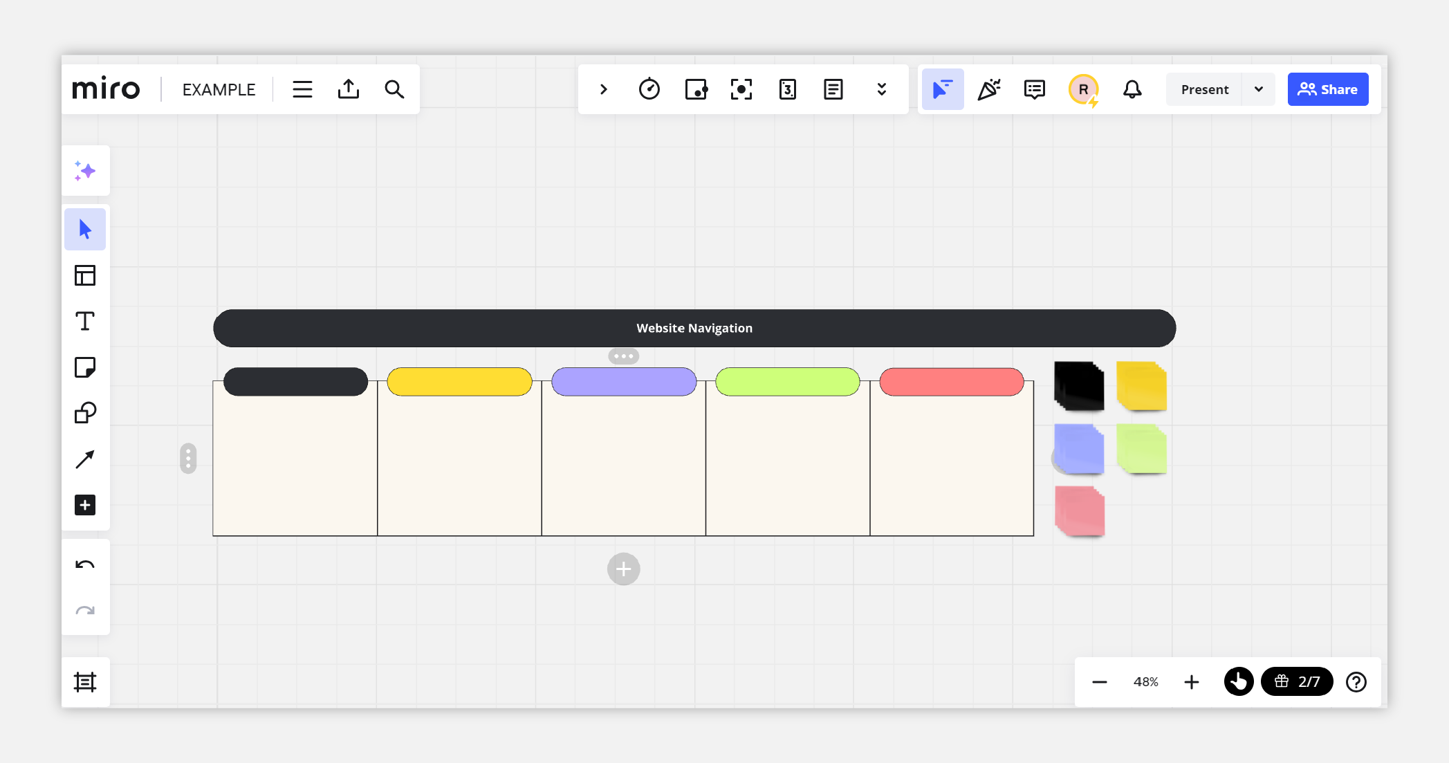
You can then start sketching out the rough layout for your website navigation and adding labels and descriptions where needed to determine what items need to be identified in your nav. This process could be done in a notebook, using Post-it notes, or with an online tool. Here at Stryve, we love to use Miro for planning web design projects because of it’s wide range of tools as well as its collaboration capabilities. Pictured below is an example of a main menu sketch and potential drop-downs we’d organize underneath each main selection.
Choosing your navigation types
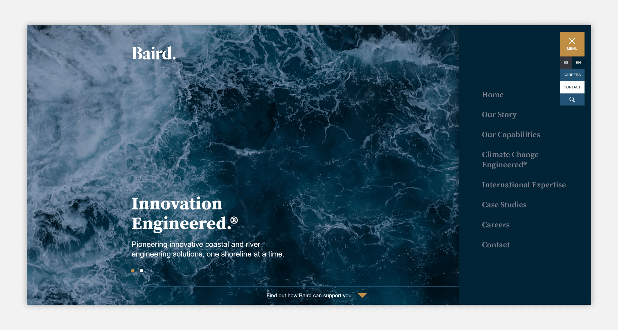
When imagining website navigation, most of us will picture the navigation bar at the top of most websites. It’s a pretty universally accepted UX principle. However, there are lots of different options for structuring your navigation and the top menu is just one of them!
Top menu
Yes, I did just say that top menu navigation isn’t the only type of website navigation, but that doesn’t mean it’s not a great option for you. Because it’s the most commonly used type of navigation, users find it highly familiar and it can make your site’s user experience much more enjoyable. Typically, a top menu will be set up with your company’s logo on the left hand side of the page while your menu options are listed along the right-hand side.
There are many variations and features to consider for your top menu like:
- Dropdown menu – the menu expands when user hover over a particular navigation item to reveal more options.
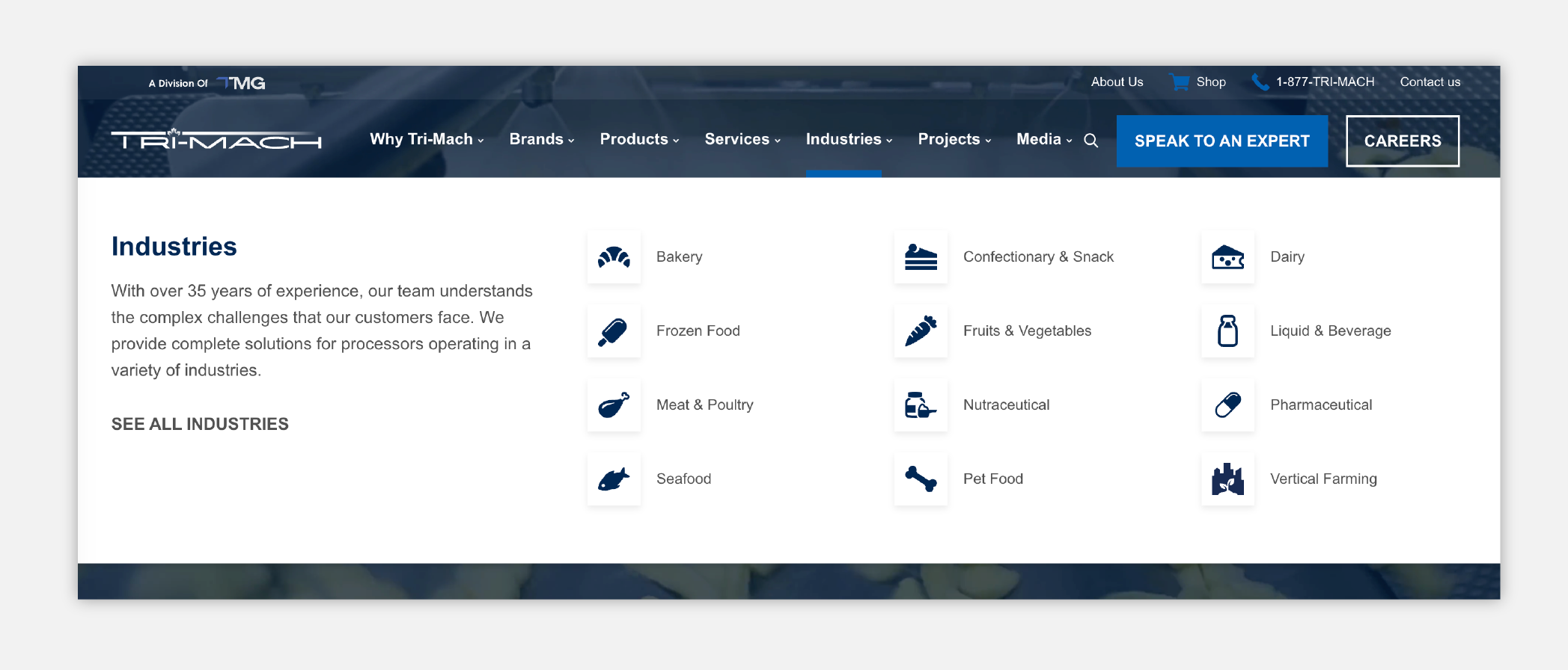
- Mega menu – a beefed up version of the dropdown menu that reveals much more content ranging from multiple sub-categories, icons/imagery and even consists of sub-headings or phrases.
- Utility navigation menu aka eyebrow nav – this is like a menu on top of your primary top menu which is usually smaller and points to utility pages or less prominent pages.
Footer menu
Another common type of website navigation is a footer menu. This can be used in conjunction with a top menu for pages that need to be visible but not the first thing that most of your users will be looking for when coming to your site, such as your privacy policy or company related pages.
Footer menus are usually more in-depth than the primary menu on your website. Unlike a top menu that requires you to engage with it to reveal drop-downs and features, footer menus are explicitly laid out with all navigation items in plain sight because unlike a top menu that sits above the fold, they have the luxury of taking up more space because it’s at the bottom of the site.
Sidebar
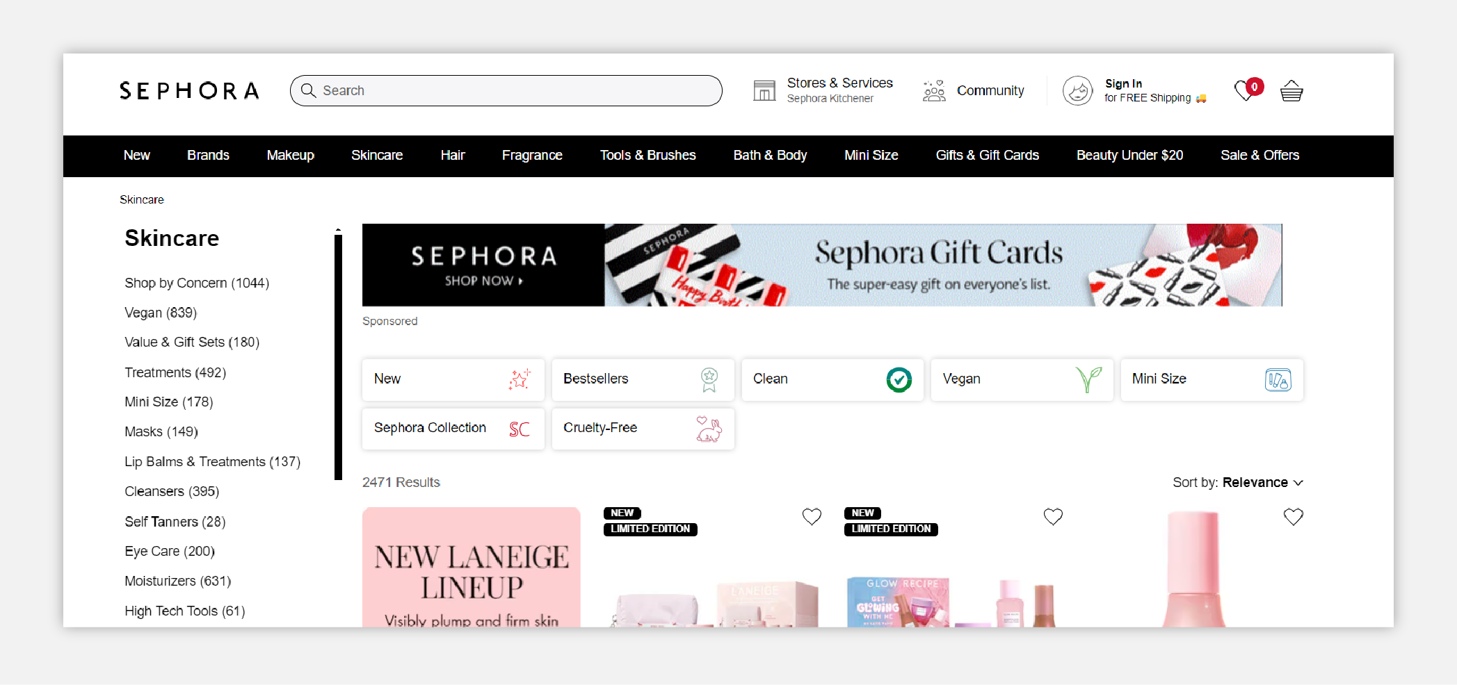
If you’ve ever done some online shopping, you’re likely familiar with sidebar navigation. This type of website navigation is incredibly popular on e-commerce sites, usually as a secondary nav, and is exactly what it sounds like; your menu is positioned to either the left or right side of the page. It is much more rare to see it used as a primary nav, at least in the past 15 years.
A vertical sidebar navigation menu is useful for categorizing your content and breaking it out a bit more. It can be used in conjunction with a top menu to further break out your content while still keeping the most important stuff on top. We’ll often see sidebars being used as sub-menus on pages where there’s a lot to sift through so users can quickly filter to what they’re looking for.
Breadcrumbs
Breadcrumb navigation is a great secondary navigation scheme to add into your website and can enhance the way that users find their way around. This navigation style is most effective on websites with a large amount of content and a clear hierarchy or grouping scheme. For example, if you have a large amount of blog content on your site, you could use breadcrumb navigation to make it easier for users to switch between categories or return to a larger overview page. It’s a visual signal to the user about how they got here so they understand their location and how your site is organized.
Best practices for website navigation
Language matters
You want to ensure your navigation is written with clarity and simplicity. It can be easy to lose sight of the fact that, while a term, phrase, or label may make sense to you, it could be confusing to your users who are less familiar with your company and your website’s content. It’s important that your navigation is built for your users and that their level of knowledge is top of mind when labeling and designing the navigation menu. Use language that they would use and keep it simple.
Avoid redundancy
The more information that’s crammed into your website navigation, the harder it will be for users to understand where they need to go. Take a look at the words and phrases in your navigation and see if there are opportunities to communicate the same message in fewer words. For example, instead of saying “Reach Us” could you get the same result by using “Contact” as the option? Getting rid of unnecessary words will make your menu cleaner, clearer, and much easier for your users to navigate.
Use icons strategically
Icons are an invaluable tool in making your website quick and easy to navigate, but they need to serve a purpose and be used strategically. While they add an exciting visual element, it’s important to keep in mind that icons aren’t decorations. When used properly, icons are a great way to communicate quickly and establish hierarchy in your web design.
A good rule of thumb before adding icons to you navigation is to ask yourself “what am I trying to accomplish and will an icon help me achieve it?” to ensure that they’re helping you reach your goals. When used incorrectly, icons can make your menu feel busy and users may become overwhelmed.
Consider accessibility and responsiveness during design
If your menu has many layers to it via drop downs or a mega menu then ensure you’re using the proper visual signals to indicate what items are expandable or clickable. Optimize buttons, clickable areas and readability through your design choices so you check the boxes of accessible website design.
Make navigating your website seamless with a thoughtful approach
No matter what kind of website you’re building, website navigation is one of the most important elements you’ll build. By carefully considering your sitemap, knowing your audience, and being thoughtful in your menu organization, you can build a website structure that boosts both usability and SEO. So take some time, plan it out, and utilize the tools available to you in a way that makes sense for your users.


