2021 web design trends you should pay attention to
By: Nicole Steinberg
February 24, 2021 | Reading Time: 2 mins
One of the toughest things about being a designer is trying to keep up with ever-changing trends while also applying your own unique perspective to your work. There’s a constant struggle of wanting to keep your designs relevant while still standing out from the crowd. It’s incredibly easy to overthink it before you even get started. Does this font come across as cool or out of touch? Does anyone still use gradients? Have flat illustrations been totally beaten into the ground?
Thankfully, there’s no shortage of great website designs to be inspired by and new trends to try out. Here are a few of the latest typographic, interactive, and illustration trends you should be paying attention to.
Throwback typography is all the rage
Just like fashion, design is cyclical and what’s old can become new and ‘hip’ again to a younger generation. What makes retro typography a unique trend for 2021 is the combo of classic and modern elements to create a new style all its own. Paring a bold typeface from the ’60s with 21st-century tech like parallax scrolling is just one example of how ‘outdated’ fonts can be made new again.
Illustrations are going 3D
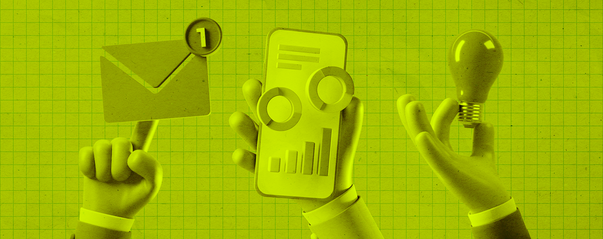
Flat illustrations will always have their place in design and are still incredibly popular. But as the internet becomes increasingly saturated, it’s only natural for companies to want their content to stand out. With plenty of easily accessible 3D modeling programs out there, what better way to stand out than to have your images essentially jump off the screen?
Digital experiences are replacing IRL events
Since we’ve all been stuck in our houses for the better part of a year, designers have had no choice but to get even more creative. Immersive digital experiences are beginning to replace IRL attractions left and right. For example, Gucci made a virtual office holiday party in which you hunt around for items that you can then buy as (expensive) gifts. Multimedia experiences and scrollytelling (no I didn’t make that word up) are just a few of the ways web designers are engaging audiences from the comfort of their homes this year.
Embrace the grid
Talk to any designer and you’ll know pretty quickly that ‘the grid’ is of the utmost importance when it comes to visual alignment. Usually the invisible backbone of a website, we’re now starting to see geometric grids and lines embraced and used as prominent design elements. Not only do they give obvious structure to a website, but they also provide an overall clean and bold aesthetic.
Draw attention to the cursor
Cursors are something we look at all the time but rarely focus on because we’ve grown used to the plain old arrow. Designers in 2021 are seeing an opportunity to take something unassuming like the cursor and turn it into an element that furthers their design. Whether the chosen cursor interacts with other elements on the page or just plays off the design, it’s safe to say we’ll be noticing them a lot more this year.
Now that you know what trends are in for 2021, hopefully, you’re inspired to get rolling on your next website project!
