Design terms for non-designers (a visual guide)
By: Nicole Steinberg
December 2, 2020 | Reading Time: 6 mins
Every profession comes with its own language, and graphic design is no exception. While talking to clients and the non-designers on the Stryve team, I’ve sometimes found myself needing to translate certain words that come up regularly. (Note that this goes both ways and marketing language frequently goes over my head).
Whether you’re reading this because you can’t decipher the email you just got from your designer, or you want to better articulate your feedback to your designer (appreciate you), here’s a bunch of terms you should familiarize yourself with.
General Design Terms
Hierarchy – The visual arrangement of design elements in a way that communicates importance. Essentially, this is how designers tell your eyes where to look. Take this blog for example – the headings are big and bold to indicate they should be read first, while the main text is smaller to show it should be looked at second.
White Space – Sometimes called negative space, this is any area of a design that remains empty. Designers use white space as a way to let elements breathe and to avoid crowding.
Contrast – The degree of difference between two elements. Contrast can be created by using any two opposing characteristics, for example, light vs. dark, thick vs. thin, circle vs. square, etc.
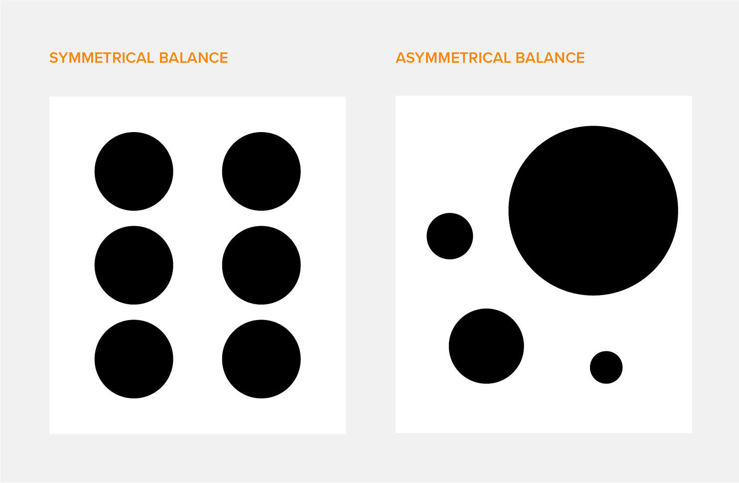
Balance – The arranging or distribution of objects to achieve equal visual weight in a design. There are 2 main types of balance:
Symmetrical Balance – Achieved by distributing objects the same way on either side of a design. Essentially a mirror image.
Asymmetrical Balance – Distributing objects differently on either side of a design, while still appearing balanced in terms of visual weight.
 Alignment – The lining up of text or other design elements to achieve balance. The 4 main types of alignment are right, left, centred and justified.
Opacity – The degree of transparency or opaqueness of an object. The lower the opacity on a scale of 0-100%, the more see-through it is.
Typography
Before we jump into this section, you might be wondering what the word ‘typography’ even refers to. Typography is the art of arranging text in a way that is legible, clear, and visually appealing to the viewer. While you might not be able to notice it immediately, there’s actually a lot more thought that goes into typography than just picking a nice typeface and calling it a day.
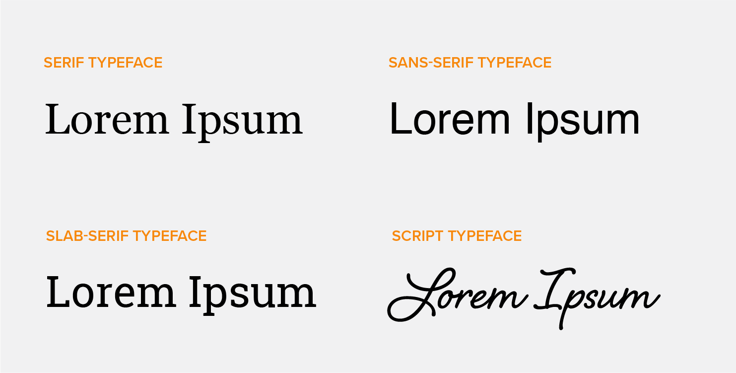
Serif Typeface – A serif is a small vertical or horizontal stroke at the end of a letter. Any typeface that includes these is considered a serif typeface. Think Times New Roman or Georgia.
Sans-Serif Typeface – Now that you know what a serif is, it’s easy to infer that ‘sans serif’ refers to a font without serifs. This can be any typeface without strokes extending from it. Examples include Helvetica, Avenir and even Comic Sans (but maybe don’t use that one…).
Slab-Serif Typeface – Any typeface with thick, blocky serifs. Roboto Slab, used for the main title of this blog, is an example.
Script Typeface – Any typeface that mimics cursive handwriting and uses flowing strokes.
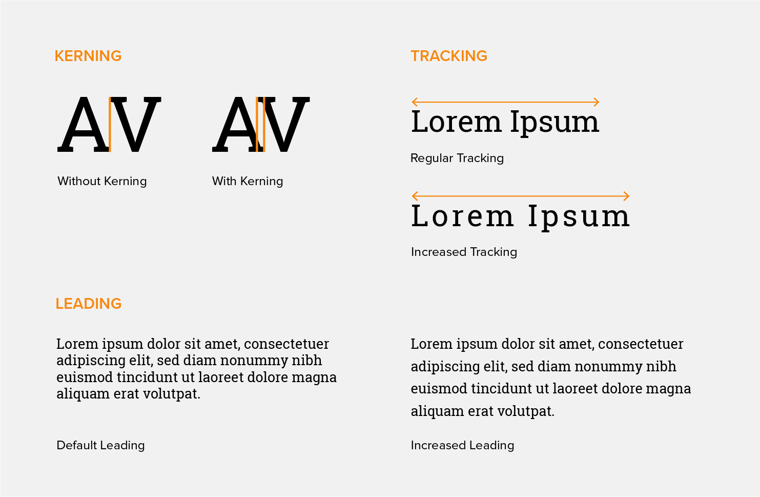
Kerning – The adjustment of space between two letters. Sometimes typefaces don’t account for certain letters looking strange next to each other. This means that space between the letters may need to be increased or decreased to make the word more legible or visually balanced.
Tracking – Similar to kerning, tracking is the adjustment of space between letters, but for larger amounts of copy. Rather than changing the distance between individual letters, tracking equally adjusts the space between all characters in a line or block of text.
Leading – Pronounced “led ding”, this is the space between lines of text. A designer may adjust the distance between lines of copy for better legibility or to avoid overlap. Remember having to format all of your high school essays to be 12pt, Times New Roman, double spaced? You were putting leading to use without even realizing!
Lorem Ipsum – Dummy copy used to fill space when the copy going into a design hasn’t been determined yet. It acts as a placeholder to demonstrate how the design will look once content has been added.
Branding & Logos
This is probably the area of design language most people get tripped up with, myself included on occasion. While you might sometimes hear words like ‘brand’ or ‘icon’ being used interchangeably, they actually have specific meanings. It can all get a little confusing so let’s walk through it together.
Brand – A brand actually isn’t something visual, but is instead the emotion or concept behind a company or product. Company values, company culture, the content they promote — these all add up to form the overall brand and the impression it leaves on the audience.
Brand Identity – This is the overarching visual identity of a brand. Taking the concept behind the brand and visualizing it with items like the logo, business card, letterhead, uniforms, website, etc.
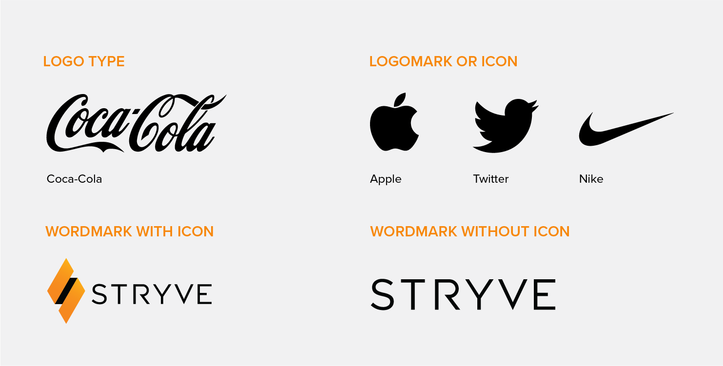
Logo – Any mark used to identify a brand. It can consist of any of the following, or a combination:
Logotype – A type of logo in which the name of the company is the sole identifying mark and it is visually stylized. Brands like Coca-Cola and Google use logotypes.
Logomark or Icon – This refers to a symbol that can be used to identify a brand without the addition of a name. Apple is a great example of this.
Wordmark – This refers only to the text that goes alongside a brandmark or icon. It can also refer to a logo that only uses type. In our case, it would be our Stryve logo without the diamond.
Colour
Colour is another area of design that can be pretty confusing if you aren’t familiar with the terms.
Palette – The selected series of colours used for a design. Coolors is a great resource (and my personal fave) for creating a colour palette.
RGB – RGB is a colour model used for on-screen design and stands for Red, Green and Blue. It is additive, meaning it starts with black and reaches white by adding more colour.
CMYK – CMYK is the colour model used for printing purposes and stands for Cyan, Magenta, Yellow and Key (black). It is subtractive, meaning that it starts with white and gets darker as colour is added.
Pantone – This is a standardized colour system used for printing that identifies colours by specific codes. It’s the best way to ensure colour consistency across a brand when it comes to print vs. digital materials.
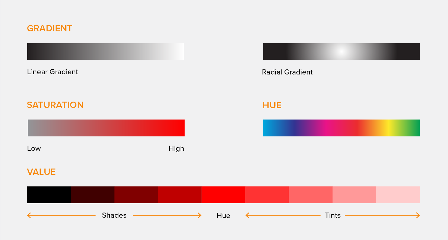
Gradient – The gradual blending of one colour to another. Gradients can be either linear in which the colours sit on opposite ends of a frame or radial in which one colour sits in the middle and the other sits on the outside edge of an object.
Saturation – The vibrancy or dullness of a colour. A highly saturated image will be rich in colour, while an image with low saturation might appear faded or pale.
Hue – The name given to a pure colour such as yellow or red.
Value – This refers to the lightness or darkness of a hue. It can be changed by adding black or white. Light coloured hues are called tints, while dark coloured hues are called shades.
While I could probably write a whole whack of blogs on typography terms alone, hopefully, this distilled list of key design terms helps you out. Keep in mind that design is an ever-changing industry and some of these terms will come and go or even take on new meanings as time passes. When working with a designer, don’t be afraid to ask questions.
