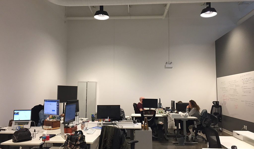
We moved into Catalyst137 almost a year ago. Since then, our office aesthetic and feng shui has been a work in progress. Our goal was to make an environment that was cool, inviting, and most importantly, inspiring. With our office now full of furniture and decoration, it was time to turn our attention to the blank 70-foot tall walls. These walls surround part of our office we call “the pit”, an open space where Stryvers desks are arranged in pinwheel configurations for optimal collaboration and TV show gossip! It’s the first area you see when you walk by, so it needed to be impactful, inspiring, and memorable.
We needed a mural.
The concept
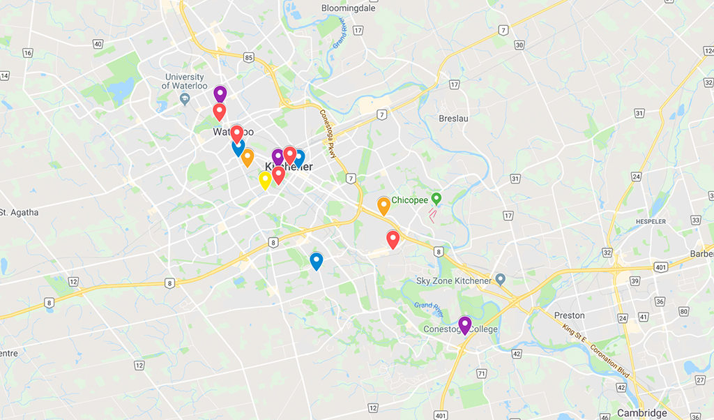
Knowing exactly where to start when designing a large mural is a little overwhelming. Thankfully, I wasn’t alone in the process of coming up with the overall concept. With my team, we came up with the idea to create an abstract map of Kitchener-Waterloo, marking specific locations important to Stryve. Categorized into groups like food (of course), landmarks, and our new and old offices, we wanted to represent the places that have contributed to our unique culture and the Stryve story. We also pride ourselves on our ability to be clever and subtle, so we loved the idea of having a mural with a hidden meaning.
The work
Before I started designing, I looked for inspiration and examples of different mural styles that reflected our office’s mid-century modern design. You could say our office feels like the Sterling Cooper agency from Mad Men, so our mural needed to live up to Don Draper‘s standards. With the inspiration and examples, I asked the team for feedback about what they liked and disliked. Art and design are subjective and “abstract” can mean different things to different people, so feedback was important in communicating the vision. The consensus was our mural needed to be flat, geometric and colourful.
The biggest challenge I faced with the design was taking into account the location and trying to visualize it in the space. The mural needed to mould and adapt to its medium and once it was painted it couldn’t be moved. The corner intersecting the two walls and the drop ceilings needed to be taken into consideration along with the rest of the office aesthetics. With so many things to keep in mind, I did some simple math and mapped out where the corner and ceilings would fall on my flat canvas. This made it easier for me to explore and play with different iterations of the design. Once I had a few strong concepts, I photoshopped them into the space and presented mockups to the team.
The result
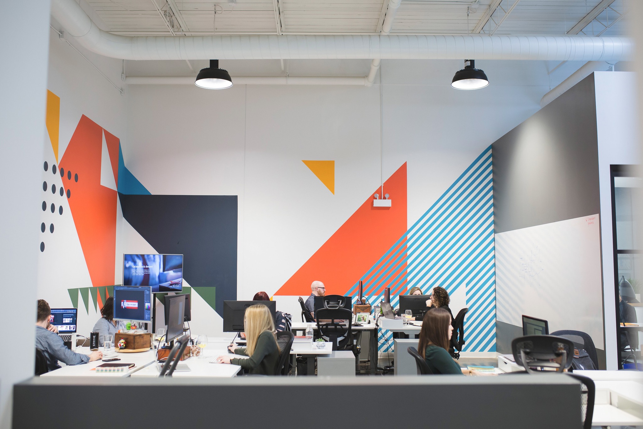
With the final design, we branched out from our branded orange, grey, and black to implement a more complex palette that reflects the office aesthetic and the colourful personalities that work in it. Taking inspiration from mid-century colour palettes, I chose a deep orange and navy base, then added a bright blue, yellow, and olive green to break up the complementary colours. Adding brighter colours gave the piece a balance between mid-century and modern design. They also acted as differentiators between our mural’s locations, with each shape representing a point on the map.

For example, orange is for Stryve’s new and old offices, while blue and green are for landmarks, and yellow is for food. We love that the clean lines and angles create triangles echoing the features of our brands diamond icon. Additionally, the use of white space, pattern, and layering created visual interest and variety to help the design flow through the space.
With help from Robin + Elaine, we were able to have this piece painted and finished for the new year. We’re so excited to kick off 2019 with a fresh new look for our clients and guests! If you’re ever in the area be sure to stop by and check it out!
