Stryve Digital Marketing wasn’t always what we called ourselves. Before November 2014, we were known as “Stryve Group” and we had a vastly different look to our brand.
The Beginnings
Back in 2008 when the company was just forming, our founding partners sat down to begin the process of brainstorming a name. After hours and hours of brainstorming, the duo looked around the room for inspiration, reached for a pack of Stride gum and thought, “What about the name Strive? With a Y.” And in that flash of brilliance, Stryve Group was christened.

Because of our ever-enduring need to make things happen, our Managing Partner whipped up this beauty of a logo within a day or two and got to business. It had worked for the time and place where the business was at, but as our team grew bigger we eventually outgrew our branding.
It really hit us when the same Managing Partner who did the original branding design saw the Stryve Group logo projected upon the wall at an event and turned to the team and said, “That just isn’t us anymore.” The business had evolved quite a bit since 2008, and our branding needed to reflect our forward-thinking approach towards digital marketing.
The Behind-the-Scenes Thinking
The big problem we wanted to fix was that our focus on digital marketing wasn’t apparent through the company name or the branding. It just wasn’t there. A company name should be simple and straightforward, so we made the decision to drop the “Group” as it served no real purpose of explaining our business anymore. “Digital Marketing” took its place.
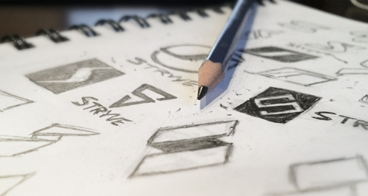
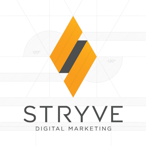
We wanted our new brand to have a modern tech feel, create impact, and have a digital presence. Creating sketch after sketch and refining some key ideas, we wanted our logo to have a sense of movement to represent our constant pursuit of knowledge and growth. Narrowing down on a flat “folded style” concept, a few more iterations were drawn out and our S diamond was born.
We also realized that blue wasn’t reflecting our brand or personality. It wasn’t enough to just choose a different colour because we had a new logo, there had to be purpose and meaning behind it. We wanted to transition to a colour that communicated our creative environment and progressive thinking here at Stryve.
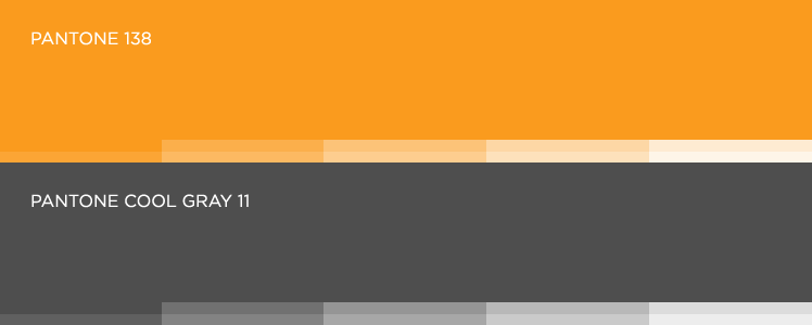
The choice was clear right away. Orange expressed exactly what Stryve’s culture is all about: innovation, creativity, energy, passion and most importantly fun. We’re also a little obsessed with food and as a funny coincidence, studies have shown that the colour orange creates the effect of an increased appetite. As a secondary colour, we chose a cool grey to give a nice contrast to our orange but also keep with a modern tech feel.
The next phase was our typography. Keeping the digital vibe flowing through the logo, we used a sleek and modern sans-serif font in an uppercase style. Using hard lines and precise measurements, the diamond was fine-tuned and digitalized for the world to see. As you can see below we are very detail-oriented!
Launching the New Stryve
With our vision for the business distilled into a logo and clear branding guidelines set, it was time to apply the new look to every single touchpoint we had with the world. As a digital marketing firm, our website was (and still is) the most important touchpoint we have and so it was the highest priority on the list.
The most interesting items on the list were the business cards. Business cards are very traditional, non-digital touchpoints. The new Stryve is very modern and digital. Our design had to incorporate visual elements that brought to mind the online world, and the printing had to be premium. We found the best option for printing business cards was the beautiful, thick, semi-gloss stock from MOO.
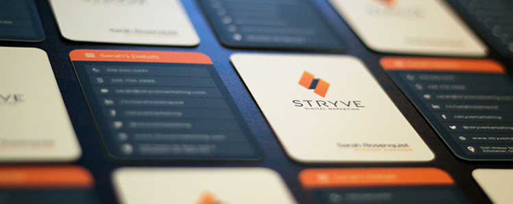
With our refreshed touchpoints ready to go, we launched the new brand on November 7, 2014. We sent out emails and social media posts to reinforce our digital focus, but we also did some new branding in real life… on Sourov’s head.
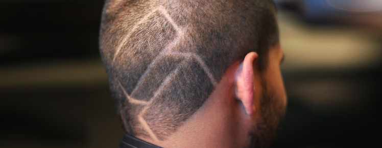
Sourov’s hair tattoo eventually grew out, just like we grew out of the “Group” and the old branding. But the new Stryve is certainly here to stay and it would not have been possible without our amazing network of helpers who lended their thoughts and opinions throughout the whole process. Thank you so very much to our Weber Street office mates, our friends, our peers, and our families for all of your help.
