Give your SlideShare big deck energy with these design tips
By: Brent Morrison
July 28, 2021 | Reading Time: 6 mins
If you’re only using slide decks for presentations and pitches, you’re missing out. Engaging and easily shareable, slide decks, Powerpoints, SlideShares—whatever you want to call them—are perfect for sharing your thoughts and ideas on social media, in blogs, and elsewhere online. In fact, research shows that SlideShare presentations, specifically, receive up to 500% more traffic from business owners than Twitter, LinkedIn, Facebook, and Youtube.
Instead of reading through long articles, Slide decks make it easy to digest information almost immediately. That is when they’re designed well. Slide presentations have a longstanding relationship with poor design, with 45% of presenters struggling to get creative with layouts. Considering the eyesores circulating online, a well-designed slide deck can really set you and your content apart.
With that, here are our tips for designing effective slide decks:
Tell a story
Before thinking about what your presentation should look like, it’s best to plan out your content first. Beyond messaging, consider the story you want to tell. Like a novel, your presentation should take your audience on a journey from start to finish. In fact, research shows that 55% of people say a story is what holds their focus.
For example, you’ve probably experienced a snooze fest of a presentation about rules in the workplace. These sorts of corporate decks are uninspired, dry, and fail to keep your attention, but what if you added a playful theme or narrative? What if you incorporated pop culture? We do this with many of our blogs, as this sort of approach hooks the audience and provides better engagement with the otherwise bland subject matter.
Create a template
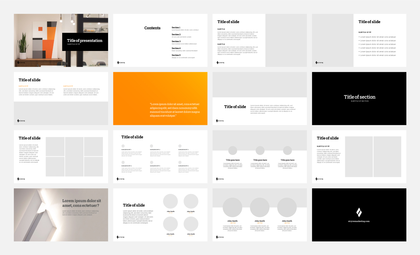
You don’t want to have to start from scratch every time you make a slide deck, so do yourself a favour by building a reusable template. By doing so, you can ensure that all slide decks adhere to brand guidelines regardless of who in your organization is building them. In addition to your typical title slide and content slides, you’ll want complimentary slides to help break things up—similar to how single-sentence paragraphs are used to break up massive blocks of text to make reading less intimidating. Consider designing a full image template or one that uses a solid background colour with a title.
While a template keeps you aligned with brand guidelines, don’t let it discourage you from making custom slides when necessary. When you do, just be sure to design something that is consistent with the look and feel of your template.
Less is more
For slide decks, 0ne of the most common mistakes is trying to say too much in a single presentation or on a single slide. By keeping your content short and sweet with quick points, you make the information easier to follow and retain. According to SlideShare, the most successful decks contain an average of 14.4 slides and are concise with content.
But what if you’re having a hard time cutting things down? Consider breaking your content up into multiple slides. As a rule of thumb, try to limit yourself to one idea per slide. If this extends the slide count, consider whether you’re trying to cram too many topics into a single presentation.
The “less is more” approach applies to animation, too. While you may be tempted to use all the star wipes and spiral transitions PowerPoint has to offer, this designer sees the majority of those options as distracting and tacky. A simple fade-in or fade-out is more than enough to spice up your presentation without distracting people from the content itself.
Typography Hierarchy
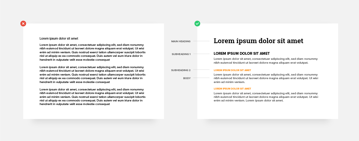
When text is all formatted the same, it’s difficult to identify what’s important and what isn’t. Hierarchy solves this problem, using styling to achieve better organization and flow. Most of your slide templates should include three main hierarchy levels: A heading, a subheading (you may have multiple, based on the content), and body copy. You can create a typographic hierarchy through font sizing, weight, colour, and spacing, all of which will improve scannability, understanding, and the overall slideshow experience.
Maximum 2-3 fonts
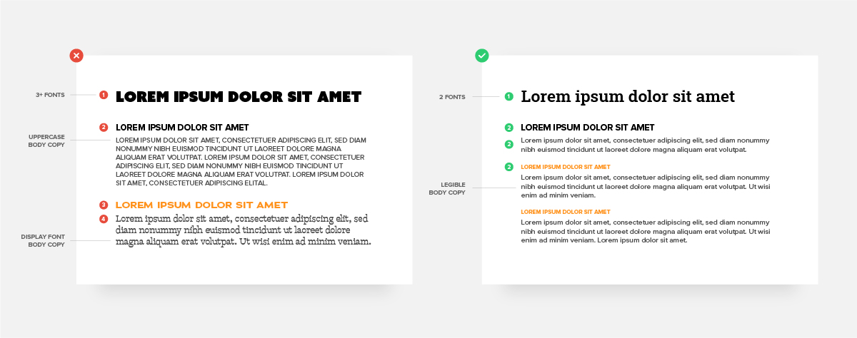
A good rule of thumb for design is to avoid using more than two or three fonts. Typically, your main font will be used for headings and a secondary font will be used for subheadings and body copy. If you use one font for all three, consider using different weights for variety. For legibility, avoid using uppercase and display fonts for body copy. It’s best to use those for headlines or short lines of text.
Alignment and spacing
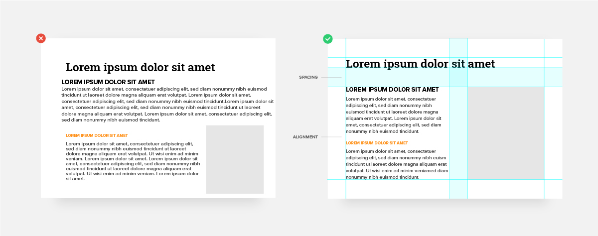
Even if you’re not creatively inclined, paying attention to a few key details can make a world of difference with your slide decks. Take a few moments to go through your presentation and make sure all your headings, text, and visual elements are aligned and spaced well with each other. If headings are shifting around on each slide it can be visually disruptive. Another important factor is space. Edit down your content to give text, images, and other elements ample breathing room.
Imagery and graphics
Presentations with visual aids are 43% more persuasive than the same presentations without visuals. But while photography and illustrations can add that much-needed flair, sourcing the right imagery can be difficult. Avoid using generic stock photos, images with watermarks, and anything that is low resolution. When placing photos, have anything with a sense of direction (like a car driving, or a person looking into the distance) facing towards your content. This will help direct the eye and give balance to the slide. When using other visual elements like icons or graphs, be sure the styling aligns with the aesthetic you’ve established already.
Cropping
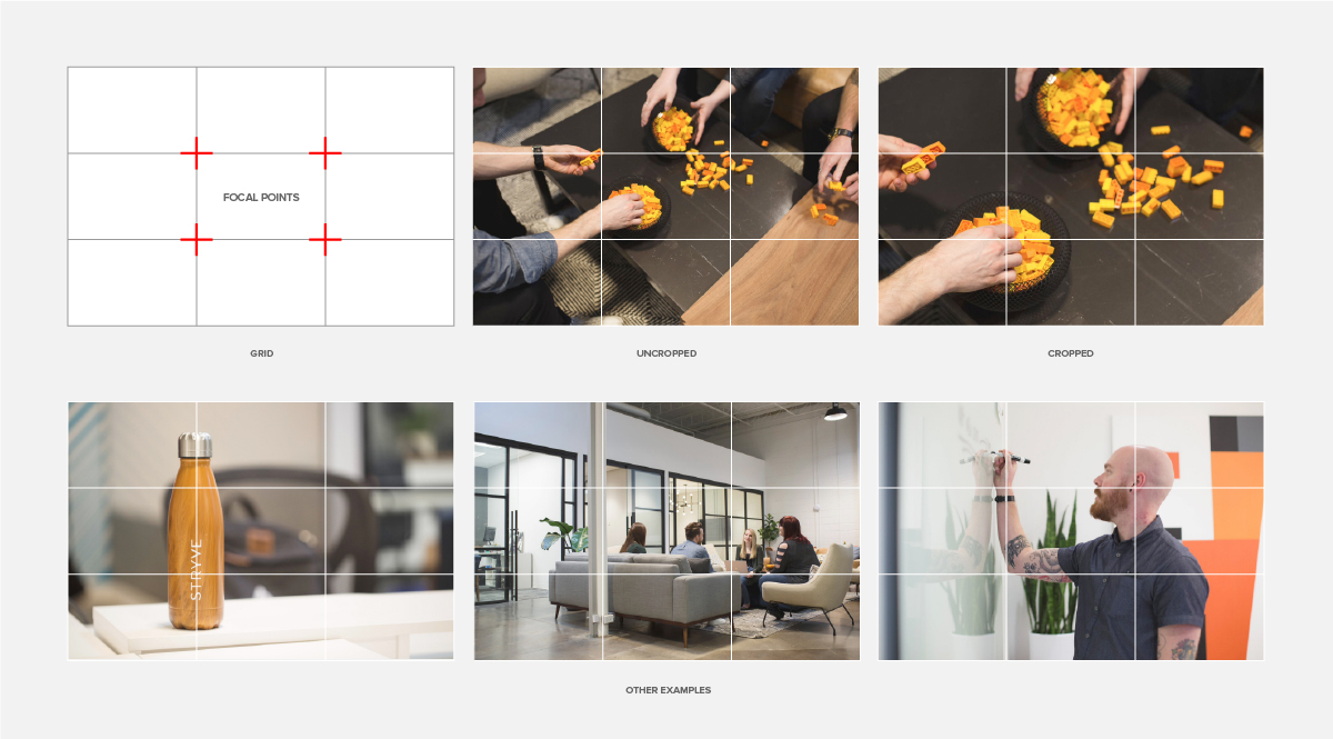
Cropping is one of the most basic ways to improve the look of a photo. Using the “rule of thirds” technique, you can easily take average-looking photos and make them more pleasing to the eye. What is the rule of thirds? It’s a grid of nine equal squares used to break an image down into thirds (horizontally and vertically). By placing key elements along the gridlines or focal points, you’ll create better balance within your photo. At the same time, images using symmetry can often have a more dramatic effect with the subject being centered.
Conclusion
Avoid ending your presentation abruptly by easing out with a conclusion. In the spirit of being concise, consider a list of takeaways that distill the presentation into a series of points. If you want to leave your audience inspired, finish with a grand statement or cryptic question.
If you want your audience to take action, point them in the right direction with a CTA. Visit our website to learn more, follow us on Facebook to get involved—these are calls to action that outline clear next steps.
If you don’t have a call to action, I recommend at least using your company logo on the final slide. This will provide a visual cue that the presentation has finished and your brand will be the final impression.
Bringing that big deck energy
Whether it’s a sales pitch or a blog being repurposed as a slide deck, applying these tips will level up the look of your presentation to leave a greater impression. We know you don’t enjoy using PowerPoint, and establishing a strong presentation template is important for any brand. So, click the button below and let Stryve take this one off your plate.


