Responsive website design best practices for the best user experience
By: Brent Morrison
November 17, 2022 | Reading Time: 7 mins
We’ve said it before and we’ll say it again—responsive design is important. With 50% of B2B search queries now being made on mobile devices, it’s clear that having a phone-friendly website is more important than ever. Data shows that mobile drives or influences an average of over 40% of revenue in leading B2B organizations, with better SEO being one of many contributing factors. If your site isn’t optimized for mobile users, that’s a large piece of the pie you could be missing out on.

But responsive design is more than just shifting around text and images to fit on a smaller screen. It’s about creating a positive user experience across multiple devices. Making responsive design a priority comes with increased consumer trust, reduced bounce rates, and improved search rankings. Not only that, but 57% of internet users say they won’t recommend a business with a poorly designed mobile site. Whether you’re creating a new website or updating an existing one, implementing these practices will help your website thrive moving forward and give you an edge over competitors who fail to adapt.
Responsive mobile vs mobile-first
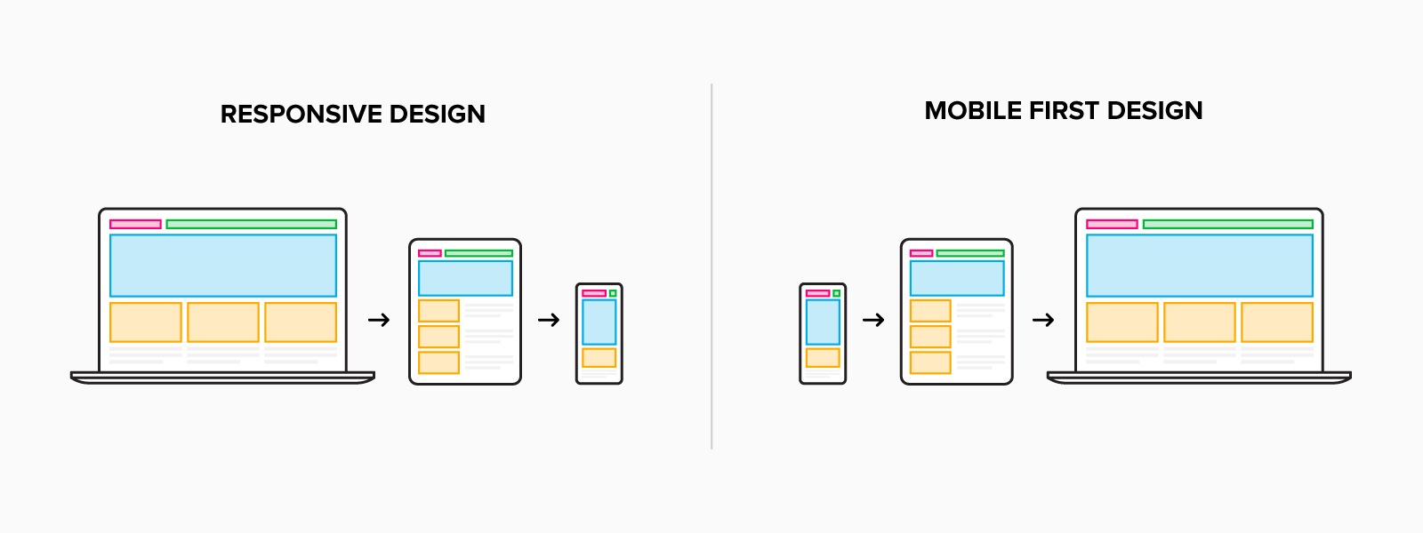
First, let’s talk about responsive mobile versus a mobile-first approach. Many websites are built for desktop users first, and then use code to adapt the site responsively for mobile devices. Whereas a mobile-first approach is a design strategy focusing on the mobile experience. Instead of cramming a desktop experience into a smaller space, today’s websites need to focus on what’s important for a great mobile experience.
Why?
Google has made it clear that SEO rankings are heavily tied to mobile optimization. If you want to rank well in search results, you’re going to need to play by their rules. At the same time, there’s a new generation of B2B buyers. They expect the same digital experiences they encounter as consumers. In fact, 90% of mobile users who reach B2B businesses online state that their user experience affects their decision to purchase. If you want to stay competitive, optimizing your website for mobile is critical for future growth.
Compress images
Loading speeds are everything. Not only do they have an impact on your search rankings, but research shows that 53% of visits are abandoned if a mobile site takes longer than 3 seconds to load. In fact, B2B companies lose $2.6 billion per year because of slow website loading speed. As displays continue to become larger and have higher resolutions, images must be optimized to look their best. The downside is that large images impact loading times. Photos can be scaled down responsively, but all that unnecessary pixel data makes for a slow-loading mobile experience. With data showing that 39% of people will stop engaging with a website if images won’t load or take too long to load, keeping image files small is a must.
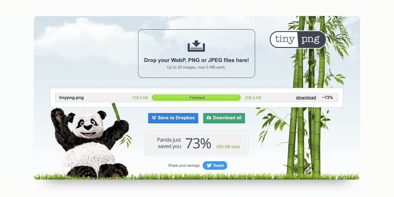
Consider uploading multiple-sized versions of your imagery for different screen sizes. This will help improve loading times by keeping file size down while also ensuring that your images display properly on all devices. An excellent tool for significantly reducing image file sizes is Tinypng.
Use SVGs whenever possible
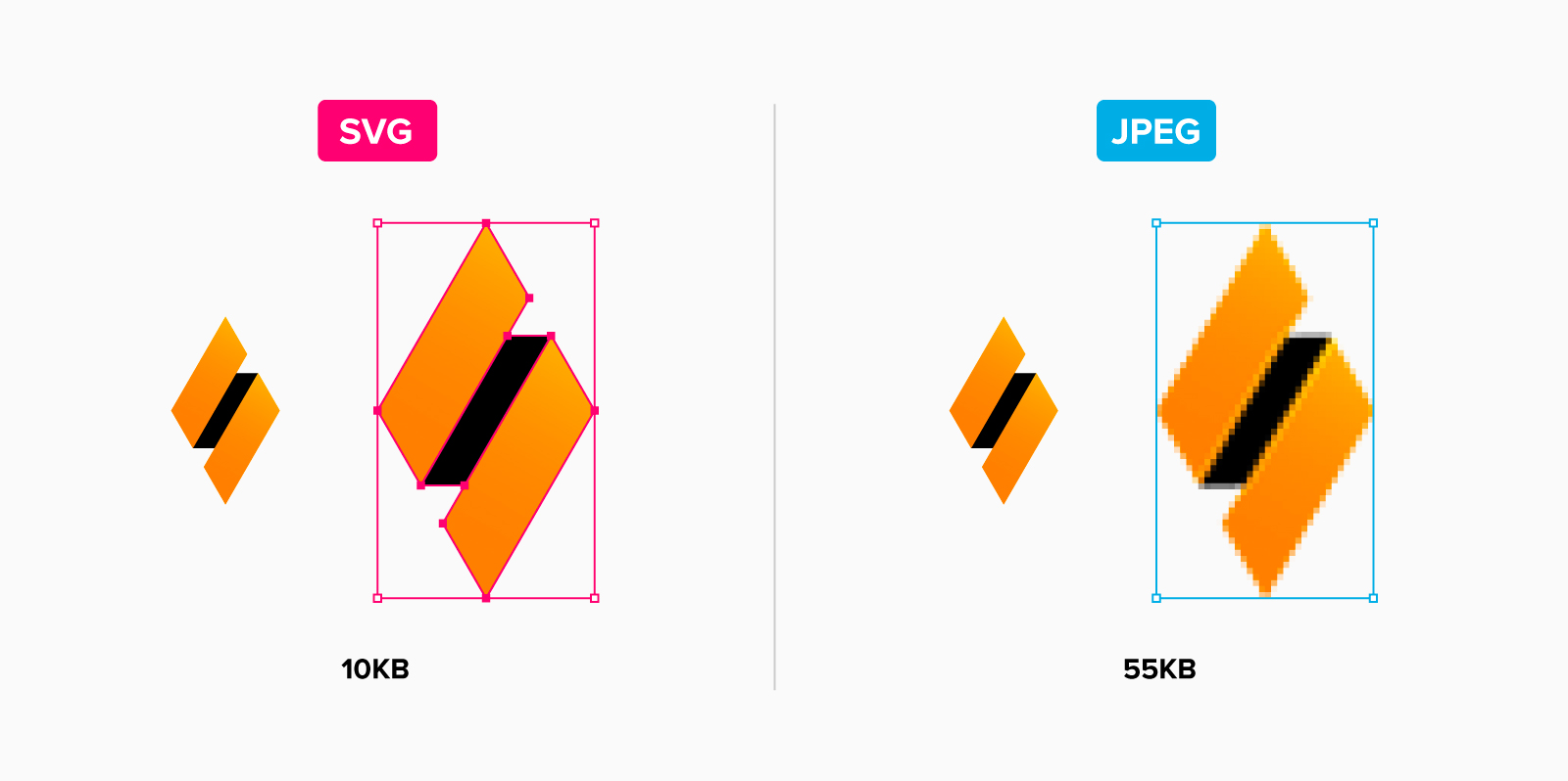
SVG or Scalable Vector Graphics is a resolution-independent file format that plays an important role in websites. Because SVGs are vector-based, they can be scaled at any size without losing quality compared to raster file types (ie. jpeg, png, gif). SVGs are also generally smaller in file size compared to raster images, helping your website stay lightweight and quick to load. This format is great for things like icons, illustrations, or logos on your website.
Scale text sizes
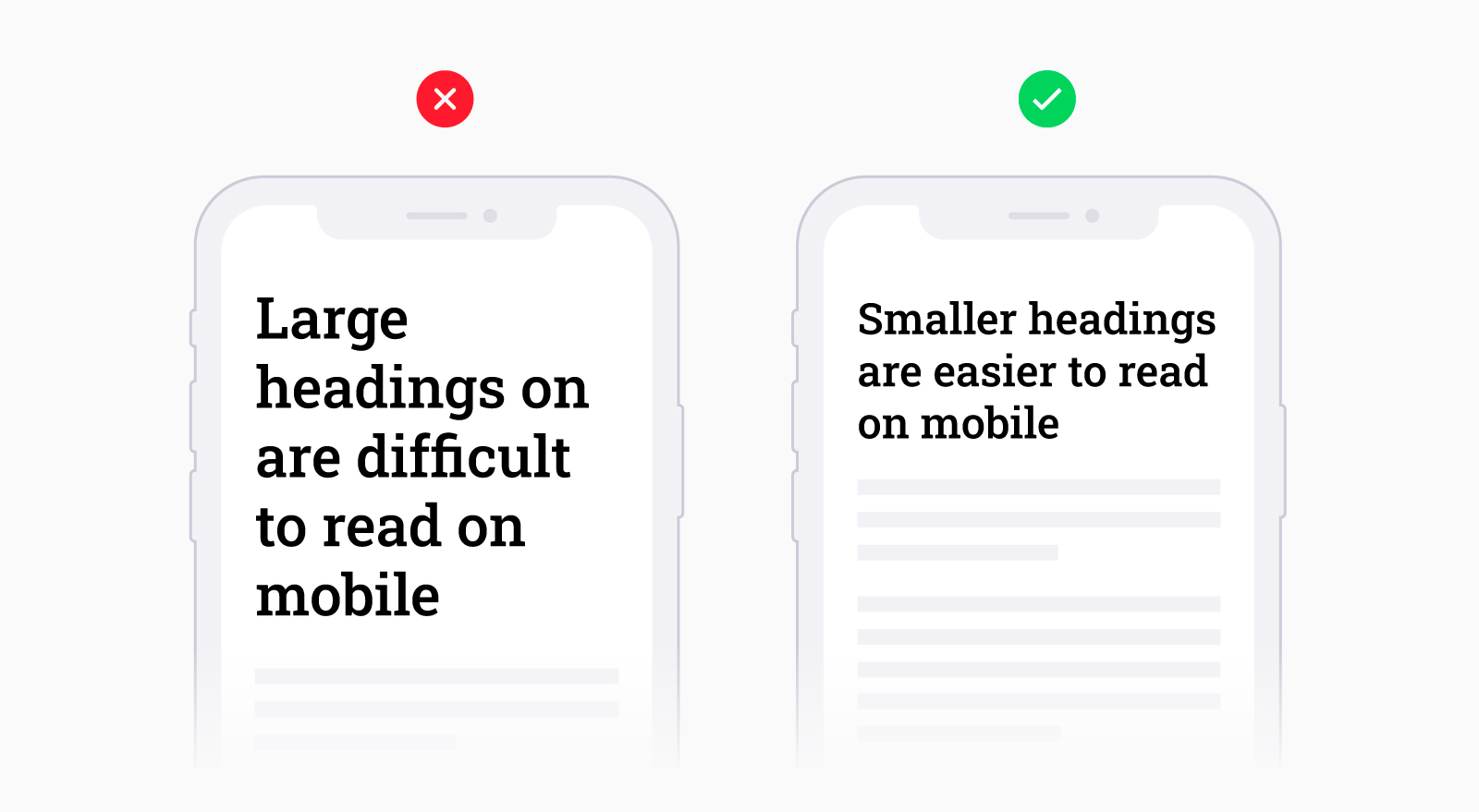
It’s become very popular to use large headings for websites. They create contrast and quickly grab the user’s attention. But when a site is scaled down responsively for mobile, those large headings are likely to be stacked on 4-5 lines making for a messy and difficult reading experience. When optimizing headings for mobile, choose a size that both contrasts with your paragraph text and will fit on a maximum of 2-3 lines.
In some instances, paragraph text may be difficult to read on smaller screens. To ensure legibility, it’s recommended to keep paragraph text to a minimum of 16px. Depending on the thickness and font style, this number may differ slightly so it’s always best to test on a variety of mobile screens for best results.
Condense mobile content
When thinking about your site on smaller screens, consider if all the information is relevant for a mobile experience. Do you need all of those pages? Is there content you can condense or remove? With significantly less screen real estate it can be challenging to arrange content that is both engaging and easy on the eyes. With 38% of people ending engagement with a site if the content or layout is unattractive, focusing on key takeaways and removing unnecessary clutter will provide users with a more streamlined mobile experience.
It’s worth noting that some desktop functionality doesn’t always work for mobile experiences. For example, an image with interactive hot spots will have limitations on mobile without the ability to hover with a cursor. In these cases, it’s often better to change how the information is displayed or remove the content for mobile altogether.
Optimize buttons, clickable areas, and forms
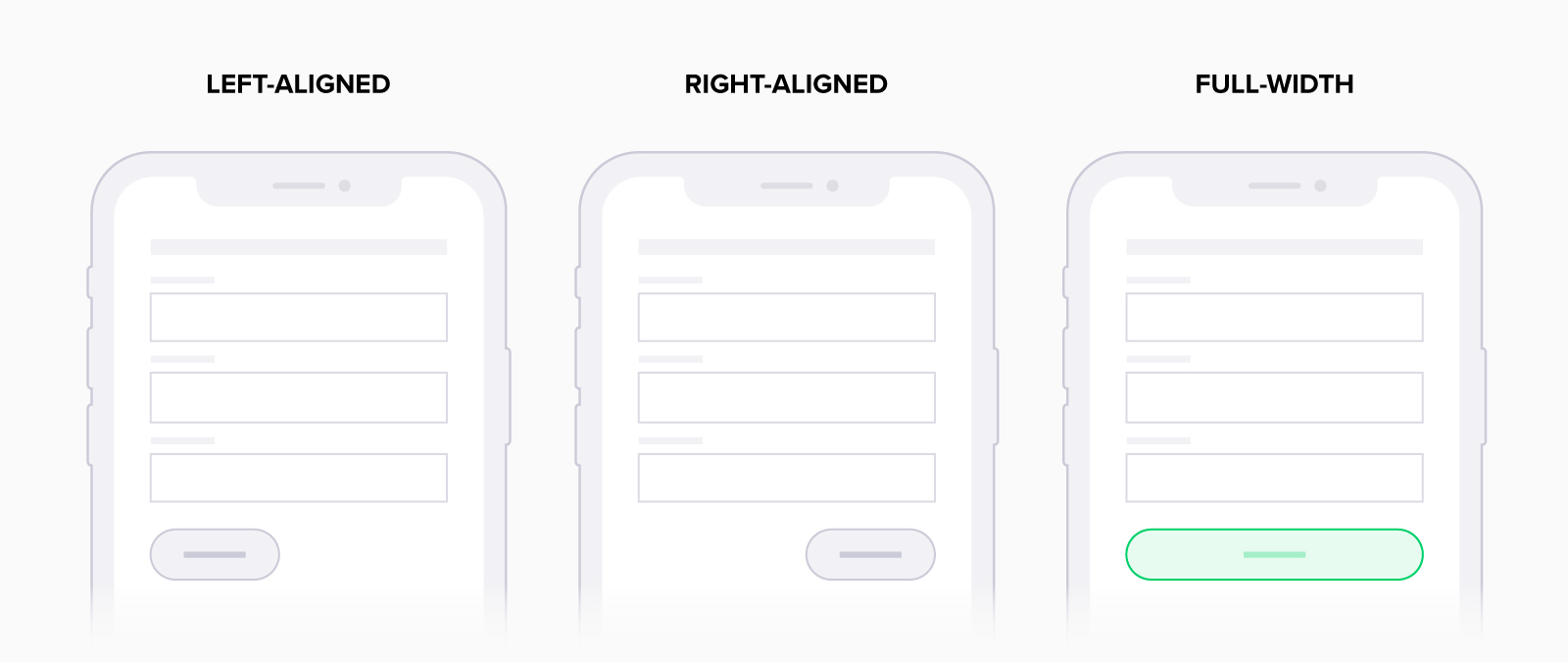
Interactive elements like buttons and forms can prove problematic on smaller screens. For example, a small button on a mobile screen can be difficult to tap, especially if there is more than one in close proximity to the other. A good rule of thumb for buttons is to have a minimum size of 38x38px. Also, consider button placement. Some larger mobile devices can be challenging for users when they have to reach to tap a button. To make buttons easier to access, consider having them stretch across the screen so they’re easy to interact with regardless of hand position.
Form submissions are the bread and butter for B2B company leads, so it’s important to reduce any potential friction for users filling them out on mobile. Companies often use too many form fields, resulting in higher abandonment. In fact, Smashing Magazine found that the second highest reason for form abandonment is due to length. Whether designing for desktop or mobile, HubSpot typically recommends a length of five form fields to get the best results.
Filling out forms on mobile can be much more inconvenient than on desktop. A great tactic to help is to enable auto-correct and autocomplete so that filling out forms is much easier for users. For more tips on improving your forms, check out my blog on form best practices.
Make your logo responsive
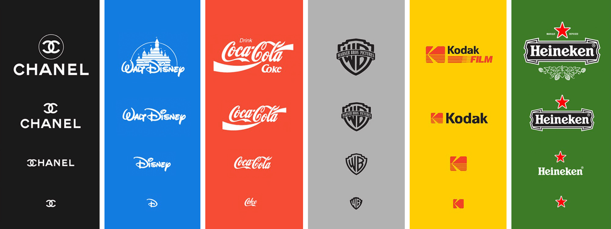
What do we mean by a responsive logo? A responsive logo has multiple variations that change in size, complexity or even colour for flexibility of use. For example, if you look below you can see multiple examples of how top companies start from their primary logo and then remove details as they scale down. Having multiple versions of your logo allows your brand to be displayed in as many places as possible and still be recognizable.
Invest in design and test often
First impressions of websites are 94% design-related. When it comes to the perceived integrity of your company and consumer trust, having a well-designed site is a no-brainer. A study showed that 75% of consumers admitted to making judgments on a company’s credibility based on its website design. Many things can impact the perceived quality of a well-designed site. Everything from colour, imagery, and accessibility, to proper organization of your content and loading times. Your website acts as a virtual storefront for customers. Think about it—if a physical storefront looked outdated and run-down, you probably wouldn’t be very confident in its service or product quality.
There is an endless number of screen sizes and devices available for users, and that will only continue to grow. So how do you optimize your site for maximum compatibility? We recommend focusing your optimization on the most common screen sizes and then refining for other formats. By focusing on those specific sizes, you’ll have most of your bases covered. It’s also important to test on multiple browsers to ensure a positive experience across all platforms.
A website is never truly finished, even weeks or months after launch day. It is a powerful marketing tool that constantly needs to be refined and tweaked to keep up with things like platform upgrades, Google updates, and security. Trying to implement these practices while staying on top of endless updates can feel like a huge undertaking—but it doesn’t have to be.


