Why you need to make responsive design a priority
By: Carly McCrory
February 11, 2022 | Reading Time: 5 mins
Internet access is always at our fingertips. Gone are the days of yelling at family members to get off the phone so you can go online using your chunky, dial-up modem. Now, we access the internet through a wide range of personal devices, accessories, and home appliances.
Like it or not, Apple got it right with this 2017 commercial, and the thought of everyone using a single basic computer is history. The majority of web traffic has come from mobile devices since the mid-twenty-teens. Throw in the fact that more and more people are viewing websites on their TVs, we’ve come to a point where responsive design is a necessity. Read on to learn why.

The history of responsive design
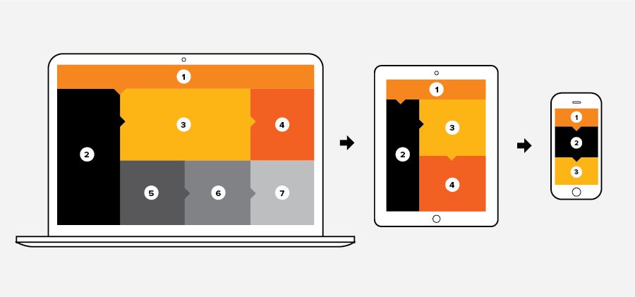
As its name implies, responsive design is the way designers layout elements to seamlessly adapt to various display sizes and orientations. In the early days of the internet, websites were designed to fit one specific screen size. If the dimensions weren’t a perfect match, users had to deal with unwanted scrollbars, cut-off content, and poor use of space. As phones developed and screens got larger, mobile browsing took off and everyone had to respond. Google factored mobile experience into its search rankings and designers began making mobile-specific versions of websites to go along with their desktop counterparts.
As phone screens grew into tablets, desktops shrunk into laptops, and a neverending torrent of different-sized phones was released, the need emerged for designers to evolve their desktop and mobile-specific solutions. Responsive design is that evolution—applying to not only desktop, mobile, and tablet, but all the sizes in between. Moving forward, that list may need to include watches, Smart TVs, and even home appliances. Ultimately, the goal of responsive design is to ensure a consistently good user experience no matter the device being used to access a website.
We’ll talk about the design benefits in another post. For now, here are the benefits of having a responsive website.
Here’s why you need a responsive website:
Be where your audience is
In the early stages of responsive design, the mobile experience was thought of as secondary to the desktop experience. Today, with well over half of the world’s web traffic coming from mobile devices, that’s simply the wrong approach. Mobile commerce, or “m-commerce,” is driving a ton of this traffic, with purchases made on mobile devices accounting for over 70% of all e-commerce transactions. A lot of these mobile purchases and site interactions are being driven by social media use, which is also at an all-time high. Simply put, users are spending more time on their phones than on their computers, so brands need to account for that in their digital experiences.
Consumers won’t put up with a poor web experience
Having a good user experience is essential to success in digital marketing. With customers interacting with brands on a variety of different devices each day, it can be jarring to go from a fluid webpage on a desktop, to a clunky, disorganized site on a tablet or cellphone. Customers are too finicky and easily frustrated to put up with a shoddy web experience. For the sake of turning web users into actual leads, brands need to make their lives as easy as possible by practicing good User Interface/User Experience design—which means a consistently easy-to-use experience across all devices.
It improves your SEO
Having your website rank as high as possible on search engines is a great way to reach more customers. Google has a long list of website factors that impact its ranking of search results. Keywords indicate the relevance of a page based on the search query and shed light on the quality of content. Website usability factors in, too, with Google valuing “whether the site appears correctly in different browsers; whether it is designed for all device types and sizes, including desktops, tablets, and smartphones; and whether the page loading times work well for users with slow Internet connections.” So if it seems like building a responsive website is a lot of work, think about what’s at stake. Failure to deploy a responsive site will torpedo your organic traffic and blow up your lead generation. No bueno!
Save money on development costs
Sure, maybe you could overcome a dried-up organic channel by launching more paid ads—but that costs money. What else costs money—and time—is the process of making updates to multiple sites for multiple devices. While building a responsive website is more work and greater investment in the beginning, it’s just that—an investment. Running lean with a single website will allow you to be more efficient with updates to content, bug fixes, and all the other things involved with managing a website. With privacy policies, SEO algorithms, and other web accoutrements–not to mention the design of the devices we use—always in flux, it’s important to consider the time it takes to respond to these updates. Hello, futureproofing, and hello lower WebOps and development costs.
How to achieve responsive design
This responsive design thing probably sounds pretty great now, right? To build a responsive site, it’s going to be a team effort between your development and your design team.
Whether you’re working with an in-house development team or an awesome agency partner like Simplistics, make sure they’re well-versed in the technical aspects of responsive design. They’ll need to know how to build a flexible layout, which will likely include developing pages using a grid formation with fluid percentage breakpoints to account for different screen sizes.

There’s a lot more than re-arranging content into grid formats when it comes to designing a responsive website. How our customers interact with websites using a mouse and desktop is completely different than using their thumbs on their cellphone or other mobile devices. How will you handle hover-over interactions? How will you account for users with larger, clumsy thumbs trying to click a small button? Is that cool font you chose as easy to read on mobile as it is on desktop? Find out more in Part 2 of Responsive Design, where we’ll go over best practices that designers can keep in mind when building a beautiful, responsive website.


