Many designers like to use type in fun and creative ways. There is a difference between the way type looks and what it means. Whether it is to express emotion, or simply get a message across, typography is a very important aspect when it comes to design. It is good to have a balance between the visual and the verbal, however, sometimes designers like to explore the two and end up with a visual design using type.
Visual and verbal design are both important, and when asked what the difference is between them, some people don’t know. The visual design refers to both images and type, whereas verbal design refers to the meaning of words and phrases. Using both often leads to a very a well-designed piece of work, and if done right, it will stand out in a very powerful way due to the reactions and emotions it can create.
Creating Emotions Through Type
Designing with type can bring a number of different emotions, but if done well, it can even create a physical response. Something as simple as the word “what” can be interpreted in different ways just by changing the style, size, colour and even kerning of the font.
The samples below show how type can create different emotions and expressions. The first picture is more of an excited and enthusiastic approach. Using the big bolded font and keeping the letters closely kerned creates a very loud and confident emotion.
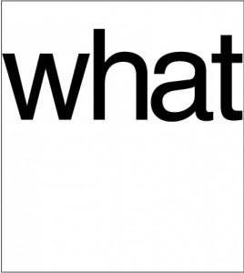
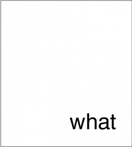
Although the second example is the exact same word and font, it has a completely different feeling than the first image, creating the opposite effect. The font is smaller, the kerning is much looser and even the positioning of the word, being at the bottom right-hand side of the page, makes this feel much timider and unconfident then the first example.
The Power of Type
Using type in your design should never be underestimated. It can be the difference between good design and bad design. Using type to enhance the message you are trying to convey can not only be powerful but also memorable.
A campaign from Greenpeace to raise awareness of the impact of deforestation.
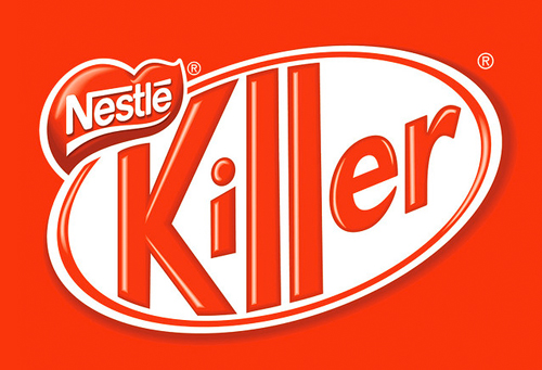
Taking a look at this image, created from an ad campaign by Greenpeace, you can see it is a very familiar logo for the Kit Kat chocolate bar. The style of the font, such as the shape, colour, and angle make it instantly recognizable with the Kit Kat brand. It is so recognizable that when first glancing at it, you might not have noticed the name being incorrect. Type can be so powerful that just the style and colour of a font can make something that recognizable.
All the examples above show that using type in your design should not be underestimated. It can be very powerful and when trying to create a message or even an emotion, try to keep in mind all the different aspects of type that can help to create the message you are trying to convey.
