The truth of design in Netflix’s Abstract
By: Brent Morrison
February 27, 2017 | Reading Time: 4 mins
Design is everywhere, even if you’re not fully aware. It’s there in the brand of coffee you get in the morning, the kind of car you drive, or the shoes you wear during your workout. They were all designed by someone. Netflix’s new compelling series, Abstract: The Art of Design, explores the world of design through various industries. Each episode covers a designer from their respective industry, from illustration and graphic design, to automotive and footwear design.
Being a graphic designer, I took a shortcut to episode six on graphic design, which follows Paula Scher and the world of typography. Learning about her adventurous career and the insights from her experience was inspiring. Here are some of the highlights.
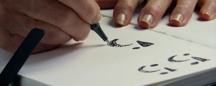
“The design of the logo is not the hard part of the job. It’s persuading a million people to use it.”
This couldn’t be more true. I struggle with this part of the job every day. Even if you have the best idea in the world, you will always get challenged on your thinking. Part of being a designer is also being a salesperson. You have to sell your idea to the client and get them excited about it. Tell them your thinking, what your design communicates, and why it works. You must persuade them to trust your decision and help them understand your vision.
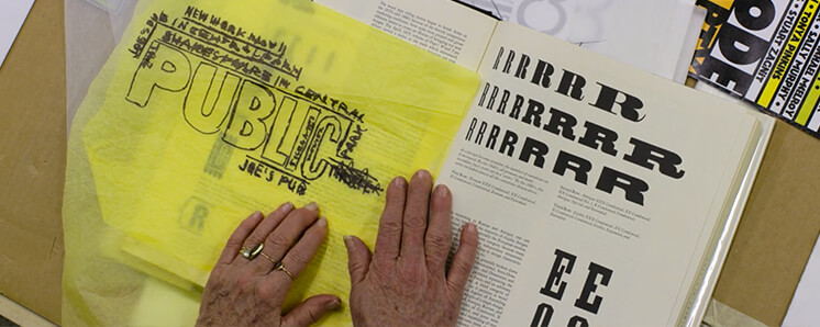
“You have to be in a state of play to design. If you’re not in a state of play, you can’t make anything.”
Do you ever find yourself trying to create something and you draw a blank? Like most things, you have to be in the mood to enjoy something, and creativity is no different. If you’re not enjoying the work or engaged in it, it’s almost impossible to be creative. Don’t waste time trying to force an idea. Take a step back and revisit it. Sometimes working on something fresh can bring on new ideas you wouldn’t have thought about. Switch up your surroundings. Even going for a drive around the city can help. Maybe a sign you always overlooked suddenly sparks an idea for an arrangement of typography.
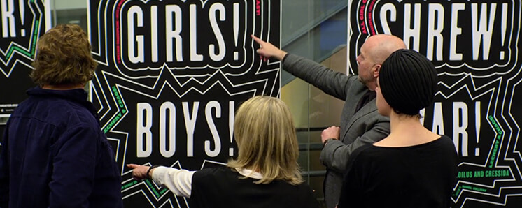
“They want proof that this is really really going to work. The problem is, there isn’t proof. It’s how people see and perceive and accept things.”
Anytime you’re presenting a design to a client, they want a guarantee that it will work or make an impact. It makes sense. If you go to a store and buy a television, you expect it to work when you use it. Unfortunately, design is not black and white. There’s really no right or wrong answer, although there is good and bad design. Design is very subjective. Everyone perceives things in a different way. Some people will like a design, others will hate it. Many times you have to test ideas, knowing they might fail, to find the right solution. To be innovative, you have to be willing to take risks and push boundaries – or risk falling behind.

“Design needs to take human behaviour into account.”
User Experience plays a key role in creating a successful design. Everyone is different and won’t always react to or use a design the way it’s intended. When creating a website or app, will someone be able to navigate easily? Is the language you’re using easy to understand? Will they notice that button at the bottom? The best way to find these answers is to test out your design and ask a lot of questions. Don’t get thrown off by criticism, embrace it instead. Get them to find issues and poke holes. This will give you important data to fine tune and create something amazing.
My Moment of Inspiration
There was one quote in it all that was my clear favourite. I always think to myself, will I be still designing and creating, ten, twenty, thirty years from now? Will I get bored with design? What’s going to keep my creativity flowing? When I heard this line from Paula, it really helped answer those questions and provide me with inspiration for years to come.
“I’m driven by the hope that I haven’t made my best work yet.”
