Whip your next logo design into shape using psychology
By: Nicole Steinberg
September 30, 2020 | Reading Time: 4 mins
While brainstorming an idea for this blog, one of my fellow Stryvers said, “I’ve always wondered about the psychology behind different shapes and why designers choose them”.
This got me thinking. Why do I gravitate towards a circle for one logo and a square for another? Why do rounded corners make sense for one brand’s website, but feel totally out of place for a different one? A lot of it comes down to the brand’s target market, their subject matter, and simply the look and feel they’re going for. Other times, it’s more about what looks best. But are these just arbitrary rules I learned in design school? Or is there real psychology behind these choices?
Whether you’re trying to make the next great logo or simply get more clicks on your ads, shapes can communicate a lot more than you realize.[/intro]
Squares & Rectangles
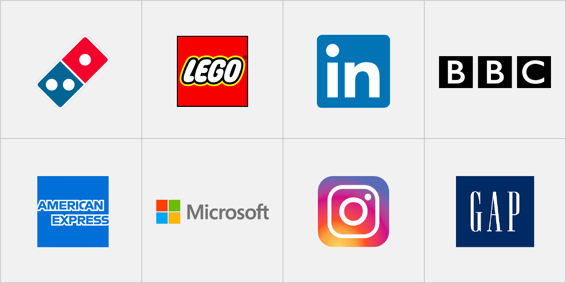
What objects come to mind when you think of structure and security? You’re probably conjuring up images of things like buildings, safes, and vaults. Squares and rectangles are super popular in design for this reason. Simply put, straight lines and right angles give a sense of reliability and trust because we associate them with reliable and trustworthy objects. This makes squares and rectangles an obvious choice when designing a logo. You’ll be hard-pressed to find a business that doesn’t want to come across as strong and dependable.
On the flip side, squares do run the risk of appearing outdated and boring because of their simplicity. But that’s nothing a little colour theory, typography, and creative thinking can’t fix.
Circles
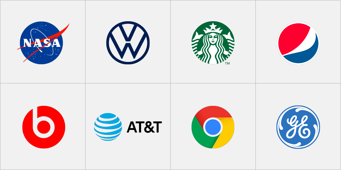
The objects a circle can represent are almost limitless; a ball, the sun, a person’s face, etc. Its recognizable form is what makes the circle an easy shape to use in design, but it’s people’s emotional associations that make circles a smart shape to use in design.
Circles seem softer and more welcoming than angular shapes like triangles and squares. In fact, illustrators use this rationale all the time when creating loveable characters. This makes them a great choice for brands looking to come across as friendly and accessible.
Commitment and unity are also represented by circles because of their infinite shape and association with wedding rings. Their lack of beginning and end give a sense of movement or energy, too.
Triangles
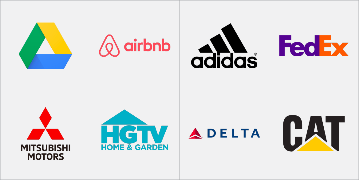
If circles can add movement to design, then triangles add it by tenfold. The shape itself quite literally has a point that the human eye can’t help but be drawn to. Our eyes naturally want to follow triangles from their wide base to pointed tip, making it the perfect shape to add direction to a design.
One of the most interesting things about this shape is how the feelings it evokes can drastically change depending on orientation. An upright triangle gives off feelings of balance, stability, and growth. A downward-pointing triangle can communicate risk and negativity while a right-facing triangle gives a sense of forward momentum.
Organic Shapes
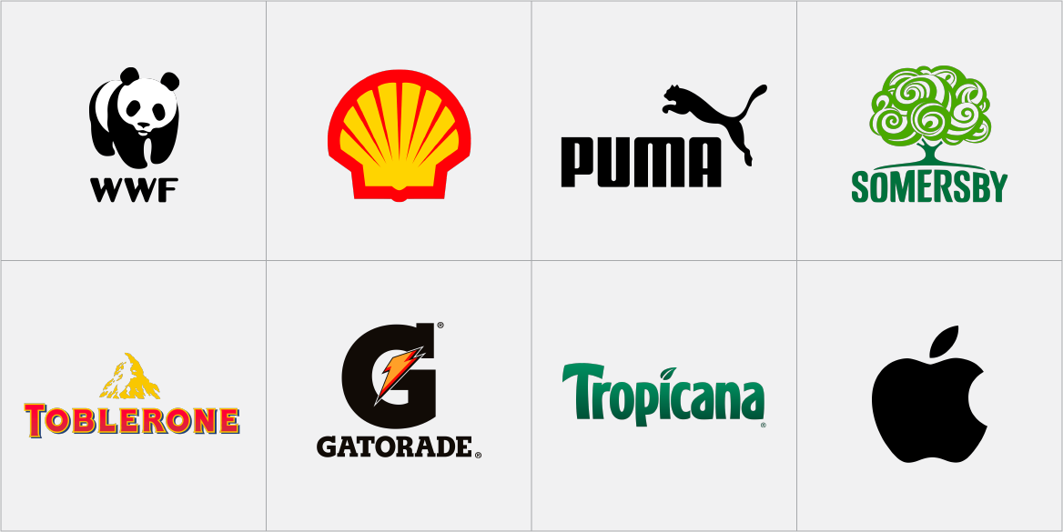
Sometimes geometric shapes just don’t cut it. The term “organic shape” is used to describe naturally occurring shapes that can’t be manufactured. This includes things like leaves, animals, and anything found in the environment. By being easily identifiable, these shapes can provide a sense of warmth and reassurance along with the associations of their actual subject matter.
When using an organic shape in your design, it’s important to pick one that resonates with your brand’s message and values. Take Gatorade’s logo for example. The lightning bolt symbolizes the energy their drinks provide their customers.
On the other hand, organic shapes can also be used quite literally. Companies like Shell and Apple take direct inspiration from their names for their logos.
These theories can be applied to basically all areas of art and design including logos, UI, and even photography. So the next time you’re faced with a design challenge, use some psychology to back up your thinking. When you’re undoubtedly asked the dreaded question of ‘why’, you’ll have an answer ready to go.
