For many designers, Photoshop is the go-to for web design. But did you know that Illustrator is also a powerful and productive tool when designing for web? Here are some great Illustrator tips that will help you with your next web design project.
1. Align to Pixel Grid
Ever wonder why some of your images or lines don’t look as crisp as they could be after exporting them? Make sure when you start a new document that under the Advanced area, Align to Pixel Grid it selected. This will ensure sharp lines and pixel perfect shapes in your document.
If you’ve started your document already just go to your Transform Panel (Window>Transform) and under the menu select Align New Objects to Pixel Grid. If you have existing objects that are not aligned yet, simply select the object and click Align to Pixel Grid in the Transform Panel.
![]()
![]()
2. Profiles – Web & Devices
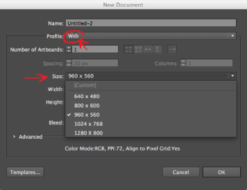
When starting a new document for web, we all know to work in the RGB colour space and in pixels. However under the Profile dropdown, if you select Web, Illustrator provides presets of common website dimensions which is a quick and handy way of getting your document started. Also under the profile dropdown is Devices, which has all the most popular devices and their respective screen sizes. This is a great feature to have as you’re going to want to design your website so that you can view it on multiple devices.
3. Pixel Preview
While you’re designing for web in Illustrator, you want to make sure you’re working in Pixel Preview. You can do this by selecting Pixel Preview in the Preview Mode when creating a new document or toggle it on and off under Window>Pixel Preview. This will give you an accurate rendering of how your design will look pixel by pixel and make sure everything looks nice and crisp.
![]()
4. Dual Windows
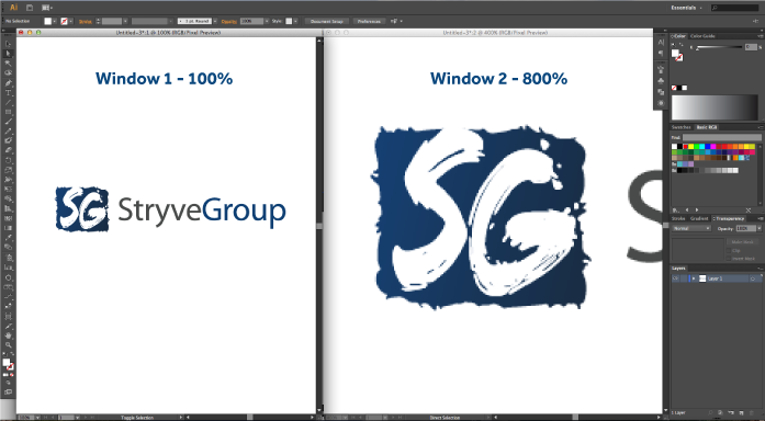
Here’s a helpful trick for both web and print. Do you ever find yourself working on a small detail at high zoom levels and constantly zooming out to see your work? With your project opened, go to Window>New Window. This will create a second live window of the current project so that any edits or changes you make on one, will automatically happen on the other in real-time. This way you can work up close and personal but still see your changes being made at a lower zoom level in the other window.
5. Artboards/Responsive
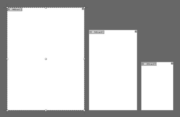
Artboards can be the handiest tool when creating multiple page documents or alternate versions of a design. With web, you can utilize this tool by creating an artboard for each separate page of your website. You can do this by pressing Shift+O and then clicking and dragging, like you would with the shape tool, to your desired artboard size. Using the command Shift+Pageup or Shift+Pagedown, you can then toggle through multiple artboards quickly.
Since mobile devices like tablets and smart phones are an important way that many interact with the web, designing your website to be responsive is imperative. In a single document, you can setup multiple artboards for different devices so that you can work on them simultaneously.
6. Symbols
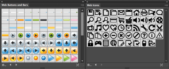
Symbols are a great tool to save time when designing for web. They allow you to easily repeat elements like icons and buttons without having to recreate them over and over. You can take any illustration and convert it into a button with a click and drag into your Symbols Panel. Illustrator also provides an existing library of web symbols if you want some quick resources as shown below. A great resource for icons is www.flaticon.com.
7. Patterns
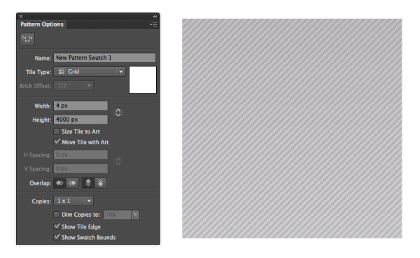
Much like symbols, patterns are another design element that can be easily created by dragging any image or pattern into the Swatches Palette. To customize your pattern swatch, double click on it in the Swatches Palette to open up the Pattern Options. Here you can change the characteristics of your pattern, including how your pattern will tile.
8. Offset Path
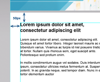
You’re probably wondering how Offset Path could be used for web design. The answer is that it’s great for creating the illusion of padding. If you’re like me, making sure everything lines up nicely and consistently is important. By using Offset Path (Object>Path>Offset Path) on an area and converting it to a guide (Command+5), you now have a boundary for your images and text that will ensure consistent spacing and alignment.
9. Appearance
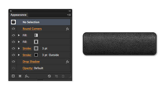
This is probably one of my favourite features in Illustrator for both web and print, as it allows you to give an object or text many attributes at once. You can access the Appearance Panel under Window>Appearance. Here you can add multiple strokes, effects, and fills contained all in one object without having to make separate layers. After adding multiple attributes to your shape or text, you can edit it and the Appearance will automatically update itself. Keep in mind, if you’re adding multiple effects to an object or text, it can slow Illustrator down a little while you’re trying to edit. A simple trick is to hide the effects until you’re done editing by clicking the “eye icon” to the left of the attribute to toggle it off. Below is an example of a button with multiple attributes including a leather pattern I added to give it some texture.
There are plenty more great features that Illustrator offers for web design, but these are a few that I use regularly. If you have any helpful tips of your own for using Illustrator when it comes to web design, I’d love to hear them in a comment below!


