Whether we’re online or offline, icons are all around us. We love using them and we love seeing them. They make our designs more appealing and they enhance our user’s experience. They’re an important part of a designer’s toolbox, but at some point, we took things too far. We use them as decorations. We use them to fill space. We’ve drained them of their meaning and forgotten their purpose.
It’s time to restore order and put an end to the madness. Here’s a friendly reminder of what your icons do best!
Quick communication
Design is all about communication, so in most cases, text is the best solution. Right?
Well, not exactly. The next time you use your microwave, take a look at the buttons for popcorn, baked potatoes, and beverages. Did you find yourself reading the labels, or noticing the visual representations? When done right, icons can be recognized instantaneously and actually communicate a message faster than text. Moo’s business card dashboard is a perfect example of a sleek and clever use of icons with labels.
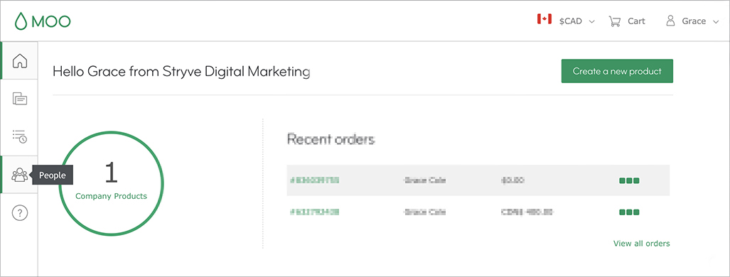
The key is simplicity. If your message is too complex to be conveyed through a single icon, it’s best to take a different approach like labels or alt tags.
Establish hierarchy
Icons are more effective when they grab users’ attention and improve their experience. Take Twilio’s website’s menu for example:
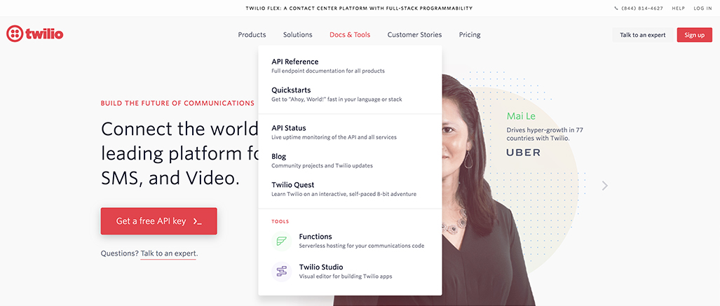 By adding icons to the bottom two links, Twilio establishes importance and organization within the Docs & Tools menu. Creating visual hierarchy can guide your user through a page and influence the decisions they make. In this instance, users are more likely to click the links associated with an icon over the ones without.
On the flip side, adding too many icons will have the opposite effect. If icons are used to signal importance and everything has an icon, you’ve done nothing to guide your user through your site.
Add visual interest
The way we interact with a web page or design is similar to how we people watch. More often than not, we’re drawn to focus on people who stand out or seem interesting. When web pages are dominated by text, icons are a great way to break up paragraphs and add an element of interest. Additionally, adding contextual icons will allow users to better skim your content and jump to points of interest.

While icons and visuals can make text more appealing, they shouldn’t be overused to the point of overshadowing your content. For tips on designing with restraint, check out our blog, Designing “smarter” with minimalism.
Next time you’re thinking about adding icons to your project, first ask yourself what it accomplishes and if it’s really needed! It can be what makes or breaks your design.
