Get your Facebook ad approved: The 20% text rule
By: Chloe Rolph
August 13, 2013 | Reading Time: 4 mins
If you have ever been involved in the creative process for a Facebook Ad Campaign, chances are you are familiar with the frustrating “Your ad wasn’t approved” alert, citing that infamous 20% text rule. Many times we threw chairs scratched our heads wondering if it was us or the Facebook ad approval team that didn’t know basic math. And forget about contacting them directly to plead your case—their support team for questions about ad disapproval is basically non-existent. Then one day along with our ad rejection alert, Facebook sent us a guide regarding their text policy for ad images.
We found the guide is partly helpful and partly grey area, but over the last few months (and quite a bit of trial and error) we’ve figured out what passes, what sometimes passes, and what doesn’t. So we’ve taken a stab at explaining it again, in black and white instead of grey:
The BIG Rule: Your image must not be made up of more than 20% text.
It’s measured by a 5 x 5 box grid, for a maximum of 5/25 boxes containing text. For Newsfeed ads, we start with a standard 340 x 340 pixel template with a handy 5×5 grid right on it. We have made it available for download in eps or psd format! (Easily turn the grid on and off using keyboard shortcut Ctrl + ‘ on PC and Command + ‘ on Mac).
Now back to The BIG Rule. With any rule in life, there are exceptions and technicalities. There are two pretty important ones associated with this one, and we’ve done our best to explain them as clearly as possible using two of our favourite things in life: Somersby and burritos.
1. Product shots
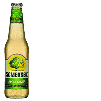
Text that exists directly on a product (think, a logo appearing directly packaging) does not count towards the text rule. But, logos not directly on packaging DO count towards the text rule. You can still include a logo, but be prepared to count it towards those 5 precious boxes.
This text doesn’t count because it exists within a product shot:

This text does count because it’s not included on a product:

Can you superimpose a logo onto a product to get around this? Facebook says no. Can you do it and get away with it? Depends on how good your designer is.
Can you zoom in on the logo within a passable product shot to get around this (i.e. Zoom in on the Somersby bottle logo so that it basically looks like the stand alone logo below it)? Facebook says no.
2. Going halfsies (or other form or part-sies) on boxes.
This one is tricky. I’m referring to any case where you have text in more than 5/25 boxes, but if you were allowed to move the grid wherever you please, it would fit in 5 boxes. Although the guide specifies that this is fine, we have still had many ads rejected. In a time sensitive ad campaign, we don’t advise you take risks on this–try to fit all your text into exactly 5 or fewer boxes.
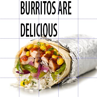
This text clearly fits into 5 boxes and you’d be safe from rejection:

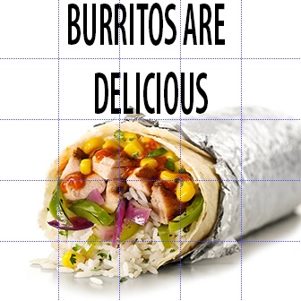
This image contains the exact same text, but by moving “delicious” to the right, there is now text in 6 boxes. Technically, it’s still 5 boxes, because 2 of the 6 boxes only contain text in half of the box. Risky business, proceed with caution.
Hopefully, we’ve been able to clear up some of the confusion surrounding Facebook’s 20% text rule so you too can stop throwing chairs scratching your heads.
Additional Resources:
- Facebook Ad General Guidelines (everything from targeting rules to the use of Facebook’s own trademarks and copyrights)


