For the past two years, Instagram’s advertising platform has been an exclusive club for only the big players like Sportchek, Mercedes, and Starbucks who already have a strong social presence on Instagram. Until now. Last week Instagram announced that steps have been taken to make ads available for businesses of all types and sizes. However, Instagram understands the importance of keeping ads creative and engaging so that they don’t ruin the Instagram experience with uninspiring imagery and spam.
How to Make Your Ads Stand Out
Instagram is all about engaging photography that captures people’s interests and passions. People use the platform to be inspired and connect with others that share their interests. When it comes time to be able to advertise on Instagram, you’re going to want to make your ads unique, intriguing, and evoke emotion to connect with your viewers. Using examples of existing ads from some of the big players, I’ll show you tips that can help you stand out with your sponsored ads and bring awareness to your brand.
Give it Humour

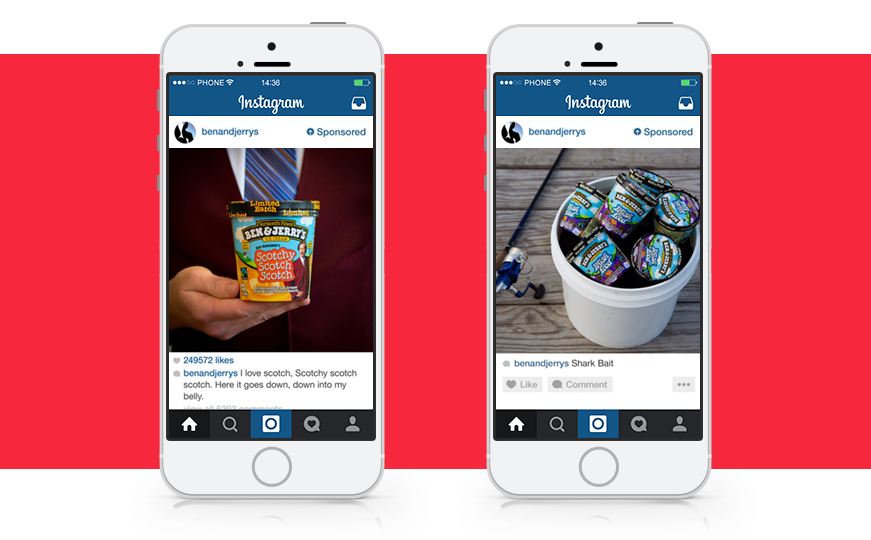
Humour is always a great way to break the ice and make your brand memorable. Ben & Jerry’s does a brilliant job with their scotch flavour ice cream by promoting it with Ron Burgundy from the movie ‘Anchorman’ and using a quote from the movie to tie it all in. With their rock-and-roll-inspired flavour Phish Food, Ben & Jerry’s implies a small joke about using ice cream as shark bait. Old Spice is another great example of this with their ridiculous ad campaigns about their shampoo and deodorant.
Colour and Contrast Are Your Friend

Making an impact with your sponsored ad can be as simple as using bold colours or images with strong contrast. In the Adidas ad, the use of light and dark combined with the red accent colour makes the image pop. From the shoes to the backboard, and even the basketballs, the subtle accent of red compliments the image and creates interest. There’s no mistake why this ad from Lexus stands out. This shot of their LFA vehicle jumps out on the screen because of its interesting angle and the bold yellow hue on a muted background.
Get Creative

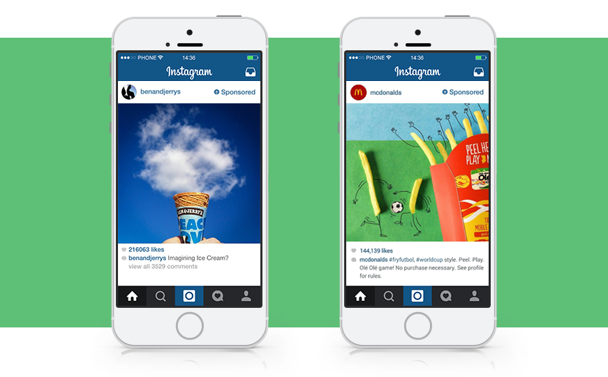
When you’re thinking about a way to promote a product or idea, using a clever way to show it off can really pique a viewer’s interest. Ben and Jerry’s came up with a great way to promote their product by using a cloud instead of the actual ice cream with the caption “Imagining Ice Cream?” On the right, Mcdonald’s gave life to their french fries as people who were playing and cheering as a way to promote the World Cup.
Make the Perspective Intimate

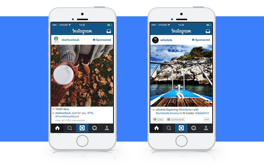
Add impact to your ad by using a perspective that places your viewers into the photo. This will engage viewers and help them visualize themselves using the product or being in a specific location. Starbucks uses an ad that places the viewer into the setting as if they are being handed the beverage. The tagline “Just for you”, makes the ad personable and really evokes the comfort of a hot beverage. The ad created by W Hotels places the viewer on the bow of a boat as if they were sitting on the deck looking out. The image captures the desire for adventure and exploring somewhere new. Plus, who doesn’t want a little adventure?
It’s All About Emotion
With all these image strategies there is one common theme throughout: emotion. Whether it’s humorous, colourful, or creative, photography is all about capturing an emotion with someone. You want viewers to feel something when they see your ad in order to create an emotional connection and make your brand memorable. If there’s nothing emotionally engaging about your ad, be prepared to be scrolled by!


