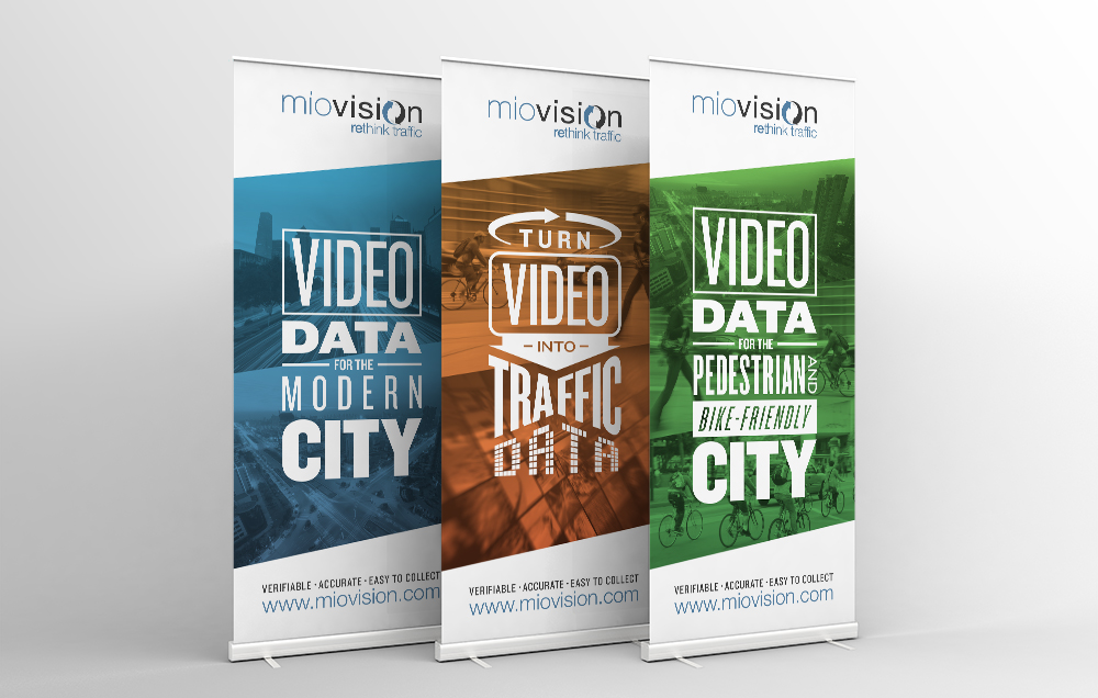
Create an impactful trade show banner
By: Brent Morrison
April 20, 2017 | Reading Time: 4 mins
A key marketing tool of any trade show is a creative, well-designed stand-up banner. They’re a great way to grab attention and an easy way to advertise your company or message. But creating a successful, eye-catching banner is not as easy as you might think. Consider these helpful tips to make an impactful stand-up banner at your next trade show.
Less is More
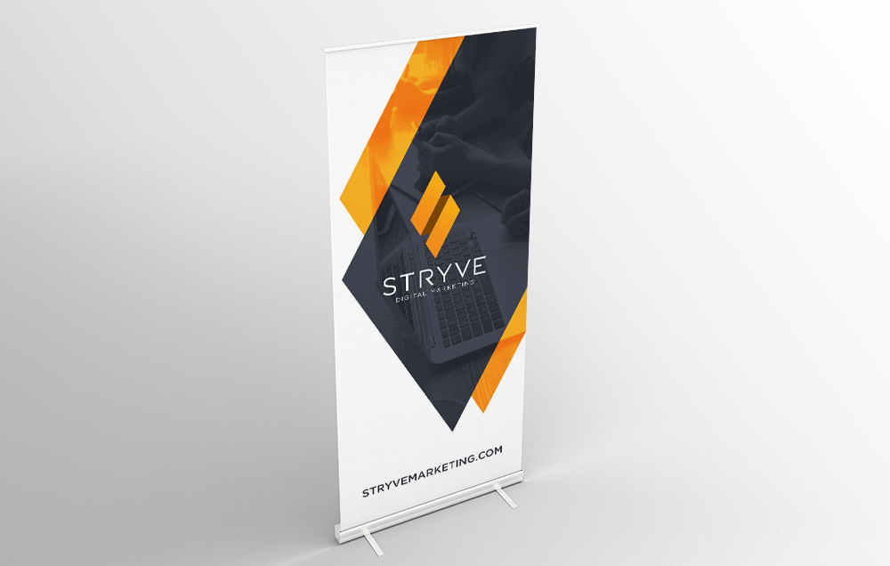
Often, companies try to fit too much information on their banners and they end up being a cluttered mess. Your banners will have more impact if you keep them simple. Stand-up banners get peoples’ attention. Let your salespeople and marketing collateral educate them.
Your photography should be pleasing to the eye and complement your company. White space or negative space is not wasted space. I get it: you’re paying for real estate so why not use it all? White space or negative space can help create interest and direct the eye. Keep your design clean, simple, and easy to read. Just because there’s empty space, doesn’t mean you should fill it.
Short, Simple Messaging
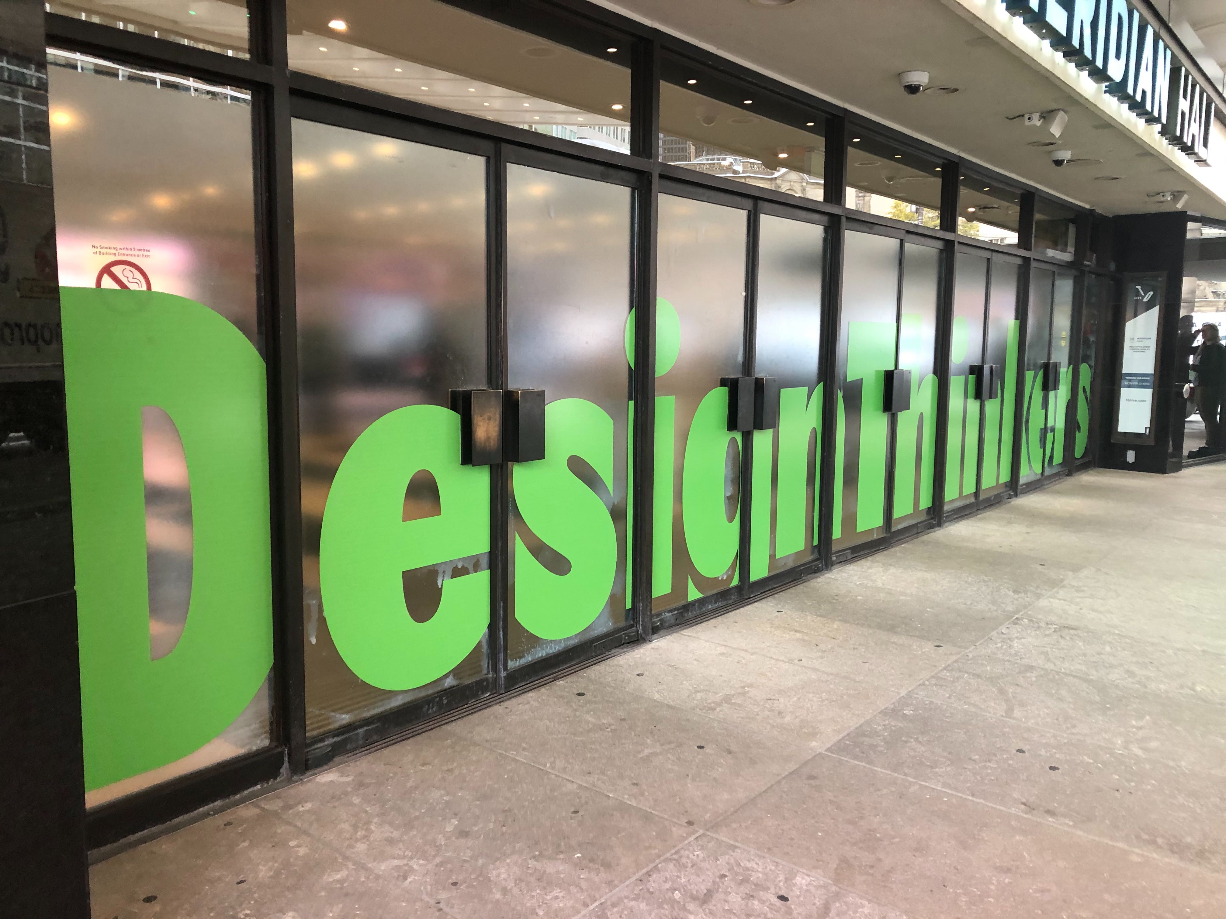
Don’t make people think. Keep your messaging short and sweet, but still impactful. It will be easier to read from a distance, and also quicker to read for those walking by. Also, it’s a good idea to avoid small type. People will be looking at your banner from at least a few feet away and you want it to be as legible as possible.
Use Multiple Banners
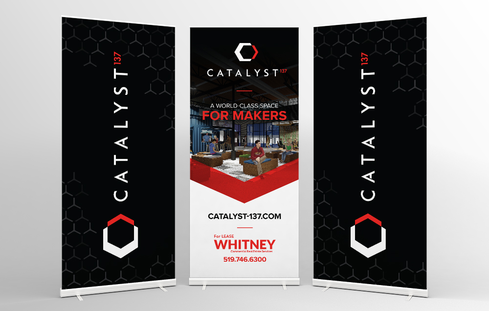
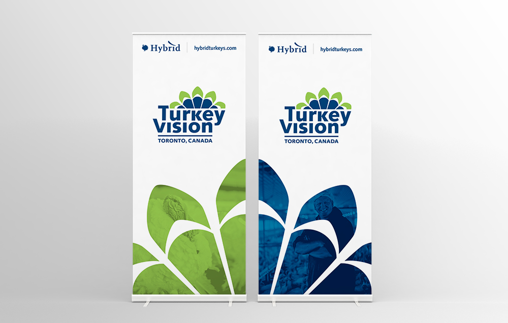
Having more than one banner can help make a larger impact on your audience. It also gives you more space for content. Instead of trying to squeeze a ton of information on one banner, spread it out on two. Or if you really want to create an impact, cascade an eye-catching photo across three banners. Another way to utilize multiple banners shown in the example below is to create supporting banners with your branding. You don’t need every banner to be different.
Information Hierarchy
People read top to bottom, left to right. Keep your high-priority information at eye level and to the top of your banner. The bottom of your banner should be reserved for things like websites or phone numbers. You want people to finish reading the banner with some sort of takeaway. That said, if your website is your top priority then use it at the top of your banner.
Colour and Contrast
Create interest using colour in your banner. Use photography that’s bright and colourful. Bonus points if it uses your brand’s colour. If your brand is orange, use orange text or icons to compliment your logo. Make sure you have strong contrast with your design so it’s easy to see. For example: avoid using yellow on white.
Use High-Quality Photography
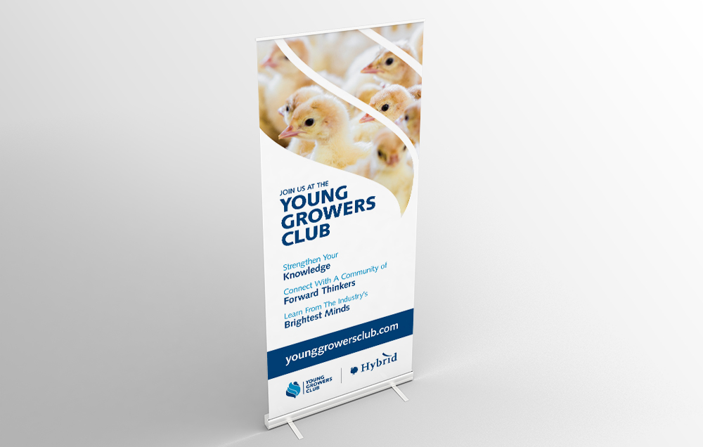
Use professional, high-resolution photos for your banner. Images pulled from websites cannot be used for print. They will look pixelated or blurry. The minimum resolution you’ll want to use is 100DPI. Because your banner is seen from a distance, your eye won’t be able to tell that it’s less than 300DPI. If you don’t have any photos or a budget for a photographer, download stock photography. You can use sites like iStock to search for photos.
Lower Quality Photo Techniques
What if your photo quality is less than ideal? What do you do? Well, there are a few things you can try.
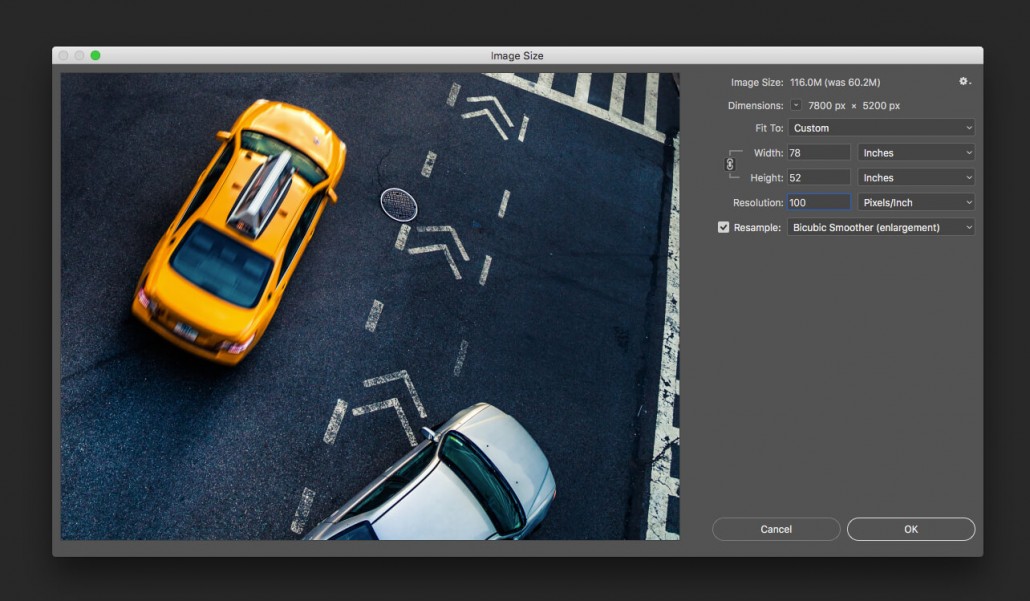
First, if you’re using a photo that’s too small, resize it in Photoshop, not Illustrator. Photoshop will enlarge your image intelligently, giving you a less pixelated result. Simply go to Image>Image Size and make sure Resample is unchecked for now. Input your desired dimensions and Photoshop will calculate what the resolution will be. If it’s less than 100DPI, then check Resample and put in 100 for the resolution. You’ll have two options for enlargement: Bicubic Smoother and Preserve details. Using the preview window, select which option you feel gives you the best result. This is by no means a miracle worker, but it will at least help with your image quality when blowing up a small photo.
A second technique you can try with lower-resolution photos is to use them as a background texture. Use a coloured background and overlay your photo with a decreased opacity. This will help hide the imperfections of the photo while giving you a nice design result. Also using stylized text as the hero with the photo in the background can help take the attention away from your low-quality photos.
Lastly, if your photos are too small, try creating a design that incorporates multiple photos to fill your banner. For example, having two or three photos stacked on each other like the example below.
