Poor colour contrast can impact your website
By: Brent Morrison
March 13, 2019 | Reading Time: 4 mins
Imagine trying to browse the internet but you can’t read anything. You squint and look closer. You adjust your screen. You try everything but nothing seems to work. Unfortunately, this is a reality for many people who suffer from vision deficiencies, including those with colour deficiencies, low-vision issues, and the elderly.
Since screen technology has advanced with higher resolutions, it’s allowed designers to take advantage of thinner typefaces and a wider array of colours. As a result, many of the most popular design trends — like the use of light grey text — have made the web less accessible to a large demographic. You can thank Google and Apple for that one!
Today, it’s not just those with vision impairments who have issues viewing web content. As we continue to use smartphones and tablets in poor lighting, some design trends have started to affect the average person’s viewing experience.
Your website is an important marketing tool and it needs to look good, but those trendy colours you’re using might just make it useless to a portion of your audience. Here’s what you need to know about designing for accessibility.
What is colour contrast?
Colour contrast is the difference between two colours. When it comes to your website, it’s important to have enough contrast between text and background colours so your content is clear and legible. While light and subtle text is trendy right now, for some, it can make content impossible to read.
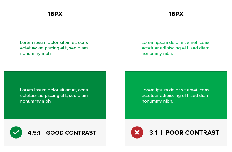
The Web Content Accessibility Guidelines (WCAG) 2.0 states that for Level AA, a minimum ratio of 4.5:1 is required for normal text (less than 18px) and 3:1 for large text (18px bold or larger, or 24px or larger). Level AAA requires a contrast ratio of at least 7:1 for normal text and 4.5:1 for large text. The recommendation was designed as a suggested minimum to create boundaries of legibility.
To help put these ratios in perspective, if the text and background are the same colour, the ratio is 1:1. For Black text on a white background or white text on black, the contrast ratio is 21:1. It sounds straightforward, but as shown below, it isn’t all black and white. Check out how just a slight increase in brightness can be the difference between accessible and inaccessible.

Why is it important?
There are many people living with vision issues. Around 1 in 12 men and 1 in 200 women have some degree of colour vision deficiency. With getting older, low-vision conditions increase and by the age of 40, a natural condition known as Presbyopia can start affecting your eye’s ability to focus on nearby objects. With the ever-increasing population over 65, the number of visually impaired people online is growing. Add that to the number of people using low-resolution devices or those reading off their phones in the sun, and suddenly you’ve got millions of people who are unable to navigate your site. How do you think that frustration will affect how they feel about your brand?
Test your colours
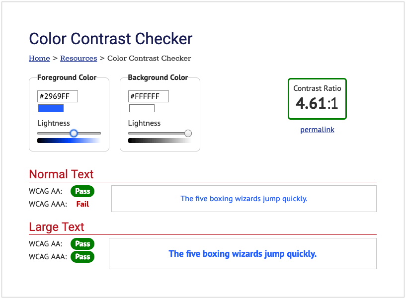
Webaim.org is a simple online resource that determines whether your text and background colours have enough contrast to be accessible. Just plug in your colour values and Webaim will determine their contrast ratio. If it fails to meet the requirements, you can adjust the colour slider until you achieve a pass. Another great resource is Accessible-Colors.com. If your colours do not meet the guidelines, they find the closest accessible combination by modifying the colours for you.

Techniques to improve contrast
This could all be news to you and your website may very well be inaccessible. You’ll want to fix that with the following tips:
- Adjust the darkness of your text or the lightness of your background to increase contrast.
- Use alternative colours in your brand.
- Don’t limit yourself to colour to show emphasis. Explore alternative visual treatments. If a link is coloured, make sure it’s underlined to let someone know it’s clickable.
- Add a secondary colour palette with better contrast colours for web.
- Increase your font size and/or font weight.
- Add a drop shadow to your text to help make it stand out.
- Grayscaling a design in Photoshop can give you a rough idea of how some colours might contrast. This is a great way to design for accessibility.
Whether it’s because of your general audience or your well-established brand colours, AAA accessibility may not be in the cards for you. That’s fine, most companies don’t need a perfect accessibility score. This blog is about considering accessibility as a factor in your design because accessibility is a factor to a lot of people. Do what you can to accommodate their needs.


