Keeping colour consistent across print and digital
By: Brent Morrison
October 10, 2017 | Reading Time: 4 mins
Colour is a very important part of branding. It’s often the first thing someone will remember about a brand and can affect how they feel towards a company. There is a significant amount of thought and time that’s put into choosing the right brand colour. Keeping that colour consistent across both digital and print is crucial for brand recognition.
Maintaining consistency can be a difficult and often frustrating challenge. There are many factors that can affect colour. Relying on conversion tools and numbers alone won’t work. It takes a detailed eye, some colour matching, and lots of testing. Here are some helpful strategies to keep your colour consistent across print and digital materials.
Use a Pantone Swatch Book
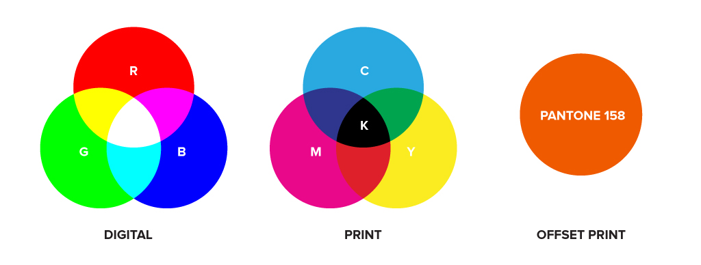
Avoid picking a colour on your screen. What you see on your monitor is completely different than what comes out of the printer. This is because monitors use RGB (red, green, blue) and are much more vibrant than print. Printing uses a four colour process known as CMYK (cyan, magenta, yellow, black) which tends to be toned down. If you start with RGB first, finding a print equivalent will prove to be a nightmare.

Start with a Pantone swatch book first. It’s an invaluable resource with hundreds of accurate print colours. These colours are based on a Pantone Matching System (PMS). This ensures that no matter where it’s printed, it will always turn out the same.
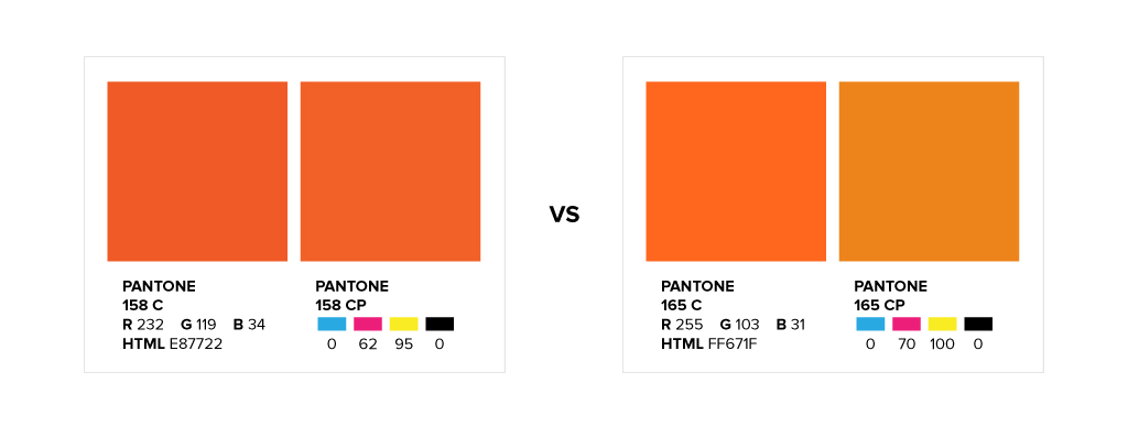
I recommend using a Colour Bridge Pantone book because it provides a side-by-side comparison of each Pantone in CMYK. Pantone colours can look very dull compared to their CMYK equivalent because they are premixed inks used in offset printing. They can achieve more vibrant and unique colours (like metallic or neon) but are also more expensive to use. Unless your client has large budgets, you’ll likely be working with CMYK most of the time.
TIP: Try to choose a Pantone that has a close CMYK equivalent. That way whether you’re printing in Pantone or CMYK, your brand colour will look very similar.

Testing and Colour Matching
To ensure the integrity of a colour, you’ll need a keen eye for colour matching. Choosing a swatch from a Pantone book will give you an accurate idea of how your colour will print, but it’s not foolproof. Different types of paper, finishes, and printing methods can change the outcome of a colour. Even printing from one vendor to the next can give you different results. Always test your colours first or get a proof before rolling out any print material. Even if you’ve printed a project in the past, there’s no guarantee you’ll have the same results.
Colour Matching
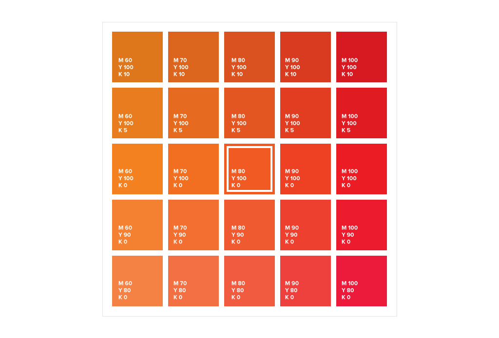
If your Pantone book doesn’t have CMYK comparisons, you’ll have to do some colour matching. Print your Pantone in CMYK and see how it compares to your book. Chances are that it will look different. I recommend creating a grid of squares with your original swatch in the middle. Then incrementally change the ink values around it. Maybe it needs more yellow or less black. This technique will give you a spectrum that will help you match your Pantone. Depending on how many options you want, you can make this grid as large as you need.

Web-safe Colours
Not all RGB colours reproduce the same online. When you’re designing for web, browsers use hexadecimal or web-safe colours to ensure colour consistency across browsers. The colour selection is limited to 216 colours so choose one as close as possible to your brand. Luckily the Colour Bridge Pantone book provides hexadecimal values for your Pantone colour.
Give your clients guidelines and explanations
A brand guidelines document is a great tool for the client to help keep their brand on track. This will outline the rules and specs to ensure consistency for their new brand. A guideline will include information such as colours, fonts, clear space, and logo usage.

Keeping a brand colour consistent doesn’t end with the designer. The client also needs to know when to use the appropriate files. Educate them on the difference between RGB, CMYK, and Pantones so they understand when to use the appropriate files. Or better yet, the negative results if they use the wrong ones. The last thing you want is a client using an RGB file for a huge printing project.

There’s no perfect solution for keeping colour consistent across print and digital. It’s often a time-consuming process that requires a lot of trial and error. That being said, a great way to set your client up for success is by providing them with all the appropriate files for their logo.


