Things are starting to move at Catalyst137
By: Brent Morrison
November 7, 2018 | Reading Time: 3 mins
A few years back when Catalyst137 was just an empty factory and a big dream, we were tasked with creating a brand to help encompass the vision of future IoT maker space. Fast forward a few years and the brand has evolved into a giant tech facility full of innovative companies and endless possibilities.
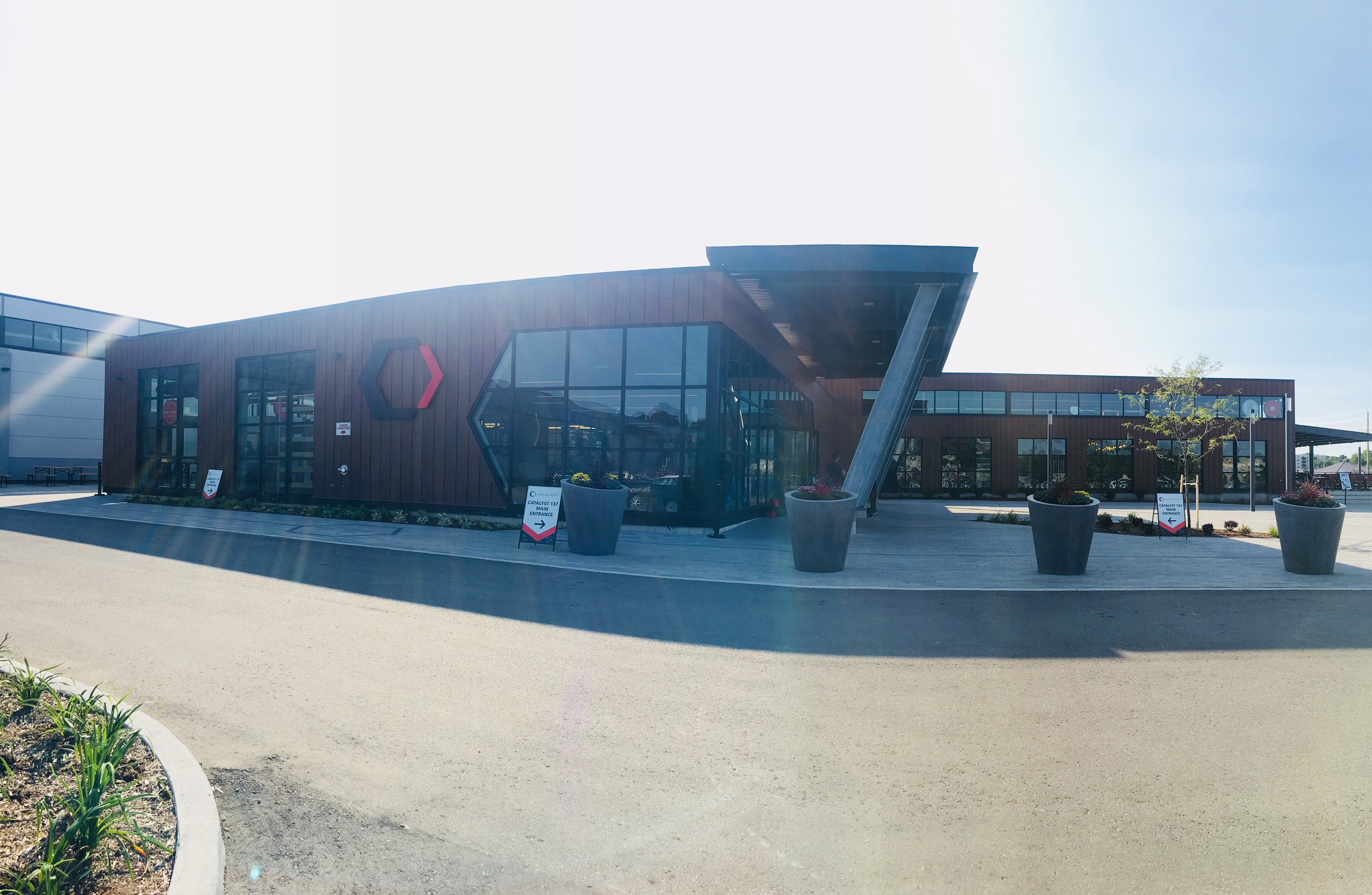
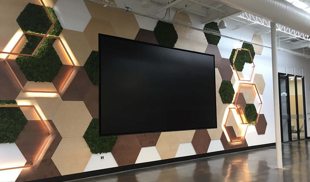
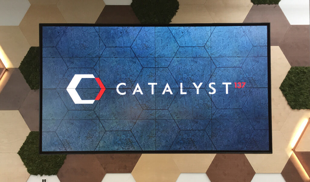
When you first walk up to Catalyst you’ll notice the geometric architecture of the entrance. From the patterns in the patio stones to the design of the exterior, elements of the brand can be seen everywhere. Entering the building, you’re greeted by the smell of freshly roasted coffee from Red Circle Coffee – my favourite part of the morning. To your right and up a few steps, a giant 220” display surrounded by hexagons made of wood, moss, and copper catches your eye. Made up of sixteen 55″ 4K screens, this impressive piece of technology installed by PCC Integrate commands an audience. But outside of being used for events, the display was unused. So Catalyst approached us with the task of creating something visually interesting that would show off the technology and capture people’s attention.
Getting Started
We brainstormed some ideas on how the screen could be utilized in a creative way. The challenge was working with very little content or direction. We concluded that showing off the logo in a fun way was the best approach. We wanted to do something more than just a logo on a screen though. We wanted to create something that would get people’s attention and really make an impact. We put together a handful of concepts and after some discussion, there was a clear winner.
The Work
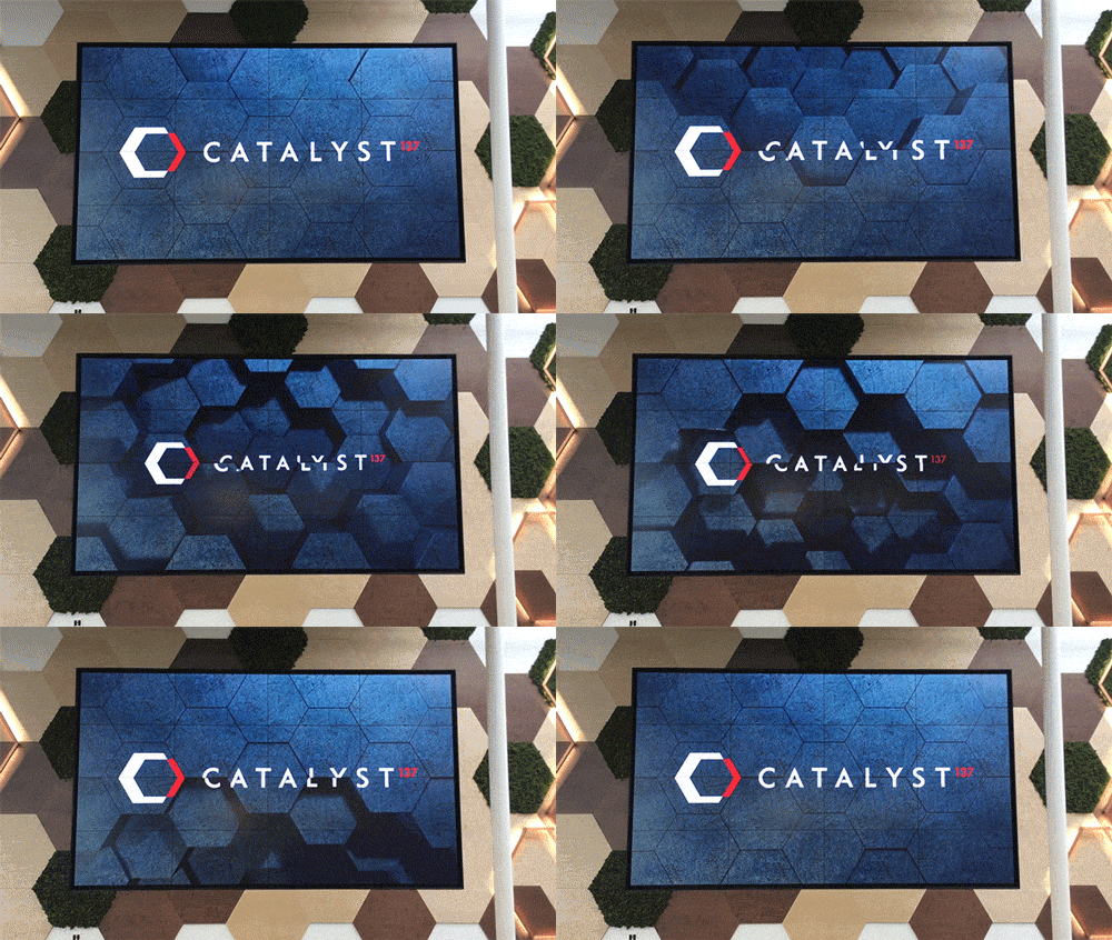
Using the hexagons surrounding the screen as inspiration, we continued the pattern into the background behind the logo. But instead of trying to match the wall colours, we decided to go with grayscale. We wanted the display to stand out, rather than trying to “hide” it as part of the wall. We then added movement to the hexagons at different periods as if the wall was coming to life. Sometimes they’ll move in and out in different patterns, sometimes they’ll flip over, and we even switched up which version of the logo we used. We also had to consider the duration. It needed to be long enough that it didn’t look repetitive so we cycled through all these different animations to keep the video engaging.
There were a few challenges we were presented with creating the video. The first one was getting the alignment right. It was tricky getting the hexagons to line up from the wall to the video seamlessly. To get the desired effect it had to be bang on. We also had to consider burn-in with the display, so creating a video that had enough movement was important. Lastly, the skylights in the lobby created quite a bit of light for the screens so we needed to make sure the animation wasn’t too dark.
This project was a little different than what I’m used to. I’m usually the one in the driver’s seat creating my own vision. This time around, I had to direct someone to create my vision. It was a new challenge that took me out of my comfort zone and place me in the seat of a client. We extended our team to Cole from Gripfilms to help us out with the animation. Cole has always knocked it out of the park for us on past projects so we were excited to work on this project with him.
If you’re stopping by for a coffee or grabbing some food at Graffiti Market, come check it out!
