Are you scaring your website users away with bad UX?
By: Kaleigh Bulford
October 30, 2024 | Reading Time: 12 mins
Visiting a website with a bad user experience can feel like you’re stuck in a horror movie: first, the weather starts getting bad, then the power goes out. The car won’t start, and there’s no cell service. And what were those creaking noises coming from the attic..? You start looking for an escape route. But unlike the characters in a horror movie, your website visitors aren’t trapped. And before you know it… they’ve ghosted you.
Bad user experience design can scare your users away, causing them to leave without converting. Fixing these issues can turn your haunted house of a website into a welcoming home, where users can have a comfortable and engaging experience (and, ideally, convert). It’s a win-win.
So what are these scary UX issues and how can you fix ’em?
Dark patterns vs. bad UX design
First things first, we’re talking about scary bad UX, not dark patterns in UX. Bad user experience design is usually due to poor design or development choices and neglecting to maintain your site. Meanwhile, dark UX is about intentionally creating user experiences to deceive or manipulate users (usually to get them to part with their money or information, and sometimes even time). Some examples of dark UX you’ve surely run across would be mobile apps with ad placements designed to be accidentally clicked or popups designed to look like official system messages (Virus detected! Scan your PC now!). Gross.
Issue: Dead links and broken pages
Dead links or 404 error pages that lead nowhere frustrate users. They disrupt user flow and make your site seem neglected. Plus, they kill trust instantly. And they’re so easy to avoid with regular maintenance.

Don’t be like the scumbag developer from Poltergeist and only move the headstones. Nobody wants a pool full of dead bodies or a website full of broken pages.
How to fix it
Prevent dead links and 404s from accumulating by performing regular audits of your site’s links and pages. Tools like Google Analytics, Semrush’s Site Audit, or Screaming Frog can help spot issues early. We like to use the free tool, BrokenLinkCheck, monthly to stay on top of and replace broken links (which is especially important for our blog which is full of links to external sites which we have no control over).
My favourite free plugin for redirects on WordPress is Redirection. We install it on almost every site we launch. Yoast Premium also automatically creates redirects when you change the URL, preventing internal dead links from happening in the first place.
Dead links are inevitable so having a custom 404 page that delights users when the rare 404 occurs can help prevent user frustration, especially when you create one that helps lead users back onto the path.
Issue: Slow load times
If your website loads slower than the zombies in The Walking Dead move, your visitors won’t wait around—they’ll flee before the site can even fully load.
Slow load times are a conversion killer, especially on mobile. In fact, 53% of visits are abandoned if a mobile site takes longer than 3 seconds to load. Users have short attention spans and more options than ever before to spend their time.
How to fix it
There are a few ways you can tackle this issue but it depends on what the root causes are. Get started by assessing your website speed with Google PageSpeed Insights (it’s free!). After popping in your domain, PageSpeed Insights will analyze your site and provide a comprehensive list of opportunities along with exactly how much they impact your loading speed so that you can prioritize the highest impact fixes. Then, hand this list off to your dev team for implementation.
Don’t have a developer at your beck and call? There are still a lot of things you can do without one. One of the biggest opportunities I see on most websites are unoptimized images. If you’re running WordPress (or another popular CMS) an image compression plugin is easy to install and it’ll right size your images. And if you aren’t running a CMS with available plugins, you can do it the manual way by running your images through tinyJPG (it does all the formats despite the name).
Your slow website is killing the planet
Issue: Confusing navigation and a lack of hierarchy

If your website navigation feels like wandering through the hedge maze in The Shining—where every turn looks the same and you can never find what you’re looking for—you’ve got a problem. Poorly organized menus and a lack of URL hierarchy can leave visitors confused and frustrated, leading them to dead ends and unable to achieve what they came for. Without clear structure and navigation, visitors are likely to abandon your site entirely.
How to fix it
Develop a logical, hierarchical sitemap
Your sitemap shouldn’t be flatter than a zombie’s EKG nor as chaotic as the Overlook Hotel’s haunted hallways. A flat, unorganized sitemap leaves users lost and frustrated. Introduce nested content categories and subcategories to create a clear, logical structure. A well-structured hierarchy helps guide visitors to the information they need, ensuring they don’t wander aimlessly through your site.
Consider user journey mapping
Outline the typical paths users take to reach key content, then refine your site’s navigation and layout to support these journeys. This approach ensures that visitors reach their goals efficiently, without endless clicks or backtracking.
Prioritize a simple, intuitive navigation
Streamline your navigation by organizing main categories and eliminating unnecessary menu items. The clearer and simpler your structure, the easier it is for users to move through your site.
Implement breadcrumb navigation
If your site is particularly large or complex, breadcrumb navigations can help users understand where they are in your site and guide them back, if need be. Just like the breadcrumb trail in Hansel and Gretel (the inspiration for the name of this navigational element), these markers allow visitors to retrace their steps, so they never feel lost.

Issue: Way too much content, not enough white space
When pages are overloaded with text, images, or videos, users can feel overwhelmed, making it harder for them to focus on what matters most. Like a scene from The Birds, users can feel bombarded by a relentless onslaught of birds (or in this case content). A cluttered site can dilute your core message, leaving visitors unsure where to direct their attention. Instead of guiding users toward clear actions, excessive content causes confusion, making it more likely that they’ll abandon the page without engaging.
Too much content creates cognitive overload. Users want quick, accessible information that is easy to digest, especially when browsing on mobile devices or under time constraints. Cluttered pages slow down their ability to scan for relevant information, making it difficult to absorb key messages. This can reduce engagement, lower conversion rates, and ultimately, discourage users from returning to your site.

How to fix it
Use white space effectively
White space allows content to breathe. It separates sections, makes the layout feel less dense, and naturally draws users’ eyes to what’s important. Embracing white space keeps the page clean, reduces visual clutter, and improves readability.
Break content into bite-sized chunks
Long blocks of text can be intimidating. Breaking content into smaller sections with clear headings, bullet points, and concise paragraphs makes it easy for users to scan and quickly locate the information they need. Visual aids like icons or infographics can also break up dense information, making it more digestible.
Establish a clear, consistent visual hierarchy
Guide users by emphasizing the most important elements of your content. Use larger or bold fonts for headings, and place essential information at the top of the page. Contrasting colors and sizes can also help create a natural flow, directing users’ attention to the most relevant sections.
Be concise
Aim to communicate your message with as few words as possible. Every paragraph, sentence, and visual element should have a clear purpose. Edit ruthlessly to remove redundant information or content that doesn’t directly support your message.
Issue: Not being mobile-optimized
It shouldn’t feel like you’re trying to escape from Jigsaw when using a website on your mobile device. Just like his victims struggle to complete impossible puzzles, your users are forced to fight through a poorly designed site—impossible-to-tap buttons, tiny, unreadable text, and hover-only elements that don’t work on touch screens. With every mis-tap or glitch, user frustration builds. But unlike Jigsaw’s victims, your website users can easily escape—by abandoning your site and finding one that’s designed for mobile. And with almost 60% of global web traffic being mobile, that’s a lot of visitors to send running.

Examples of elements that aren’t mobile-optimized
There’s so much to cover here, we’ll skip the obvious (fixed-width layouts from 2005).
Hover-dependent elements
On desktops, certain elements like dropdown menus, tooltips, or cards that ‘flip’ might appear when a user hovers over them. It’s easy to forget, but on mobile devices, there’s no hover functionality, so these elements either don’t appear or are inaccessible, making navigation difficult or even impossible. Navigation menus that only expand on hover are particularly egregious. On mobile, users might not even know there are sub-menu options.
If you absolutely must have these elements on desktop, you should deploy mobile-friendly alternatives.
Buttons and links that are too small to tap
Links or buttons that are too small or too close together are hard to tap with your finger on mobile devices making it easy to accidentally tap the wrong thing or requiring multiple attempts to hit the ‘target’, leading to user frustration. The most common example of this I see are the tiny, close-together social media icons you often find in footers. You can avoid this by following best practices for minimum target size. Google recommends 48x48dp, or about 9mm in physical size, with 8dp of space between other elements while W3 recommends a minimum size of 44×44 pixels for AAA accessibility.
Pop-ups, overlays, and other elements that are hard to close
Pop-ups that appear on mobile can take up the entire screen, and if the close button is too small or hidden, it becomes impossible to dismiss. Some pop-ups might even get cut off, making it hard for users to find the “X” or the exit.
Text that forces you to zoom in or out to read
Text that isn’t properly resized for mobile screens appears too small or oversized, forcing users to zoom in or out just to read basic information. This extra step leads to an annoying experience. Make sure you alter text sizes, all your headings and body copy, to fit comfortably on a smartphone.

No touch-friendly gestures
Websites that don’t incorporate mobile-friendly gestures, such as swiping or tapping, feel outdated and clunky. Relying on interactions like “click” without considering “tap” creates friction for users. For example, image carousels or slideshows that require a click or navigation arrows instead of being able to swipe left or right.
How to fix it
Don’t put your users in a position where they have to struggle through a bad experience. Make sure you design for the mobile experience. Ensure your site is responsive, with touch-friendly buttons, readable text, and layouts optimized for mobile devices. And test, test, test on a variety of screen sizes and devices. Users should feel in control and free to explore—not stuck in a nightmare where every interaction feels like a puzzle they have to solve.
Issue: Auto-play media
BOO! Auto-play videos or music that start without user interaction are the jump scares nobody asked for. They can be jarring, intrusive and disrupt the user’s experience and may even cause them to leave the site immediately—especially if they’re in a quiet environment or on a slow connection. Keep the jump scares where they belong… in horror movies and games!

How to fix it
Give users control over their experience. Instead of auto-play, allow them to start videos or audio when they’re ready and make it easy to pause, too. This not only reduces bounce rates but also respects the user’s time and environment (and data if they’re not on Wi-Fi!). And while I’m on this soapbox, make sure you caption your videos too!
Issue: Long or invasive forms

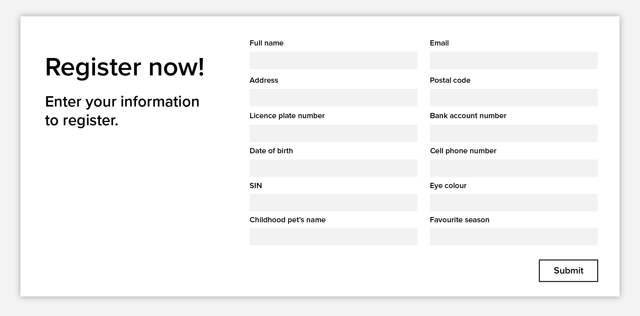
Just like the endless, featureless, hallways and rooms of The Backrooms, a long registration form exhausts your users. Every time they think they’ve reached the end, they encounter yet another field to fill out—another room with no exit. The endless clicking through fields with no visible ‘submit’ button in sight leaves users wondering when, or if, it will ever end. Every unnecessary field is another “room” they must slog through, slowly draining their sanity and leading them to abandon the process before completing it.

How to fix it
I always get scared off when a website form asks for my phone number, let alone a long list of items including my grandfather’s middle name and my SIN. Are you trying to steal my identity?? Keep forms concise and to the point. Only ask for truly essential information upfront (do you REALLY need that phone number?). Use progress bars to give users a clear sense of how far they’ve come and how much is left and consider breaking the form into manageable steps if it does need to be on the longer side.
Get more form submissions with these best practices
Issue: Aggressive or excessive pop-ups
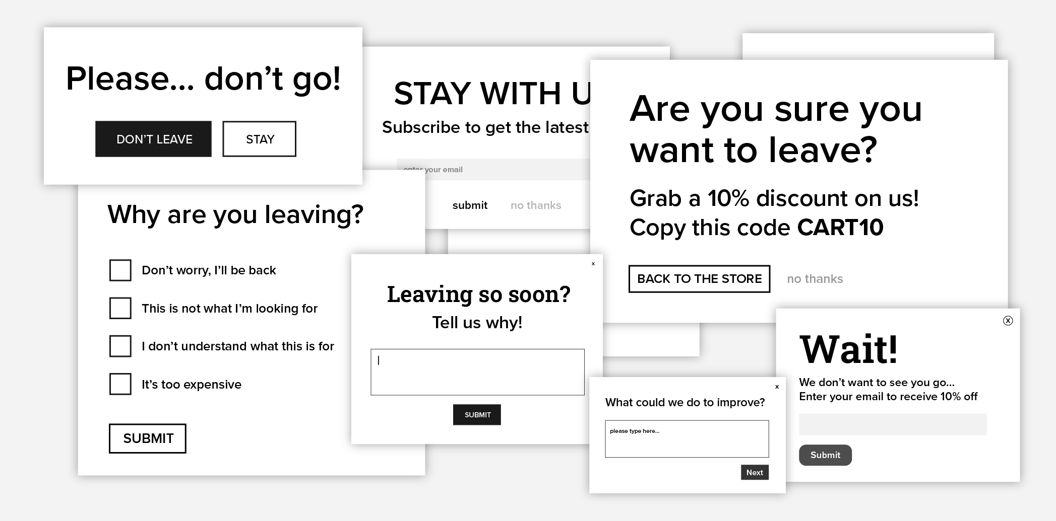
Aggressive pop-ups, like those that repeatedly ask users if they’re sure they want to leave, or bombard them with offers the moment they try to exit, are like the psychological torment in Misery. Just like the protagonist in the film, your visitors feel trapped and smothered by a force that refuses to let them go. Even worse? You can’t find the ‘X’ button to close them.
These types of pop-ups don’t just annoy visitors—they make you sound pushy and desperate, causing users to lose trust. Constant interruptions or forced interactions, especially exit-intent pop-ups that trigger multiple times, make users see red.

How to fix it
Be strategic with your pop-ups. Use them sparingly and only at key moments, such as for special promotions or when delivering real value. Exit-intent pop-ups should be a last resort, not an aggressive tactic that stalks visitors. Test your timing and messaging to find the balance between engagement and annoyance, and always give users a clear, easy way to close the pop-up.
Issue: Overuse of sticky or fixed elements
In It Follows, an entity slowly but relentlessly pursues its victim, never allowing them a moment’s peace. When overused, sticky elements—like chatbot widgets, social sharing icons, tables of contents, and email subscription popups—can feel like they’re always lurking in the margins, following users everywhere they scroll. Sticky elements can serve a purpose and even enhance the user experience, but too many of them can be distracting and even slow down page load times. And poorly placed elements can obstruct content, especially on mobile where margins are minimal.

How to fix it
Sticky elements should enhance the user experience, not overwhelm it. Limit sticky elements to essential features only. If using a chat widget or banner, consider giving users the option to minimize or close it. Test your site to ensure these elements don’t obstruct core content and remain unobtrusive on mobile devices. Remember, a user-friendly site lets users engage on their own terms, without feeling followed by intrusive elements.
Issue: Lack of accessibility
Websites that aren’t accessible to all users, including those with disabilities, are like locked doors and barricades—blocking entry and excluding many visitors from engaging with your content. Whether it’s missing alt text for images, poor colour contrast, or confusing keyboard navigation, these barriers can leave users feeling shut out and you risk damaging your brand’s reputation. And if you want to talk about something really scary, websites that aren’t accessible can even result in legal consequences.

How to fix it
To unlock every door for as many visitors as possible, prioritize accessibility in your design and development. Use tools such as WAVE’s accessibility evaluation tool (there’s even a Chrome extension) and WebAIM’s contrast checker to audit your site. Implement features like alt text for images, high colour contrast, and keyboard-friendly navigation. Not only does improving accessibility make your website inclusive, but it also improves usability for all visitors, reducing bounce rates and increasing engagement.
If this all sounds like a lot to stay on top of, we recommend Userway or Accessibe, accessibility tools that automate many aspects of accessibility compliance and provide ongoing monitoring to keep your site inclusive. They also offer user-facing widgets, allowing visitors to adjust settings like font size, contrast, and navigation options to suit their needs.
Don’t let your website become a house of UX horrors
Scary UX mistakes don’t just cost you conversions—they drive visitors away. By exorcising these issues, you can turn your site into a welcoming experience where users feel engaged, and eager to explore.
Ready to bring your website back to life? Staying on top of website maintenance and CRO with WebOps services can help exorcise those lurking UX issues, keeping your site optimized, user-friendly, and conversion-ready.


