7 effective ad design strategies for professional service firms
By: Brent Morrison
June 22, 2023 | Reading Time: 9 mins
If you’re a professional service firm that’s had poor results with your display ads, the culprit could be your ad creative. When you don’t have flashy product photos of the latest smartphone or a sexy sportscar, it can feel challenging to advertise. How do you design attention-grabbing ads when working with minimal visual assets?
Here are 7 design strategies your professional services firm should consider to elevate your display ad game.
1. Intentionally play with colour
When you don’t have much to work with, colour is a great way to grab attention. There’s more to colour than just choosing something that looks nice. Choosing the right colours heavily depends on your brand and target demographic.
Think about your audience’s, brand’s and industry’s colour preferences
For example, Baby Boomers respond most to neutrals or classics, whereas GenZ prefers bright, contrasting colours. Colour can also be perceived differently between cultures. In Western culture, red is often seen as a colour of danger, aggression, or passion. In Eastern cultures, red represents luck, beauty, and wealth.
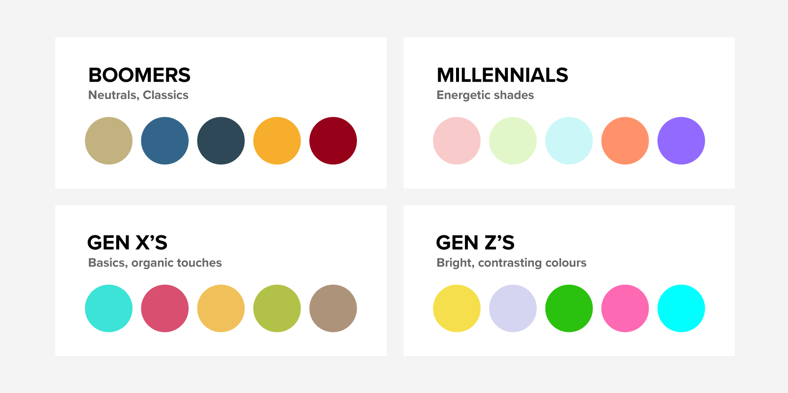
Colour psychology influences your audience in many ways. Brighter colours typically do better than darker colours, but too many bright colours can create a sense of chaos and confusion. Use too many dark or muted colours and your design may come across as dull or boring. Blue is often the most used among brands because it communicates trust, calmness, and is universally liked by all age groups. Whereas yellow is perceived as cheap, avoided in health industries, and preferred by youth. If you’re noticing a certain trend with competitor ads, like using a specific colour or style, try switching it up. That’s how you’ll turn heads.
Create a sense of order with a colour hierarchy
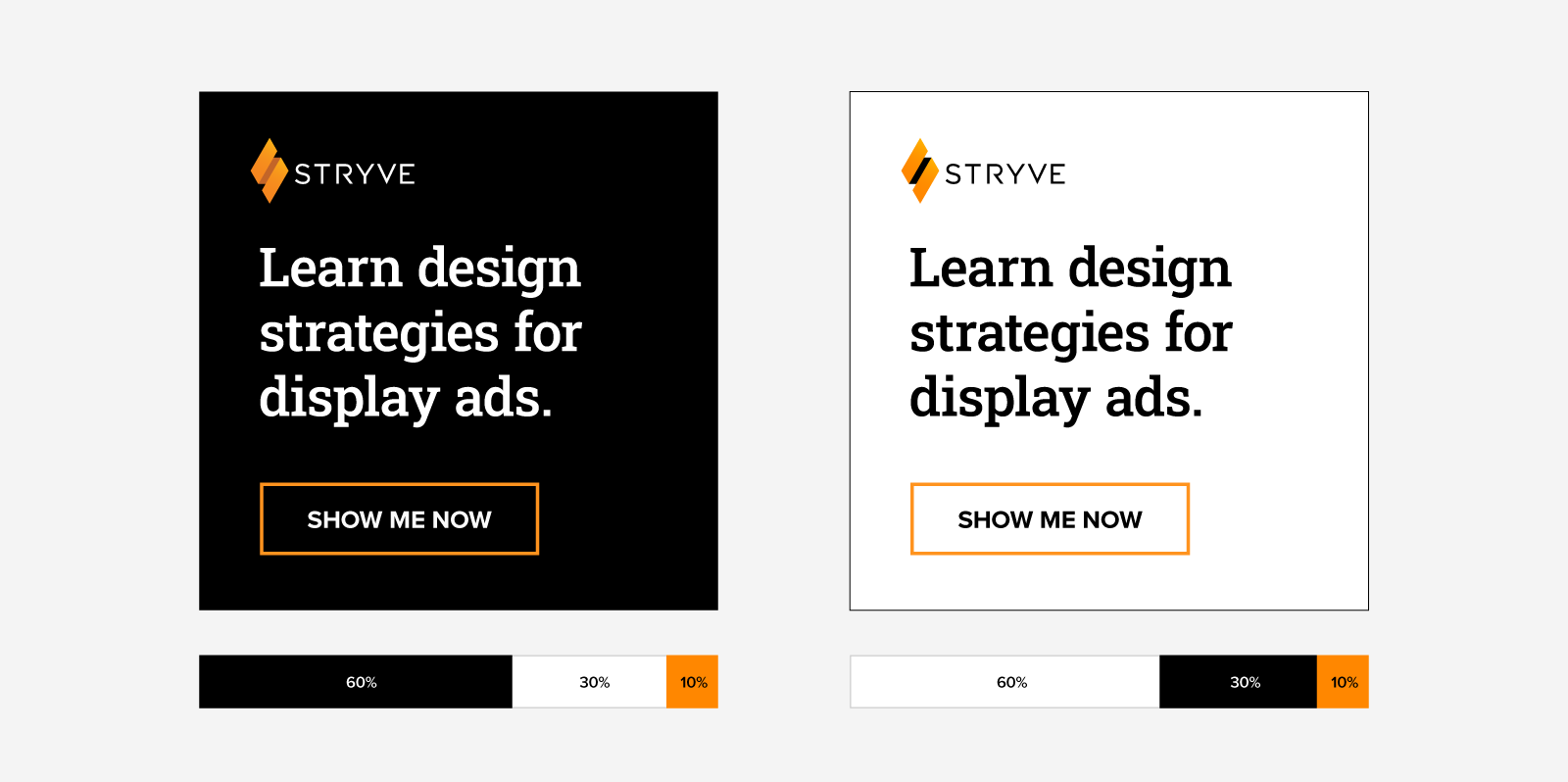
No matter the colours you’re working with, a trick you can use is the 60-30-10 rule. This rule helps create balance in your ad.
- 60: When you choose a new colour palette, 60% of your palette will be dedicated to that principal colour in the ad. This could be your brand colour or a neutral like white or black.
- 30: Your secondary colour, or complimentary colour, will be 30% of your palette. It’s used to support your main colour and provide contrast and interest.
- 10: The remaining 10% will be used as an accent colour for items like a CTA button or graphical elements.
Remember, the 60-30-10 rule is just a guideline—not a strict rule. Don’t be afraid to change things up by experimenting with different proportions and adding additional colours if needed.
Keep accessibility top of mind
Colour and contrast are very important. This is especially true for accessibility. Approximately 4.5% of the world’s population is colour-blind. That may not seem like a large number, but in terms of population, that’s more than 350 million people. Try this simple tool to help ensure your colours provide the best contrast
2. Source meaningful photography that’s balanced and versatile
As a professional service firm, photography poses a challenge when you don’t have physical products to showcase. It’s not impossible to create a visually engaging service-based ad, it just requires a different approach. A thoughtfully chosen photo that compliments your message can create an emotional impact and help your ad stand out.
Choose impactful photography
So what’s an impactful photo? Make sure the photo you choose is clear and interesting. Avoid photos that are blurry, excessively filtered, or visually skewed. Photography sites like Unsplash or Pexels can be great free resources to find photography that can be a little more unique than standard stock sites like iStock. It’s important to be mindful of the photos you choose. They should help support your message.
Ask yourself the following:
- Does the photography reinforce the text accompanying the ad?
- Can my target audience see themselves within the photograph? Is it relatable to them?
- Is the photography distinct for my brand or has it been used widely within the industry?
- Does the photography showcase our brand’s personality?
- What feelings does the photography evoke? Is that in line with our message?
- Is the photography high quality, high resolution and can we manipulate it to further suit our needs?
- Would the photography translate well across a variety of display ad sizes and dimensions?
Consider universal design principles when choosing photography
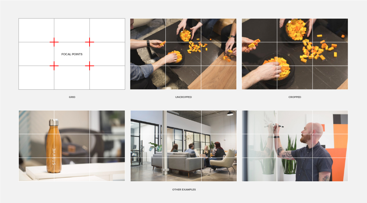
When sourcing photography, keep the rule of thirds technique in mind. It’s an easy way to take average-looking photos and make them more pleasing to the eye. Simply divide your ad into a grid that makes nine squares. Then place key elements in your photo along the gridlines or focal points. This technique can bring balance to your photography which improves the overall ad.
3. Leverage social proof to showcase the quality of your service
What better way to visualize your expert offering than with a testimonial? Leveraging testimonials is an effective way to build trust, credibility, and social proof for your service-based company.
Showcase faces in your testimonial ads
From a photo perspective, faces naturally draw our attention. A University of Salento study even showed that ads with faces are more memorable and preferred. When presented with an ad, having imagery of people or faces will often help engagement because it helps humanize your message. It’s why you’ll notice many YouTube thumbnails with faces. By putting a real face to the testimonial, it reinforces that a real person is behind the positive review.
Legitimize the testimonial with details
The more details you include about the “testimonial giver”, the more authentic and credible you come across. So, include the name, photo, and any relevant information about the customer providing the testimonial. If applicable, also include the customer’s job title, company name, or location to establish further trust.
Depending on the design of your ad, you can present the testimonials as text overlays, callout boxes, or even integrated into graphics or images. Ensure that the testimonial text is easy to read and stands out from the rest of the ad’s content.

4. Hone in on your typography and messaging
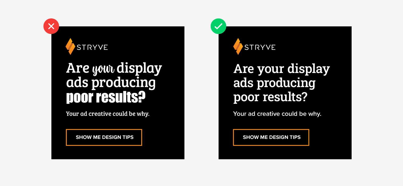
Legible typography is a crucial factor in an effective display ad. It helps guide the viewers’ attention and effectively communicates your message. A display ad can look visually engaging, but if your message is hard to read or long-winded, don’t expect many clicks.
Keep it short and sweet
Marketers often make the mistake of saying too much. The more copy your ad has, the more effort is required to read it. Keep your headlines to 1-3 lines and 2-4 words per line for easy reading. If your ad requires additional subtext try to keep it to 1-3 lines. You have a limited amount of time to convey your message so do it in the clearest and quickest way possible. Also, consider the fact that your text will appear very small in certain ad sizes.
Keep your text alignment left
Left alignment follows the natural reading pattern of left-to-right. When all your text is flushed left, it provides a consistent starting point for each line of text creating a clean and organized look.
Keep your text sentence case or title case
For easier reading, avoid using uppercase for your headlines and subtext, especially for long sentences. Uppercase has less visual contrast between letters making it harder to read for users. Uppercase also communicates a sense of intensity and feels less approachable. That’s not to say uppercase can’t be effective, just something to keep in mind when thinking about the tone of your display ad. THIS IS A LOT HARDER TO READ BECAUSE THE LETTERS AREN’T DISTINGUISHED AND IT ALSO FEELS LIKE I AM YELLING AT YOU.
Keep fonts to a minimum
Lastly, when you’re choosing fonts, It’s best to stick to 1-2 fonts max! The more fonts you use, the more chaotic and confusing your ad will look. Be sure that the fonts you choose don’t compete for attention. If your fonts are competing for attention then that can further dilute the key message. Similar to choosing colours, fonts should complement one another. If you’re unsure about pairing fonts, fontpair.co is a handy resource that can help.
5. Apply motion to add intrigue
As humans, our brains are wired to notice movement as a survival instinct. Although we no longer rely on hunting for our food or need to avoid dangerous predators in nature, noticing movement is still very much hardwired in our brains. Even the simplest of designs with movement can drive more engagement for your ads. According to a 2023 survey, 87% of marketers claim that using animations enhanced traffic to their websites.
If the word animation is making you nervous, don’t worry. Adding animation can be subtle. With intuitive platforms like Creatopy, creating animated ads can be easier than you think. Animation can be as simple as having a few elements in motion for a few seconds.
Animation also allows you to pack more information into the same amount of space as a static image. Instead of a static ad covered in text, you can tell a story and make your content more digestible for viewers. Animation also plays on our desire to want to see things to the end which helps keep your audience engaged.
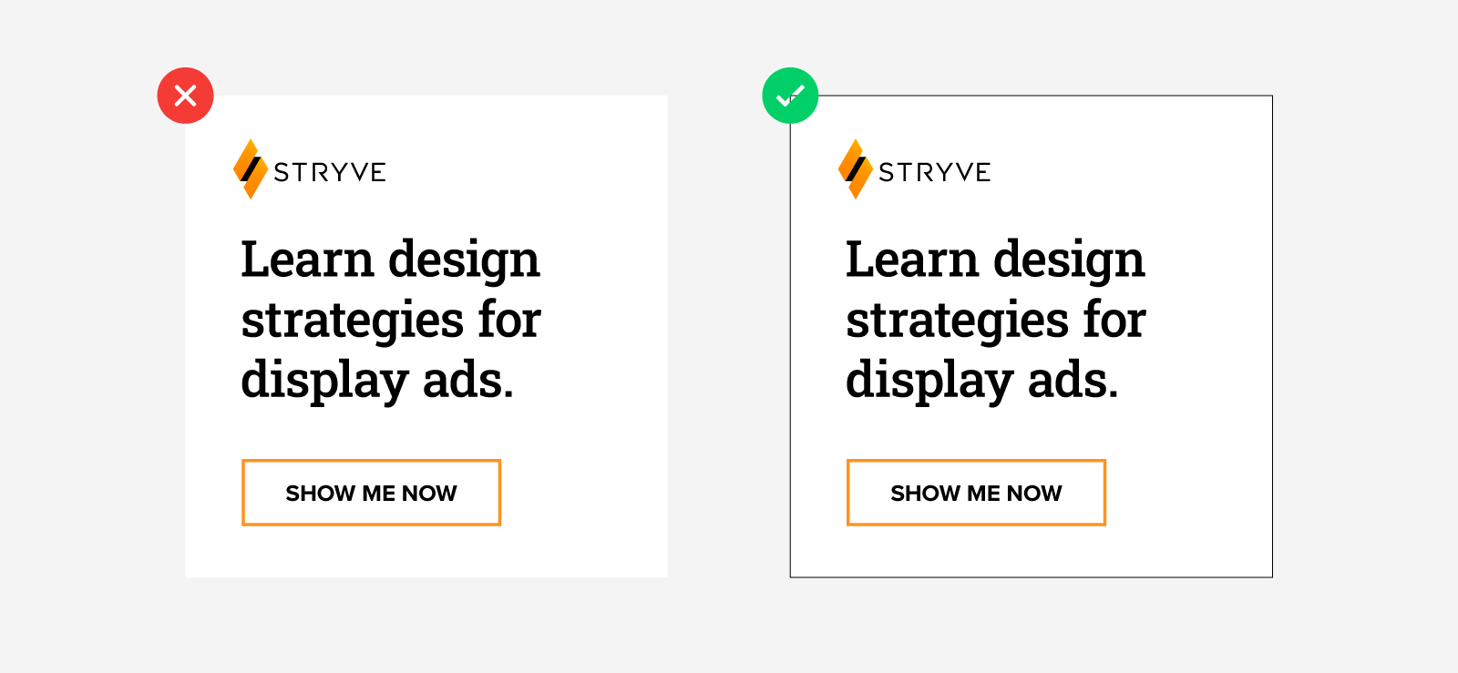
6. Add a border to frame your ad
It’s always a good idea to add a frame around your ads. This is especially true if your ad is white or uses lighter or muted colours. Humans are naturally drawn to photos in boxes because it provides a sense of organization and structure. Borders provide a clear visual distinction between the ad and the surrounding content on a webpage. Since you won’t always know the context in which a display ad is being shown, adding a border is an extra measure to ensure your ad contrasts with the background colors of where it’s being placed.
7. Experiment with CTA buttons
While it may seem like a simple element, CTA buttons are important visual cues for users that help encourage users to click your ad. But there’s more to a button than just adding a rectangle with some text. The shape, size, colour, and text all play a part.
Play with button shapes
Simply rounding the corners of a button can impact engagement. How? Buttons with rounded corners are easier on the eyes and require less effort to visually process. They also communicate a sense of trust and warmth which makes them appear more approachable. That being said if your brand is more modern or classic, a rounded button may not be the right choice.
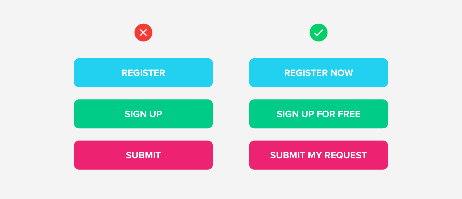
Make the CTA text feel persuasive
Above all, the most important factor for buttons is the text. Buttons with a strong command verb are more direct and tell the user what to do. If your ad is about registering for a webinar, use “Register Now” instead of “Register.” Just adding one word can dramatically increase your click percentage. Another thing to consider is to make your button text personalized. A study by Verve showed that changing button text from second person (“Reserve your seat”) to first person (Reserve my seat”) resulted in a 90% increase in clicks. For quick reading, try to keep your button text to 2-5 words.
Put it all together and elevate your advertising game
While creating ads for professional service firms presents its own unique set of challenges, regardless of your offering, a great-looking ad needs to adhere to web design best practices and universal design principles. With these design strategies, hopefully tackling ads for professional services feels less intimidating!
If you’re still not seeing results, or looking for more expertise on how to reach new markets, we can help you with your next digital campaign.


