How to create an effective infographic
By: Brent Morrison
June 14, 2013 | Reading Time: 4 mins
First off, what exactly is an infographic? An infographic is an image containing graphics and text that visually explains large amounts of data in a creative way. I’m sure you’ve seen them popping up all over social media in the last couple of years with their increasingly growing popularity. Brands and businesses especially have been taking full advantage of this new social media marketing trend. It’s a great medium to tell a story to consumers in a compact manner and is easily shareable.
Information is very powerful but when it’s bland and boring the message becomes lost, especially in this day and age where we are exposed to so much information. An infographic can take any kind of dry data and channel it into an informative and beautiful piece of art. So how does one go about creating an effective infographic? Here are some simple guidelines to ensure your infographic is just as big as its data.
Key Parts of an Infographic
- Visual – Colour Scheme, Graphics, Reference Icons, Fonts
- Content – Time Frames, Statistics, References
- Knowledge – Facts, Research
Wireframe & Flowcharts
An architect wouldn’t start building a skyscraper without planning and designing it first right? Infographics can be quite complex, and thus laying it out with arrows, grouping relevant data together, and visualizing the flow of information using flowcharts is key. Much like a website, planning your course of action will be very helpful to make your infographic effective.
Developing a Colour Scheme
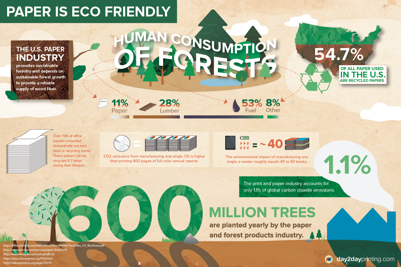
Having an attractive colour palette can be just as important as the information you’re trying to show off. The colours should tie in with the theme of your infographic and compliment the overall design. For example, if your infographic is about being eco-friendly, you might want to use shades of green and earth tones. Categorizing or colour coding your information is another great use of colour as readers can become quickly confused with complex infographics.
Use of Graphics
There are two types of graphics in an infographic: themed graphics and reference graphics. Themed graphics define the overall visual of the design and are usually always included in the infographic unless it’s more of a static design. For example, if you’re creating an infographic on the auto industry you could include graphics of cars, tire tread, speedometers or auto parts. Reference graphics are essentially icons that help as visual pointers for the viewer, especially when you have a lot of data. Icons can be used to indicate important information, group data together and make numerous references using the same instance. They make understanding the information easier by categorizing elements and directing the eye to key areas. They are not necessarily required in the design but definitely help direct the flow of information and keep things organized.
Research and Data
The most important element of your infographic is that your information is accurate. Make sure your data is thoroughly researched and can be backed up with facts. Especially from a brand perspective, having data that is accurate and relevant will define the credibility of your infographic. Another key element to keep in mind is your demographic. Who will be using your infographic? Where will it be shown? For example, if your infographic is primarily directed towards international students with multiple languages, using far more visuals and less text will be a more effective strategy. Depending on your chosen demographic, you must make sure it is reflected in your infographic’s colour scheme, icons, knowledge, and complexity.
Hierarchy of Information
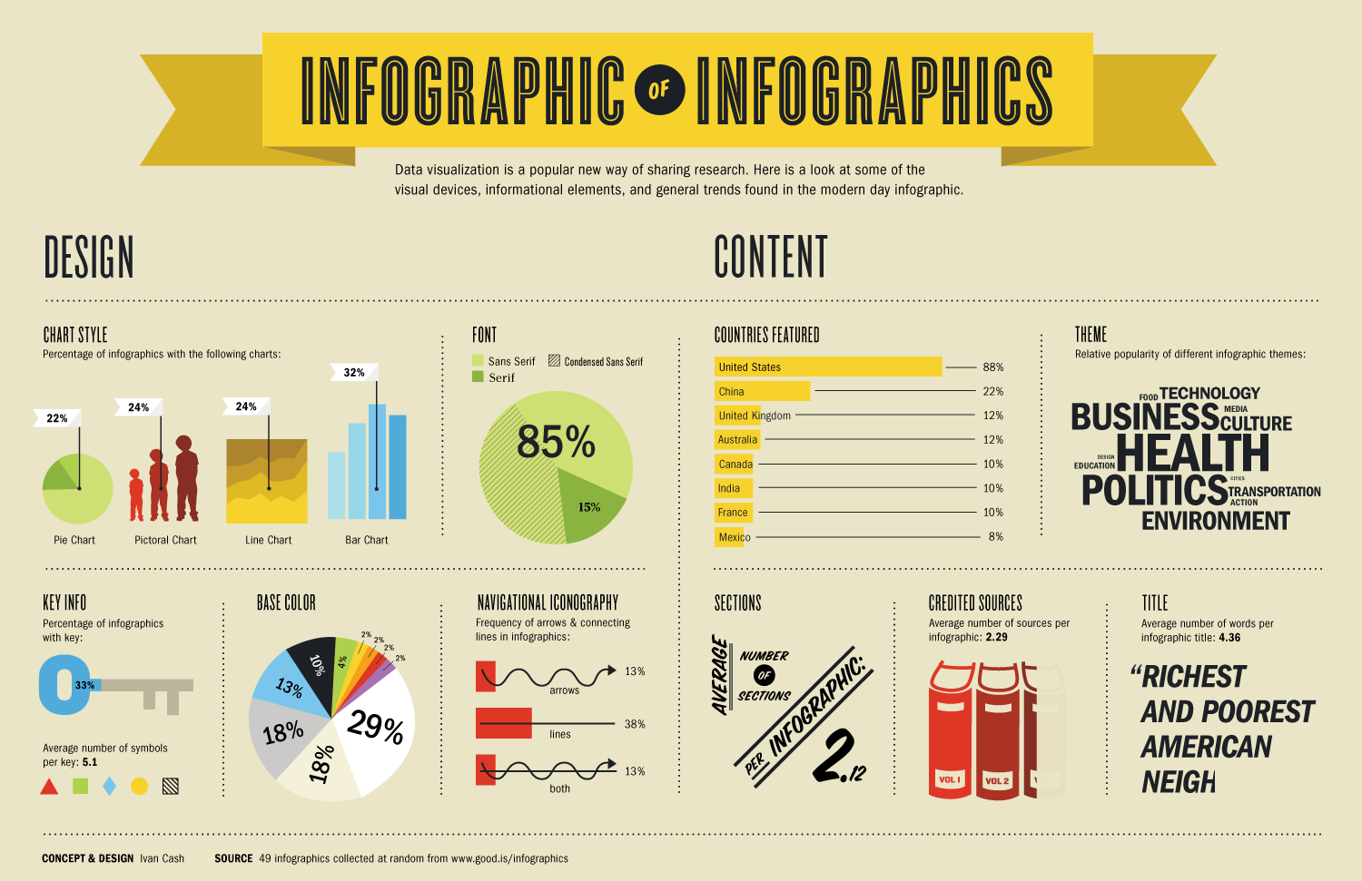
Depending on how you lay your infographic out–left to right, top to bottom, or center to outside–it’s important to understand the importance of hierarchy. A great infographic has multiple hierarchy levels. At first glance, the reader should understand an overall message but upon further inspection, the infographic should show a story in greater detail. If your infographic is horizontal, the left and right are your starting and ending points of a viewer’s opinion or thoughts. With a more concentric design, it would make sense to have the most important data in the middle. An infographic should have one single strong visual that will capture the reader’s attention and then have supporting background information to add depth.
At the end of the day, a great infographic tells a story that is impactful and has a strong takeaway. It should highlight key content in an attractive manner and not confuse the viewer, which can be easy especially with a lot of data. Look at it from your audience’s perspective: does your infographic tell its story competently? Is it informative and accurate? Does it grab your attention? If you answered yes to all of these then it’s time to share!
