Google+ redesign adds a fresh look and new features
By: Brent Morrison
May 31, 2013 | Reading Time: 4 mins
When Google+ was first introduced roughly two years ago, I was eager to see how it would compare to Facebook, the king of social media. What new features would it introduce? Would people use it? Would Facebook become another MySpace and lose its crown? But what I was most interested in was what would it look like? To my disappointment I found my first encounter with Google+ to be rather dull and boring. With its bleak grey interface, outdated looking icons, and cumbersome layout, it felt more like Google Minus. I mean this is Google we’re talking about – a company known for their creativity and innovation over the years. Not only have they created a dominant search engine and web browser amongst the online world, but they are also a leading competitor in the mobile wars for their Android operating software. Well, two years later I’ve been intrigued once again with the announcement of a redesign.[/intro]
The Google+ redesign includes new features and adds a fresh look that puts imagery front and center. The size of cover photos has increased once again, taking up the full half of the screen above the fold. Photos and videos will spread across multiple columns as they do on mobile devices and the overall look is clean and slick. Google has launched 41 new features for Google+ which include a completely overhauled Photo product, Hangouts app, and an improved stream experience.
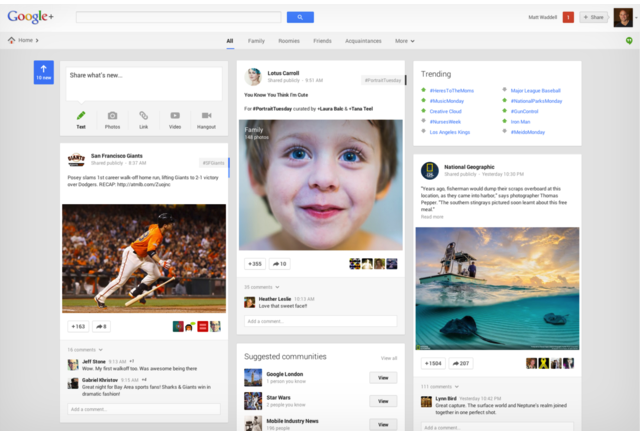
Jumping right in, the first change you’ll notice is the upgrade to a three-column treatment to the stream. Steering away from the single-column approach that Twitter and Facebook uses, the multi-column design lets you scan items faster, rather than scrolling endlessly to interact with something. This is handy for those times when you’re trying to track down a post you saw earlier that day or just tired of endless scrolling. Another feature you’ll notice about the stream is that sections of your content will stand out better with the introduction of interactive “Cards.” Basically, if you’re a user of Pinterest you’ll feel right at home. In addition to “Cards,” Google+ will now add hashtags to your posts. When you click the hashtag, the “card” will flip around where you can see other similar content. Hashtags that are greyed out are ones automatically assigned by Google, however, blue ones are hashtags added by the sharer themselves.
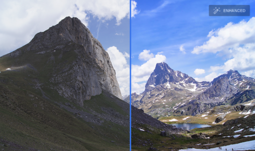
A couple of really cool features are the “Auto Enhance” and “Auto Awesome.” Auto Enhance improves the quality of your photos by analyzing and applying tweaks to elements such as brightness, contrast, and saturation. This is great if you don’t want to be bothered manually editing photos before posting them especially if you have a bunch.
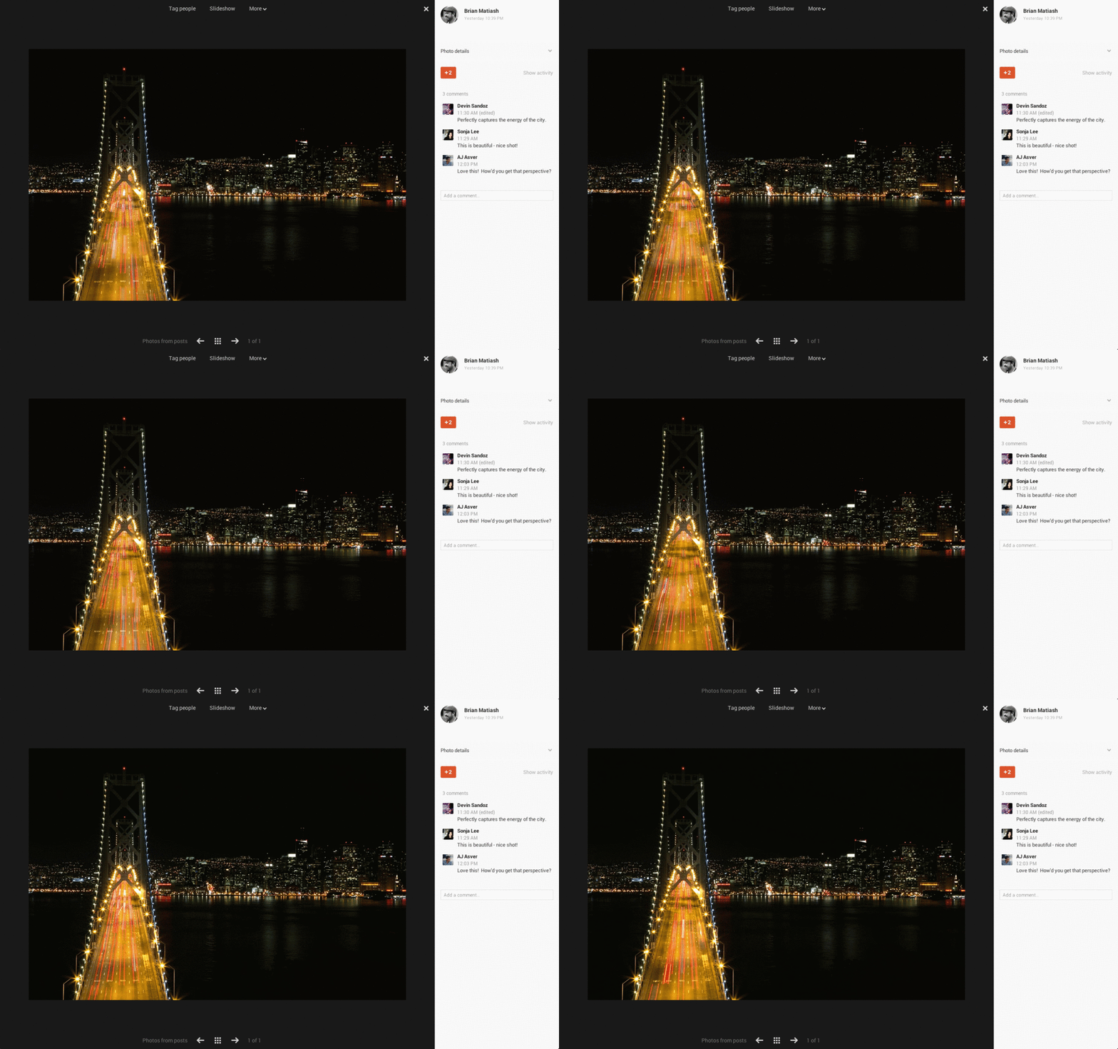
The Auto Awesome feature creates a new image from something that didn’t exist. So what does that exactly mean? For example, if you upload a series of similar photos taken in a short period of time, Google will make an animated GIF from them. If you upload a set of group shots, Auto Awesome will stitch together a single picture so that everyone is smiling. On top of these photo features, Google+ will also pick out your best photos you’ve uploaded. Say for example you just got home from a vacation and you want to upload some of your photos to share with others. A very tedious and painful task especially when you have to filter through 500 photos and delete duplicates, blurry photos, and underexposed shots. Using algorithms, a feature called “Auto Highlight,” Google+ will do just that by choosing the “best” photos to show off.
I think the Google+ redesign has definitely made an improvement from its original debut. It’s easier on the eyes, incorporates useful new tools especially in the photo category, and makes the overall experience more convenient. For those of you who are not Google+ users currently, I’m not sure if these new improvements will make you rush to your nearest web browser and create an account, but it’s definitely worth checking out. I will admit I’m not an avid Google+ user, but with an improved look, cool new features, and its increasingly growing popularity, Google+ has once again intrigued my interest. What are your thoughts on new Google+? Are you intrigued?
