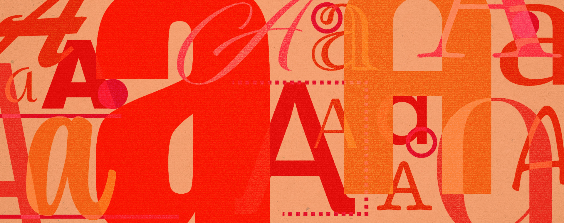
The transformation of typography: From print to digital
Typography isn’t just about picking a cool font—it’s the backbone of design. It shapes how we read, feel, and connect with ideas. But getting here took centuries of innovation, from hand-drawn manuscripts to the digital tools we use today.
In this blog, we’re diving into the wild history of typography—from Gutenberg’s printing press to web fonts and variable type. Because knowing where it all started makes the tools we have now even more powerful.
The origins of type: from manuscripts to movable type
Handwritten beginnings
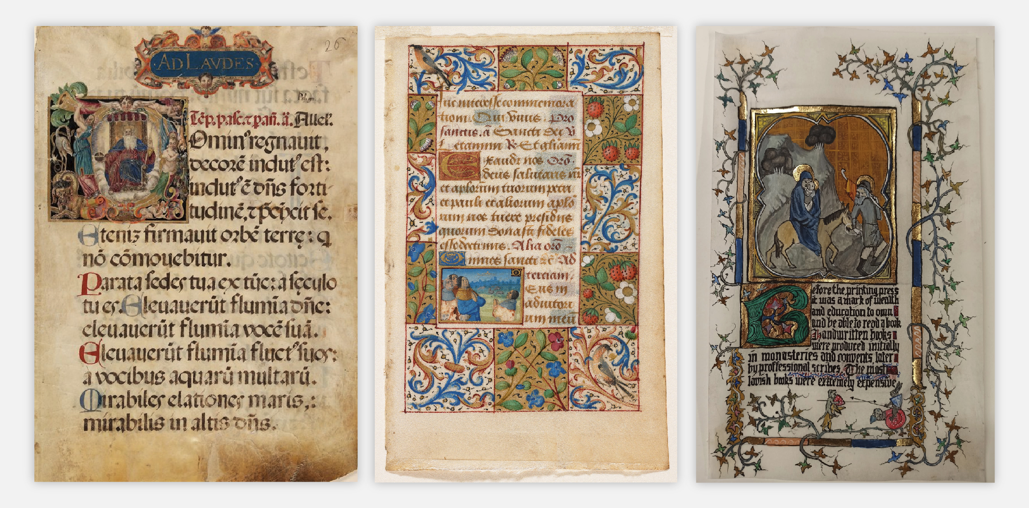
Typography’s origins can be traced back to the Middle Ages, where monks and scribes spent their days hunched over parchment, carefully crafting handwritten manuscripts. The illuminated manuscripts of this period were not just functional texts but also artistic masterpieces, full of vibrant illustrations, elaborate borders, and shiny gold leaf. The intricately detailed paintings played a crucial role in bringing the text to life, serving as both decoration and a visual aid to convey its meaning.
Since literacy wasn’t exactly booming back then, these illustrations weren’t just for show—they helped people understand what was written. Basically, they were the original infographics.
These manuscripts act as a reminder to graphic designers about how typography can merge artistry with communication. Each letter was expertly crafted, emphasizing the importance of detail and creativity.
The invention of moveable type – The Gutenberg press
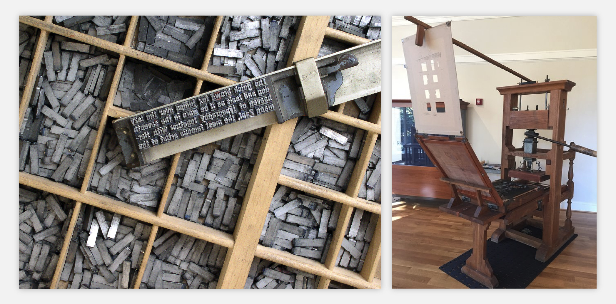
The invention of moveable type in the 15th century by goldsmith Johannes Gutenberg was a groundbreaking advancement that started the printing revolution. He invented the Gutenberg Press that introduced the ability to produce multiple copies of text, transforming how information was shared and consumed. The moveable type printing press could crank out 3,600 pages a day.
For perspective, scribes could barely manage 40. The first big project? A set of 200 Latin Bibles in 1455—a process that still took three years but, hey, progress. By 1500, half a million books existed, and suddenly, knowledge wasn’t just for monks and the elite.
Moveable type involved arranging individual metal letters by hand that could be re-used, enabling mass production. With the creation of his own oil-based ink, which transferred from his metal type to the printing substrate better than the water-based ink that was being used by other printers, he was able to print at a much greater rate. Gutenberg’s work laid the foundation of typographic standards and consistency.
The standardization of typefaces
As printing evolved, so did the need for standardization of typefaces. In order to save space, letters were often italic and squished together. People quickly realized that squished, italicized letters weren’t exactly easy to read.
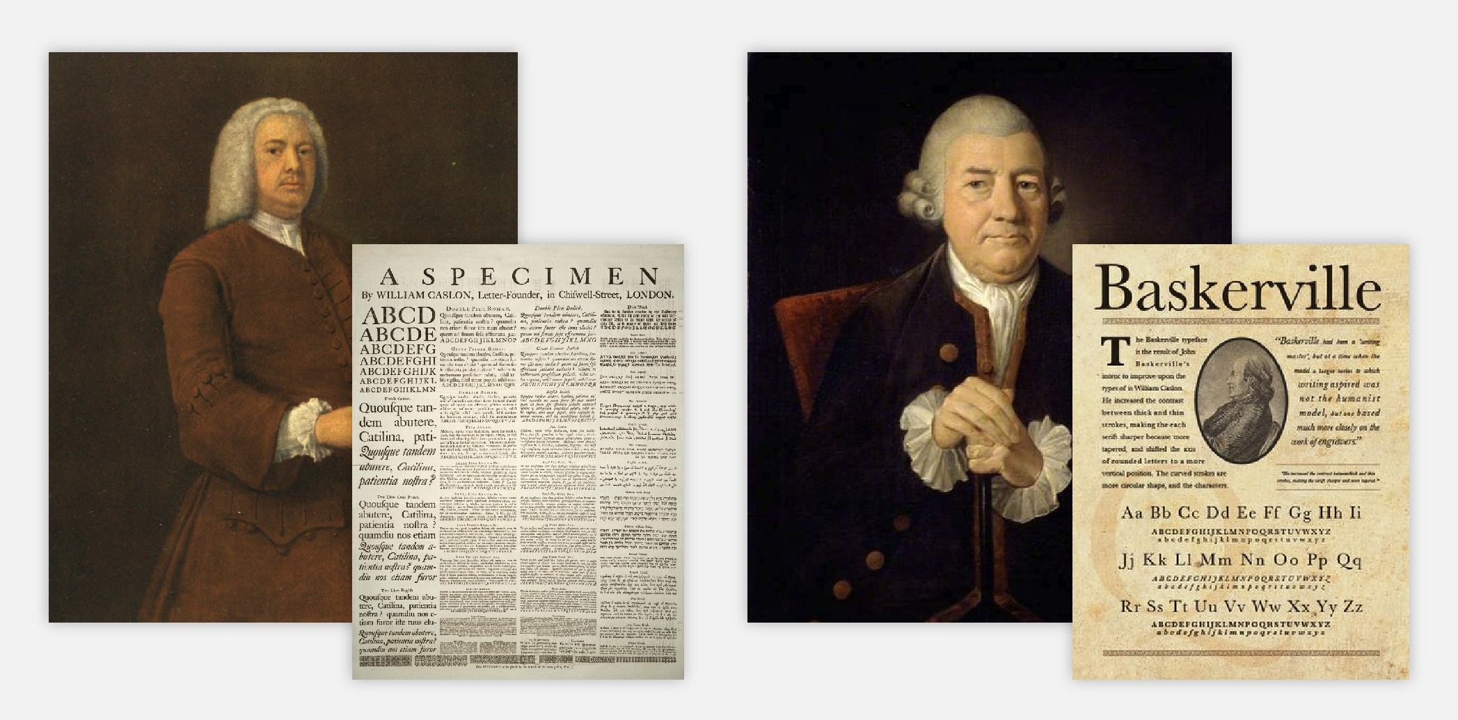
In 1734, William Caslon revolutionized typography with the creation of a typeface that introduced greater contrast between strokes, improving clarity and legibility. Known today as “Old Style” type, this design gained instant popularity and was used in significant printed works, including the first printed version of the United States Declaration of Independence.
Then, in 1757, John Baskerville came along and made things even bolder—literally. His typefaces were darker, sharper, and so dramatic that critics claimed they’d “blind the nation.” Despite the initial backlash, Baskerville’s work was rediscovered in the 20th century and is now celebrated as a key bridge between Old Style and Modern type design.
For today’s designers, this era is a reminder that great typography isn’t just about looking pretty—it’s about clarity, functionality, and, apparently, avoiding mass vision loss.
Typography in the Industrial Era
Mass production
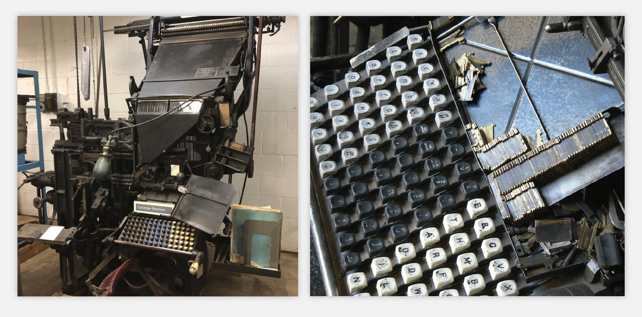
The Industrial Revolution brought mechanical innovations like the Linotype machine, which was a key advancement that revolutionized how type was produced. This machine automated the labour-intensive process of setting type, allowing for more efficient production.
Invented by Ottmar Mergenthaler (a German watchmaker who apparently decided clocks weren’t challenging enough), the Linotype machine let operators type out entire lines of text at once. Here’s how it worked: Press a key, and a tiny brass mold for that letter dropped into place. Once the line was set, molten lead was poured in, forming a single metal slug. These slugs were then arranged for printing, while the machine automatically sorted and reset the molds for the next batch. No more painstakingly placing individual letters by hand.
Whitelaw Reid, publisher of the New-York Tribune, supported the development of the Linotype machine as one of its key financial backers. Thanks to his involvement, the New-York Tribune became the first newspaper to test the Linotype in 1886. Within a few years, the paper published the machine’s success, prompting other newspapers to adopt the technology. The Linotype revolutionized the newspaper industry by speeding up the typesetting process. This innovation made newspapers more efficient and affordable to produce, allowing them to meet the growing demand of the public.
Advertising and display typography
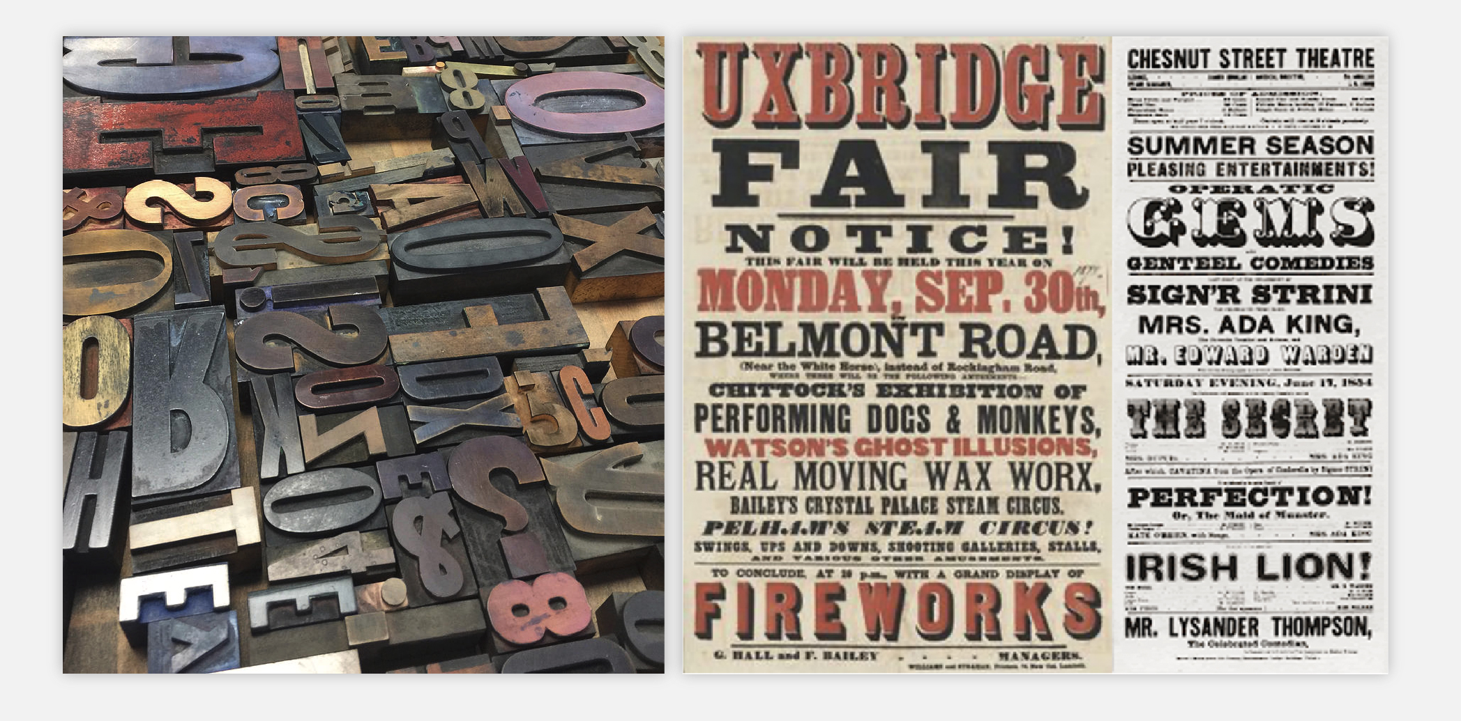
The rise of advertising in the 19th century created a huge demand for bold and eye-catching typefaces. Enter display type, the loud, dramatic, in-your-face fonts designed to turn heads on posters, billboards, and packaging.
Woodblock typefaces became especially popular because their sturdy construction allowed for intricate and highly detailed designs. The painstaking manual carving process meant businesses could customize their typography, making their brand stand out in a sea of competitors. Think of it as the 1800s version of a killer logo font. The wood’s durability made it ideal for repeated use in printing, especially for large-scale campaigns. Compared to metal type, woodblock printing was also more affordable for creating large letters.
Woodblock typefaces are a source of inspiration for creating bold, impactful designs. They demonstrate the importance of scale, contrast and artistic flair in typography, elements that remain crucial in design for branding and advertising.
The birth of digital typography
The transition to phototypesetting
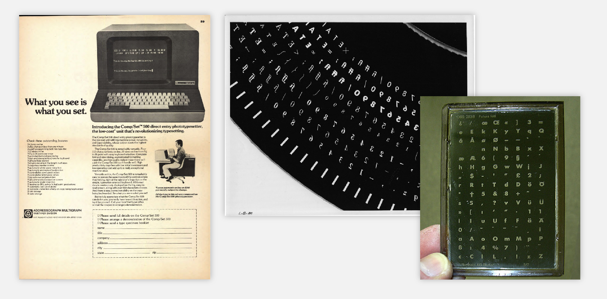
In 1946, Louis Marius Moyroud and René Higonnet decided metal and wood type were so last century and introduced phototypesetting—a game-changer in typography. Instead of casting chunky metal or wood letters, this process used a photographic process, allowing text to be composed on film or paper.
The phototypesetter operated by projecting light through a film negative of an individual character from a specific font. This light was then passed through a lens system, which allowed the operator to adjust the size of the character by magnifying or reducing it. The adjusted image was projected onto photographic paper, where the text would appear in sharp detail.
Designers could now manipulate type with greater precision, and experiment with size, style, and spacing in ways that were previously impossible. The flexibility of phototypesetting allowed designers to integrate text and images more seamlessly, paving the way for more dynamic and complex layouts. This era expanded the creative possibilities of typography, bridging the gap between traditional methods and digital innovations.
First steps into digital
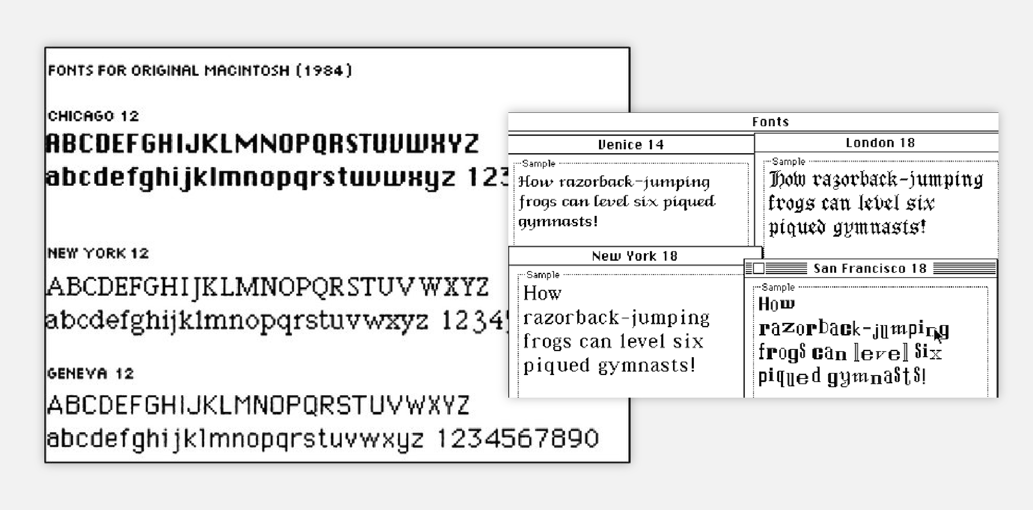
The late 20th century was like the awkward teenage phase of typography. Computers had just entered the market, and suddenly, fonts weren’t just printed—they were glowing on screens. Enter bitmap fonts—tiny grids of pixels.
While very pixelated by today’s standards, bitmap fonts represented a significant breakthrough in adapting typography for screens. Bitmap fonts were designed to function within the limited resolutions of early computer monitors, focusing on legibility rather than aesthetics. Each character was essentially a small pixel map, carefully crafted to maintain clarity even at low resolutions.
An example of early digital typography was the Macintosh system font, which came preloaded on the original Macintosh computer released in 1984. This font demonstrated the potential of type customized specifically for screen use.
But let’s not sugarcoat it—early digital typography had issues. Limited resolution, barely any font choices, and zero tools for fine-tuning meant designers had to get (more) creative. Still, this was the start of a new era—one where typography was no longer just ink on paper but alive on screens, ready to evolve.
 origins
Scalable fonts and vector technology
The introduction of scalable fonts and vector technology marked a revolutionary shift in typography, enabling type to adapt to different sizes and resolutions without loss of quality. Unlike bitmap fonts, which were composed of pixel grids and were prone to distortion, vector fonts use mathematical equations to define the shape of letters. This innovation, introduced by formats like PostScript and TrueType, gave designers complete control over typography! Fonts could now be scaled infinitely, maintaining the sharpness and clarity across print and digital mediums.
PostScript, developed by Adobe, revolutionized the professional design industry by enabling precise rendering of text and graphics for high-quality printing. However, in 2022, Adobe discontinued support for PostScript Type 1 fonts, as most modern browsers and operating systems no longer recognized them. They have since been replaced by OpenType fonts, which offer greater compatibility and versatility. TrueType, introduced by Apple and later adopted by Microsoft, brought scalable fonts to everyday users, making them a standard for digital.
These technologies also empowered designers to customize typefaces, adjust kerning, tracking, and leading with precision, and seamlessly integrate text into dynamic layouts. Scalable fonts paved the way for more modern digital typography, setting the stage for web-safe fonts, responsive design, and variable font technologies.
Typography in the digital age
Web typography
Back in the dark ages of the internet, web typography was not exciting. Designers had three-ish choices—Arial, Times New Roman, and Verdana. If you wanted to get fancy? Too bad. Your font choices were limited to whatever was pre-installed on a user’s computer. This made branding a nightmare. However, the arrival of web font services like Google Fonts and Adobe Fonts revolutionized digital typography. These platforms provided access to thousands of typefaces, enabling designers to craft visually engaging websites.
There are many fonts that are great options for web, and the best font depends on the purpose of the website and the target audience. However, some popular fonts for websites include:
- Helvetica: a sans-serif known for its clean and simple design
- Arial: similar to Helvetica, professional but more informal
- Georgia: a serif font that is known for its classic and elegant appearance
- Tahoma: a sans-serif similar to Arial but it is wider and has more space between the letters
- Roboto: a sans serif font that is modern and versatile.
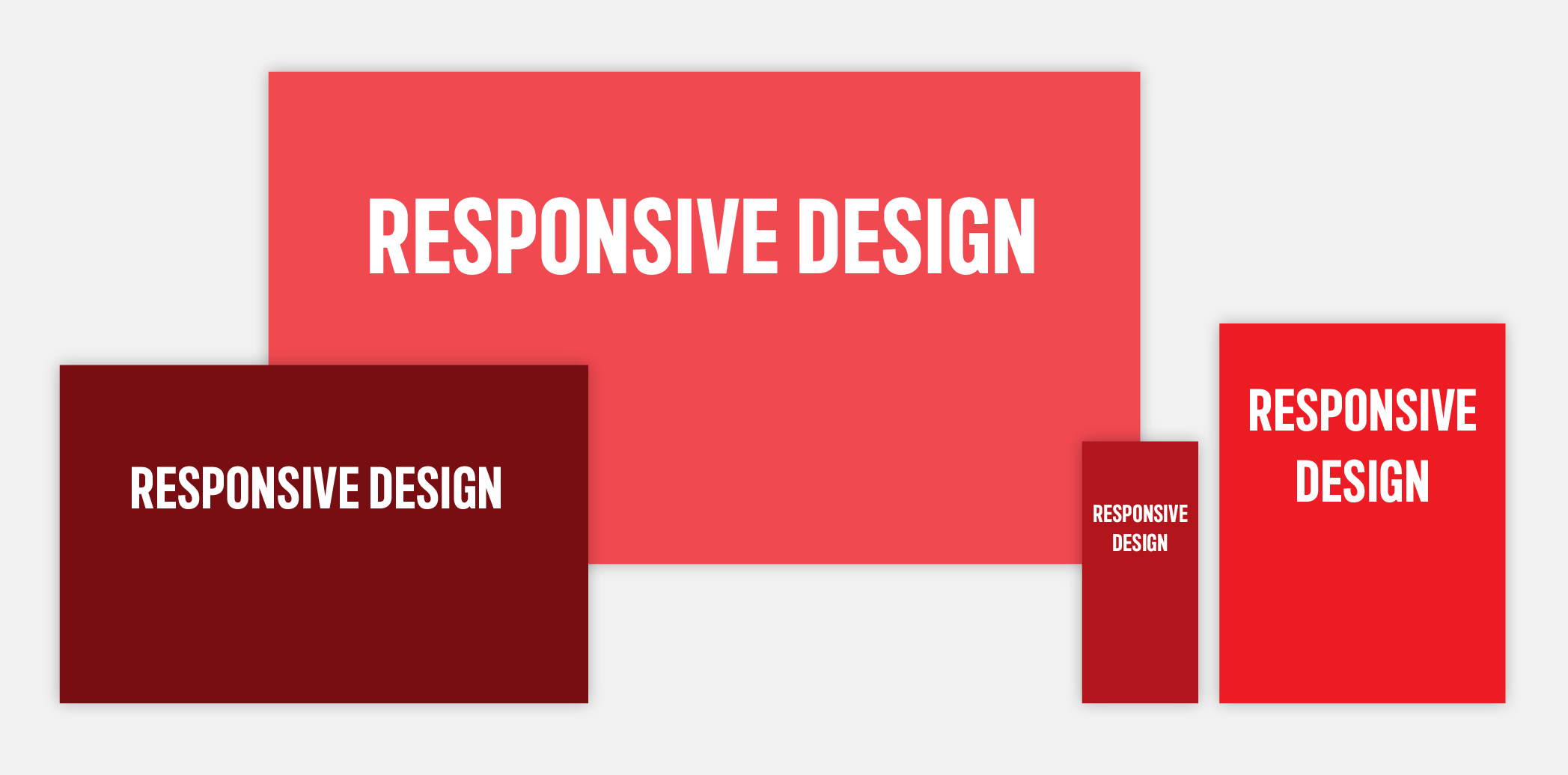
Responsive design: Websites are no longer just on desktops
Then came smartphones, and with them, a giant headache—how do you make text look good on everything from a massive monitor to a tiny phone screen? Unlike the static demands of print design, digital typography required flexibility to ensure that text remained legible, visually appealing, and functional on everything from tiny smartphone screens (these weren’t your modern day iPhones) to desktop monitors.
Responsive design required designers to think beyond fixed dimensions, creating type systems that could dynamically adjust to fit the needs of various devices. Techniques like fluid typography, where font sizes scale proportionally based on screen dimensions, became essential for maintaining both legibility and visual hierarchy. For example, large headings that dominate desktop screens might need to scale down on a mobile device to avoid overwhelming the layout.
Accessibility also became extremely important in modern typography in the digital age. Designers were tasked with creating type systems that were not only visually effective but also inclusive. This included considerations like font choices that accommodate readers with visual impairments, sufficient contrast between text and background, and support for dynamic text resizing to meet user preferences.
Responsive and accessible type systems became fundamental to creating user-friendly digital experiences, allowing designers to craft interfaces that were not only visually compelling but also intuitive and functional for diverse audiences.
The role of variable fonts
Variable fonts, introduced with the OpenType 1.8 standard, mark a groundbreaking advancement in digital typography. Unlike traditional fonts, which require separate files for each weight, style, or width, variable fonts consolidate all these variations into a single file. This innovation offers several benefits: it simplifies workflows, reduces file sizes, and significantly enhances website performance by minimizing the number of font files that need to be loaded.
Beyond efficiency, variable fonts provide designers with extreme flexibility. Designers can seamlessly adjust a wide range of attributes, including weight, width, slant, and even optical size, allowing for more dynamic typographic choices without the need for multiple font files. This capability is especially useful for responsive web design, where font adjustments are necessary to ensure legibility across different screen sizes and devices.
With their ability to adapt to various design needs and optimize performance, variable fonts represent a powerful tool for modern designers, offering both creative freedom and technical efficiency.
The future of typography
As we continue to navigate the digital world, the future of typography promises to be as innovative and transformative as its past.
Typography and sustainability
As sustainability becomes an increasingly pressing issue, typography is stepping up to help reduce the environmental impact of both digital and print media. Designers are turning to eco-friendly fonts that not only reduce ink and toner usage but also contribute to more sustainable large-scale print projects.
Examples of such fonts include:
- Ecofont Sans – features holes in the letters to minimize ink usage
- Ryman Eco – consumes about 33% less ink than traditional fonts
- Century Gothic – with its thin lines and taller lowercase letters, it uses less ink overall
Designers are also considering how fonts impact energy consumption. For instance, heavier fonts with intricate details can demand more processing power, thus increasing a website or app’s carbon footprint.
When selecting fonts, designers should keep a few key factors in mind:
- Font weights and complexity – lighter fonts with simpler designs require less power, helping to lower energy consumption
- System fonts vs. custom fonts – system fonts are pre-loaded and do not need additional resources to be downloaded
- Variable fonts – these versatile fonts allow multiple variations within a single file, reducing the number of files needed and lowering energy consumption overall
By making thoughtful font choices, designers can play an active role in reducing environmental impact while maintaining design quality.
Augmented and virtual reality typography
As AR and VR technologies continue to gain momentum, typography is expanding into three-dimensional spaces, transforming how information is communicated in immersive environments. In these dynamic settings, typefaces must do more than convey information—they need to seamlessly integrate into the user’s experience, becoming a part of the virtual world.
This shift brings both exciting opportunities and unique challenges for designers. For instance, typefaces must remain legible and visually appealing from multiple angles and distances, adapting to the fluid nature of 3D environments. Designers also need to consider how users interact with type in real-time, ensuring the experience is intuitive and engaging.
Above all, clarity and usability must remain top priorities, especially when catering to a diverse audience. Designers are tasked with crafting type that balance aesthetics with functionality, paving the way for typography that is as innovative as the technology it serves.
Typography: From stone to screen—and beyond
Typography has come a long way, from painstakingly handcrafting type to the slick digital tools we rely on today. For us designers, knowing this evolution gives us a deeper appreciation for the creativity and innovation that’s shaped our field. Looking back at typography’s history isn’t just about honouring its roots, it’s about finding fresh inspiration for what’s next.
From monks hunched over manuscripts to Ctrl+Z saving our butts daily, typography has been on a wild ride. What started as painstaking, hand-drawn letters has evolved into an endless selection of dynamic digital typefaces we now take for granted. For designers, knowing this history isn’t just about nerding out over typefaces (though, let’s be real, we do)—it’s about appreciating the creativity, struggle, and sheer genius that brought us here.
Typography’s past isn’t just a history lesson—it’s fuel for what’s next. Because if we’ve gone from carving letters into stone to variable fonts that adapt on the fly, just imagine what’s coming next.