

Gemini: Establishing a visual identity
The Mission: Gemini was looking to break into the medical device sales industry and establish themselves as a worthy alternative to their monopolistic competition.
The Outcome: An established brand featuring a new company logo, full brand guidelines, and a new modern website.
The Impact:
- Increased visibility and brand recognition throughout the industry
- Consistent branding across all sales and marketing touchpoints.
- A more accessible and user-friendly brand experience.
Project background
A strong visual identity is essential for any business. It visually communicates the brand’s personality and values, and fosters recognition and connection in the minds of consumers. It doesn’t matter if you’re a 100-year-old company going through a rebrand or a new company trying to establish itself, your brand identity must reflect who you are and where you’re going.
Founded in 2021, Gemini is a medical technology company specializing in urodynamic catheters. Frustrated by how the urology market was being treated by market leaders, Gemini was formed to provide a cost-effective alternative that worked for all. Equipped with nothing more than a name, a product, and a drive to make a difference, Gemini partnered with Stryve to build out its visual identity and bring its brand to market.
Crafting Gemini’s signature mark
A company’s logo is one of the most important parts of its visual identity. The typography, the colours, the iconography—it’s often the first thing people think of when they engage with your brand. As such, there was much thought and discussion throughout the process.
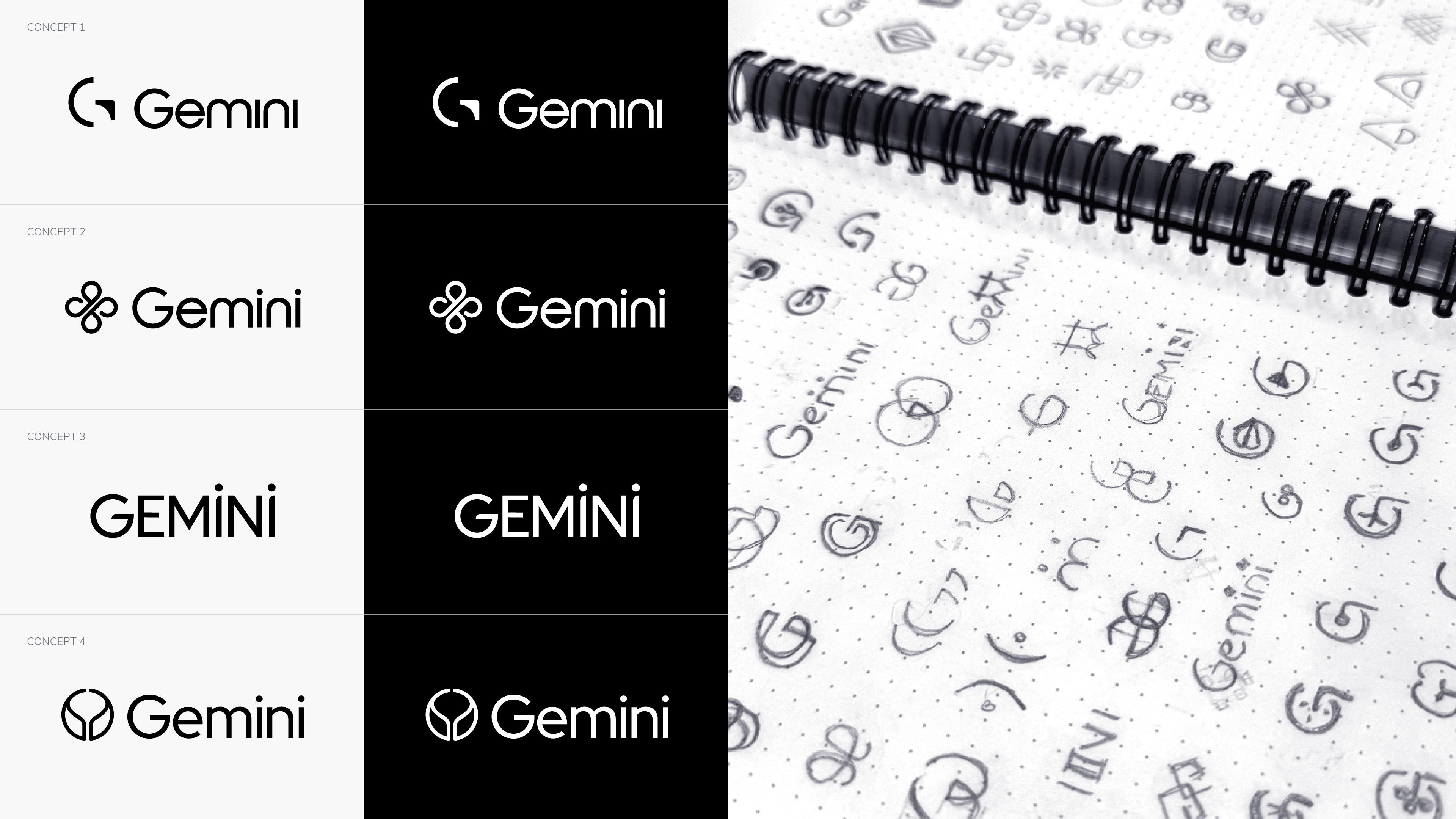
The first few working sessions were focused on brainstorming and getting to the root of what Gemini represents. Where did ‘Gemini’ come from? What characteristics and benefits did the company and products possess? What words do Gemini and their audience use? These discussions along with divergent brainstorming gave us a starting point to draw inspiration for the first round of logo concepts.
The first round of design is used to get an idea of what’s working and what’s not. Utilizing different themes, fonts, icons, and layouts, the first four concepts each had a unique take on what the Gemini logo could look like. Despite an overall positive reaction, the Gemini team wasn’t fully sold on any of the original four as their final logo. The discussions of these logos and initial colour swatches did, however, lead to uncovering three key nuggets:
- A larger focus on strength was critical. The company was in an industry dominated by a handful of large corporations and the logo needed to illustrate that Gemini was up for the test and that the brand could stand on its own.
- Concept 1 was the clear favourite due to its unique icon design. However, the Gemini team felt it would be too busy when paired with their sub-brand, Atmos (which also features an icon in its logo).
- The Gemini team was fully on board with blue being their brand colour and was open to exploring various shades for both the primary and secondary colours.
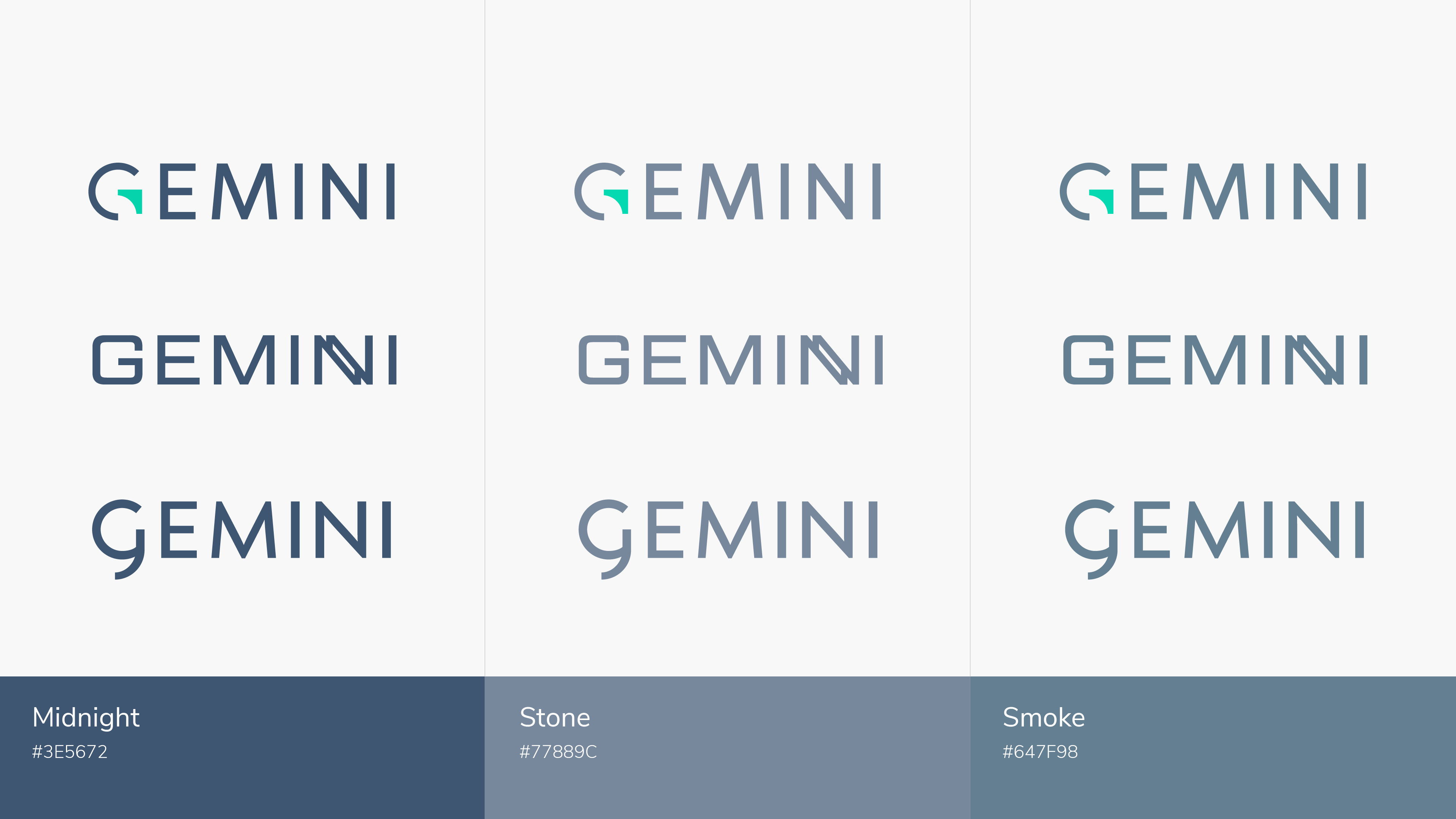
A bigger, bolder approach
With this feedback in mind, three new options were created with a deeper focus on brand strength. Stronger logos, in this case, meant darker colours, sharper and uppercase letters, and more spacing.
Each of the options below featured new ideas and incorporated elements that the team liked from the first round. To help bring these logos to life, these options were presented in three unique fonts and shades of blue: Midnight, Stone, and Smoke. Each was selected for the ways they’d pair with both the turquoise element the Gemini team enjoyed as well as how it would look alongside their Atmos sub-brand.
The new Gemini
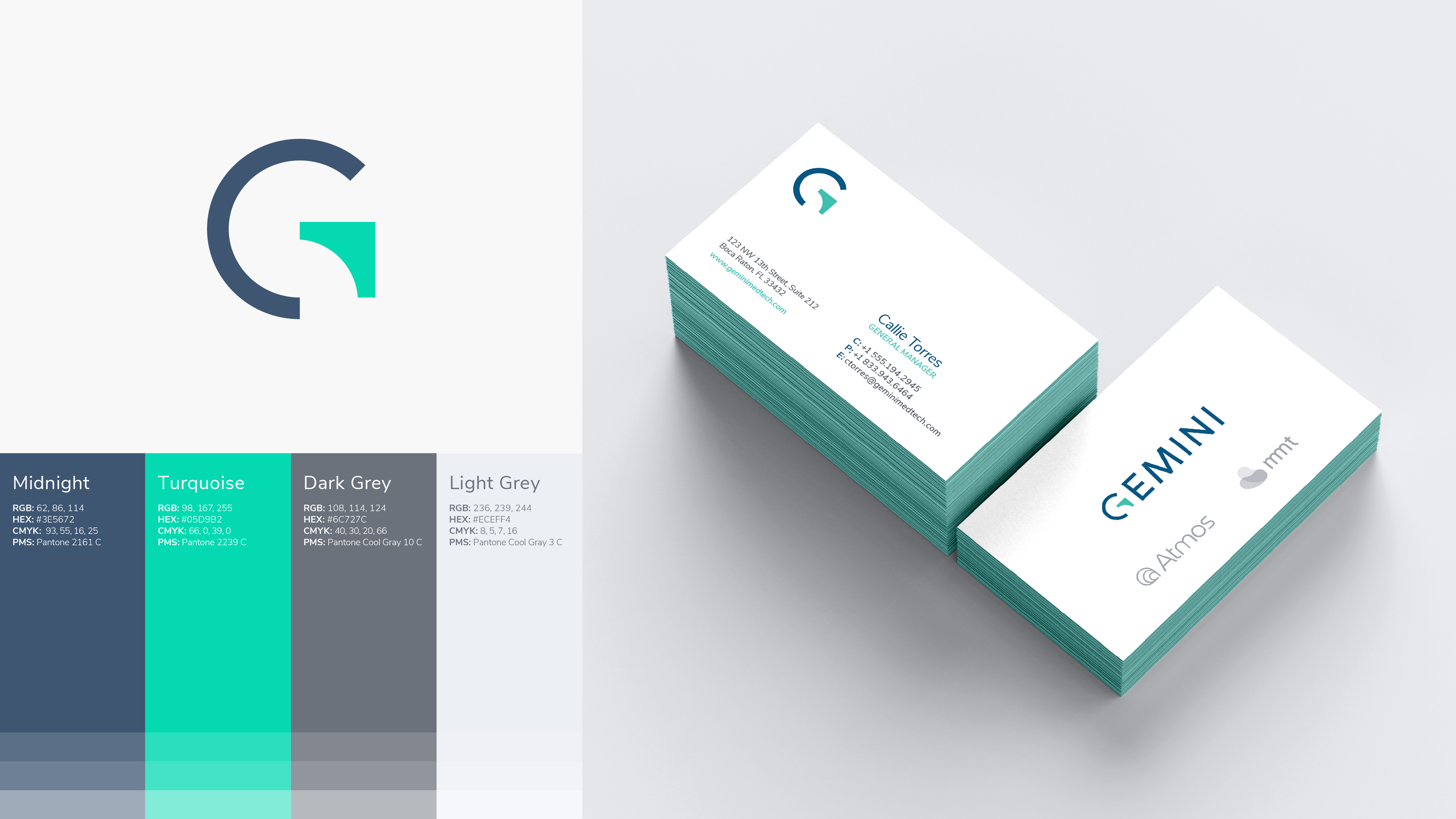
The Gemini team took one look at the new mockups and universally agreed that there was a clear winner.
The new logo uses a clean, modern approach that speaks to the medical industry. The use of an uppercase sans serif typeface communicates the brand’s strength and confidence in the Urology space. The ‘G’ in the primary and secondary watermarks incorporates a visual element without having to be its own standalone icon. The ‘Turquoise’ notch allowed us to include a secondary brand colour in the logo and visually communicates an upward trajectory for a growing company in the field.
The primary colour is called Midnight. This dark, unique blue hue stands out in the medical industry and pairs well with both the accent colour, ‘Turquoise’, and their sub-brand Atmos.
Ensuring consistent branding across touchpoints
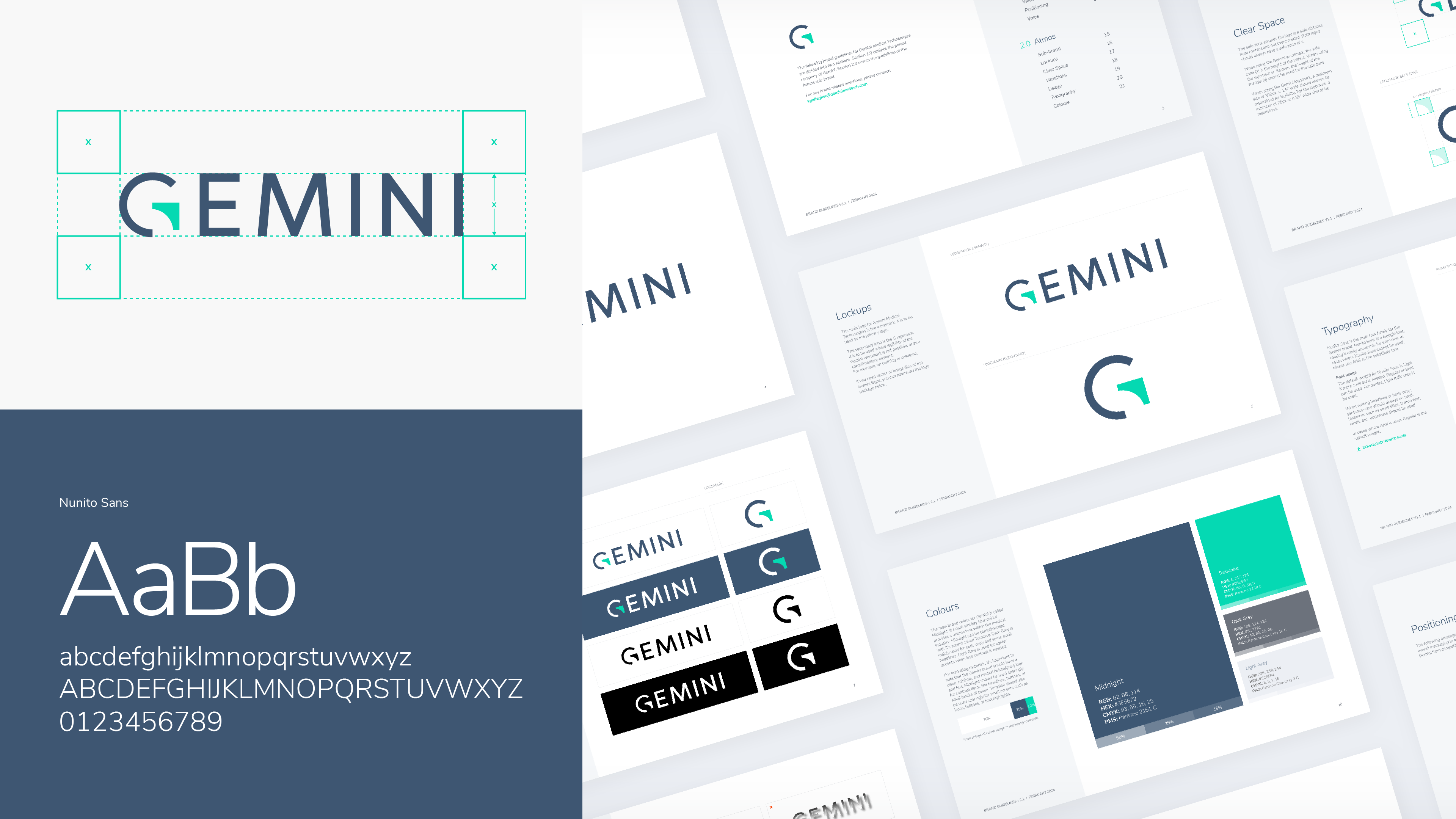
Now that key elements, such as brand colours, typography, and logo were established, it was important to make them consistent across touchpoints. Brand Guidelines were created as a comprehensive blueprint for maintaining consistency in brand representation. These guidelines serve as a roadmap for aligning every aspect of the brand’s identity, from watermarks to fonts to colour usage. These instructions, examples, and mock-ups ensure that all communications, both internal and external, reflect the brand’s essence cohesively.
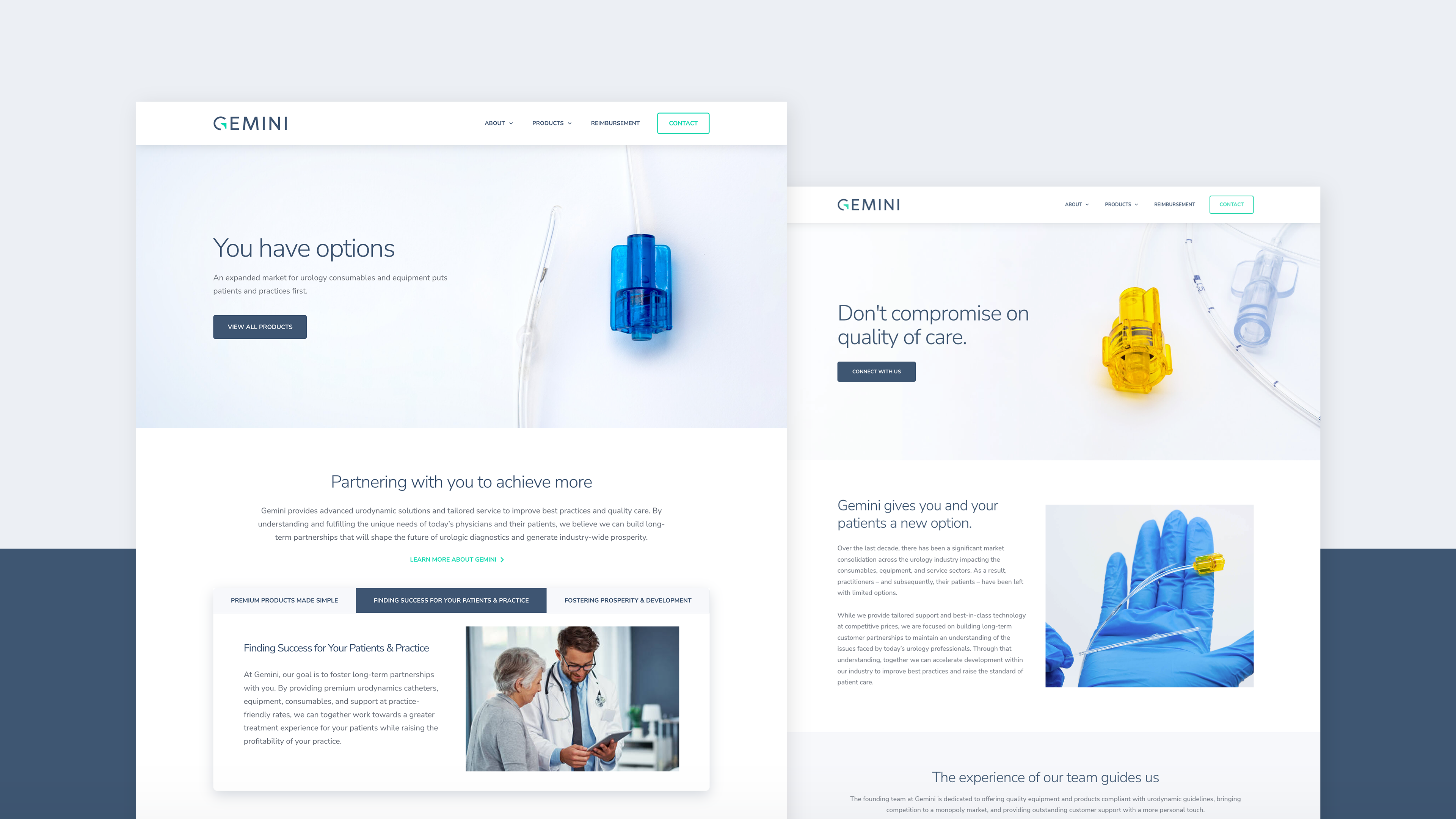
Amplifying the brand with a modern website
With the look and feel of the brand established through the creation of the logo and brand guidelines, the focus turned to creating an impactful, user-focused website. A place where the Gemini team could formally introduce their new brand to the world.
To do so, we needed to go deeper on their audience. Not simply reviewing demographic characteristics but digging deeper into the psychographics of the audience. What makes them tick? What are their pain points? How do they act? How does Gemini make their lives better?
Fortunately for us, the leadership team at Gemini had decades of combined experience and a deep understanding of their market.
Understanding the problem
In a 2023 interview, Gemini Founder Brian Hersh and Chief Medical Officer Elizabeth Babib, MD, explained how the leaders in the Urodynamics space had created a monopoly:
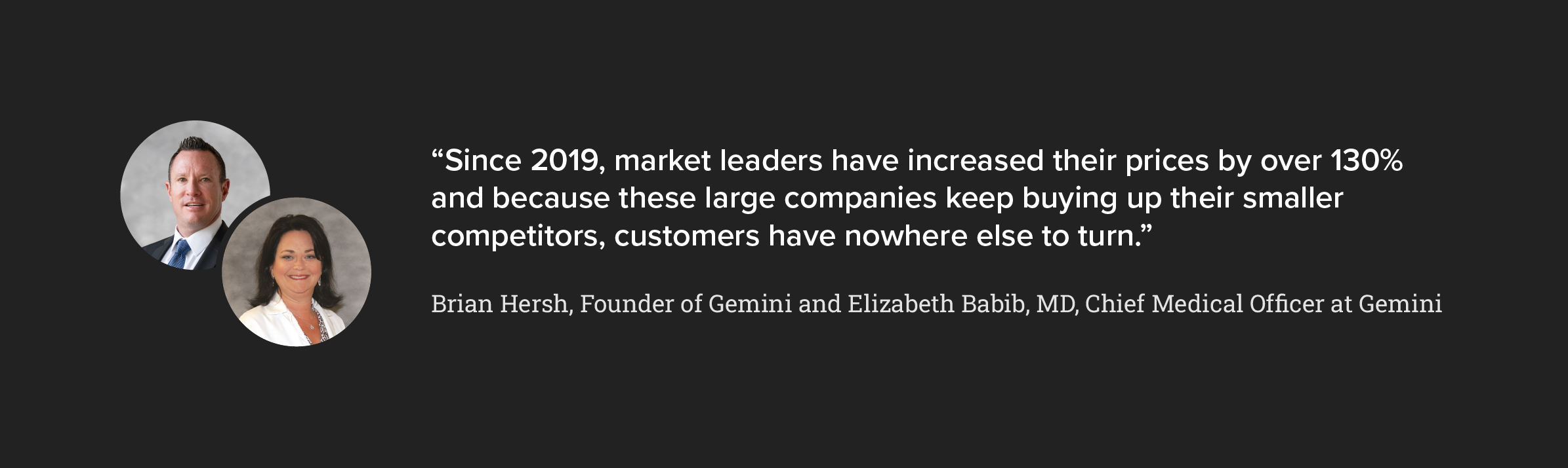
This was the crux of the problem and the main reason Gemini went into business: healthcare workers were under pressure. Under pressure financially—price increases were cutting into their bottom lines. And under pressure from a lack of choice—without competition in the industry, there were no alternatives for better products or customer support.
Gemini focuses on alleviating this pressure and providing a cost-effective, supportive option so their customers can focus on what’s important. That was the message we needed to drive home in every facet of the website.
Competitive messaging
The messaging throughout the website needed to play a key role in positioning Gemini as a worthy challenger. Together, we identified three key areas that we sought to target with website copy:
- Value – Gemini was entering the market with products that were a fraction of the cost of their competition. Offering superior service and customer service at lower prices, value was going to be a key area to highlight.
- A Supportive Partnership – It became clear health care workers in the space were feeling neglected and often ‘locked in’ to long-term, fixed contracts. Gemini focuses on client care and the two-way benefit of an effective long-term partnership between vendor and customer.
- Empowering the Audience – For years, healthcare workers were stuck with the products and services that was provided to them by their monopolistic counterparts. Gemini gives their audience power by giving them control over their decisions and freedom to choose what option works for them.
Overcoming objections
Changing vendors or service providers isn’t easy. Despite the tangible benefits of switching, these decisions are ultimately met with questions relating to opportunity costs. This isn’t changing a coffee order; for many healthcare workers changing providers represents a disruption in day-to-day activities. This is why we sought to minimize the learning curve around the company and products to ensure a seamless transition.
Designing for healthcare
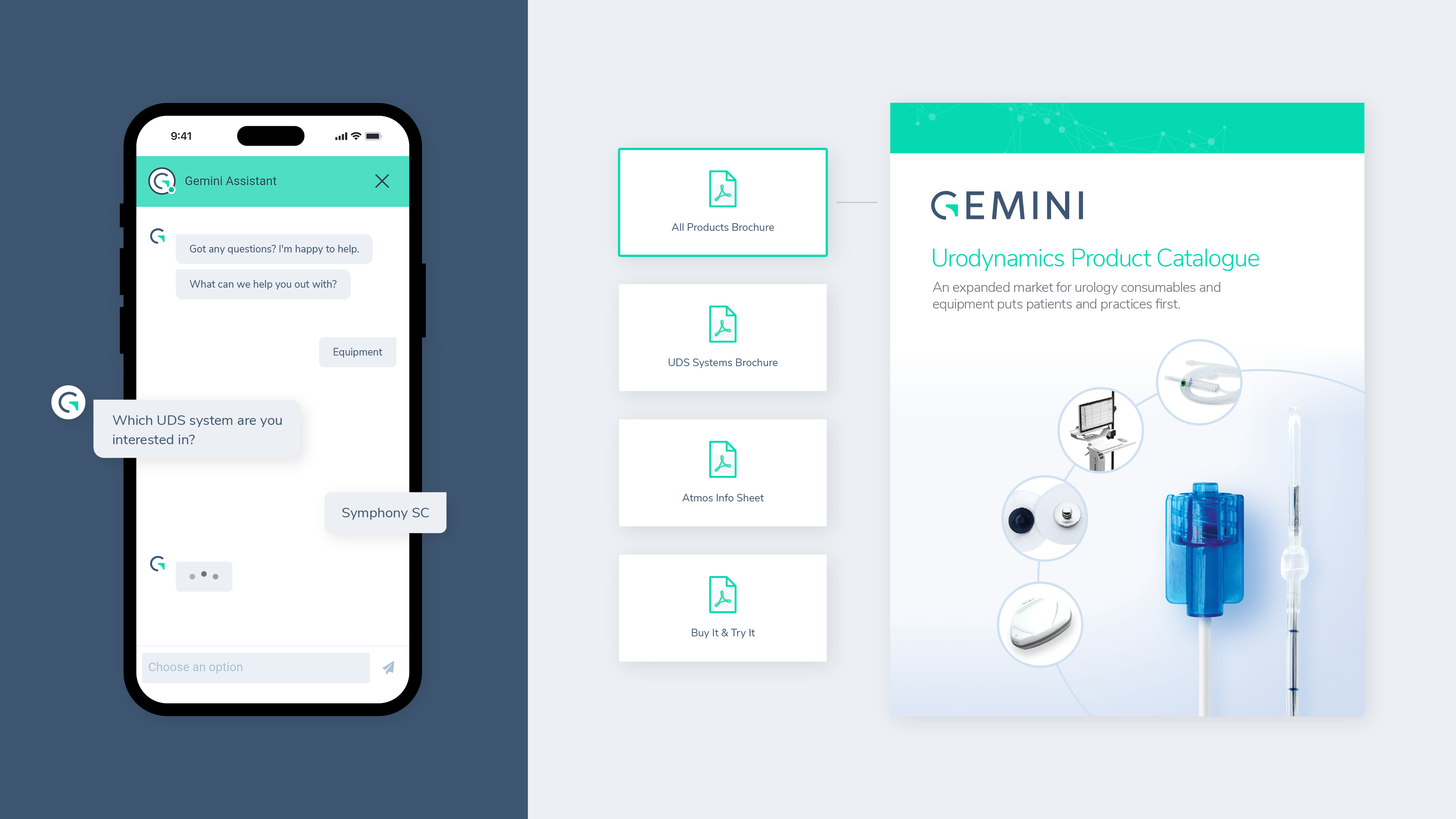
With these possible objections in mind, the theme of the Gemini website was simplicity. Fewer pages, fewer clicks, fewer dropdowns and more of what’s important. Healthcare workers prefer direct information presented in an organized way, so we ensured that everything that is featured on the website has a specific purpose and importance. If someone wanted to learn more or get into the nitty-gritty of the technical details about the products, we included a resource hub that features anything additional you could ever need.
The website’s layout is professional, clean, and bright. High-quality imagery and white space are used between sections to allow the content to be easily distinguished and digested. Brand colours of blue and turquoise were used sparingly to help certain elements pop and draw the user’s attention.
Starting conversations
For a company with little to no public-facing assets or marketing, the website is a critical touchpoint. It needed to give their audience access to the information they needed but also enable them to take the next step in the buyer’s journey. Whether it’s to set up a demo, a trial, or a simple call, we want to encourage the user to start that conversation. That’s why ‘Contact’ is the main CTA in the main website navigation and why an always-on AI chatbot was essential. This is just another way Gemini supports its busy healthcare audience.
The impact & our ongoing work
When we began our work together, Gemini was in its infancy. Fast forward to the end of this branding project, however, and the Gemini brand is now cohesive, modern, and consistent. Their brand recognition has increased throughout the industry, and they’ve got a firm step in the door in the Urology market.
In conversations with Katie Gallagher, Director of Marketing at Gemini, she had this to say about our partnership:
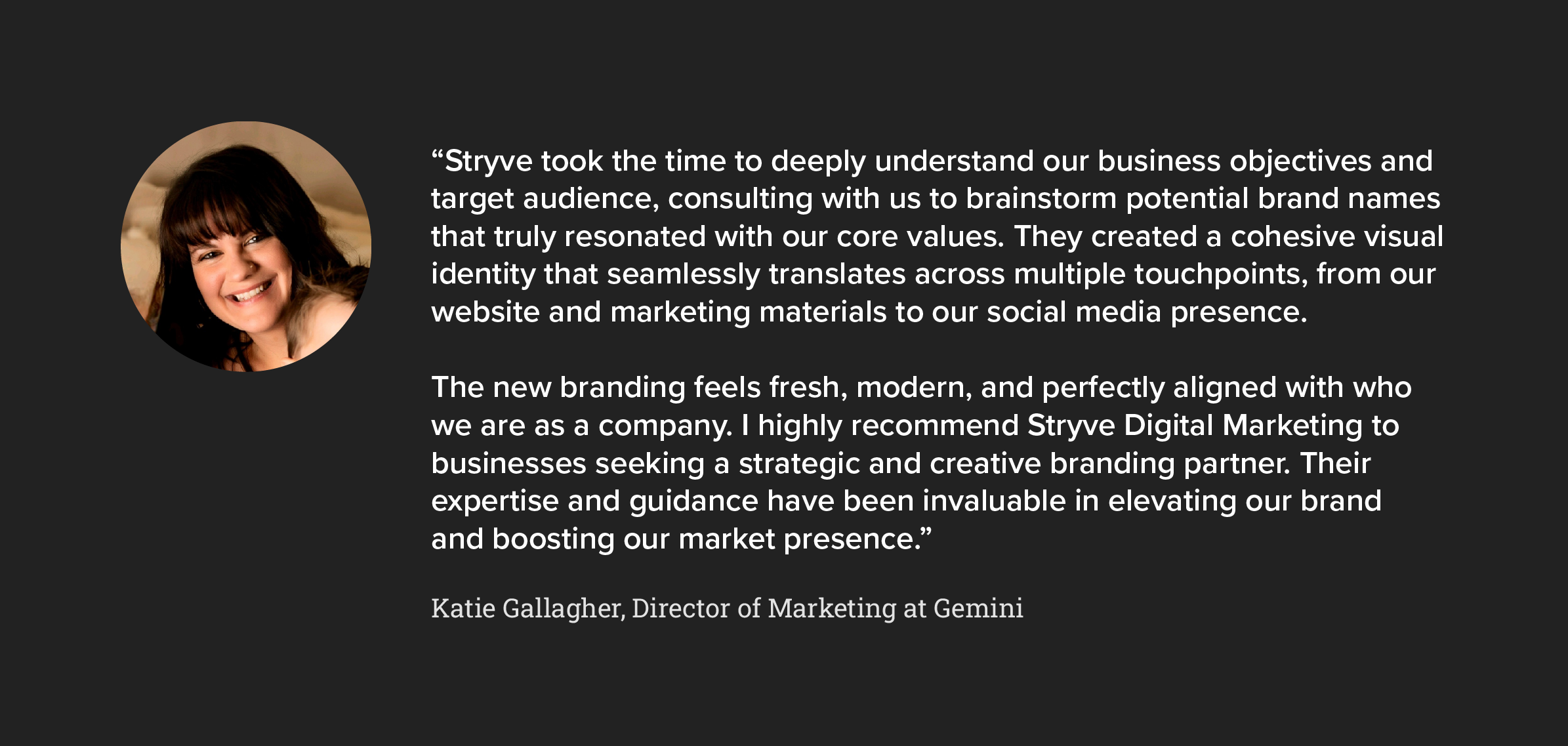
Since the launch of the Gemini brand, our partnership has only expanded. What started as branding, has evolved into digital campaigns, corporate messaging, social media management, graphic design support, and more. We look forward to continuing our work together and seeing where the Gemini brand goes next!