Our 2024 design trend predictions
By: Bethany Johnston-Baril
November 23, 2023 | Reading Time: 10 mins
As designers we constantly juggle between wanting our designs to stay relevant, having them stand out AND staying true to the brands we design for. A big part of staying relevant is keeping up with the evolving world of design trends. Come peek into our crystal ball as we make our design predictions for 2024.
Looking into the future 🔮
Trends don’t pop up out of nowhere! They are influenced by a combination of cultural, technological, social, economic, and aesthetic factors. Cultural movements, movies, art, and fashion have a large influence on design trends along with technological advancements like AI and nostalgia cycles of retro aesthetics.
Here are ten design trends we think will grow in popularity in 2024.
1. Bold minimalism
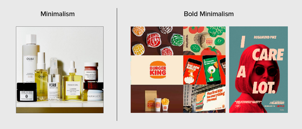
Minimalism’s edgier younger sibling, bold minimalism is a style that combines the simplicity and clarity of minimalism with stark contrast and impactful elements that capture attention. While traditional minimalism often emphasizes subtle, understated design, bold minimalism adds a layer of visual intensity through the use of striking features. This style aims to maintain simplicity while making a strong and memorable visual impact. With a focus on bold typography, this approach is powerful and dramatic, while being elegant and simple.
We’ve seen a number of brands embracing bold minimalism from Minute Maid, Kraft Singles packaging, to Uniqlo’s rise in retail. Burger King is another great example. Their minimalistic design strategy indicates confidence and emphasizes quality through design. Their use of solid colours, flat icons, and bold font creates an impactful visual identity. I Care A Lot has a poster for the film that perfectly demonstrates bold minimalism by incorporating strong, contrasting colours, and a bold font. These impactful elements instantly capture attention and draw the viewer in.
2. Serif fonts
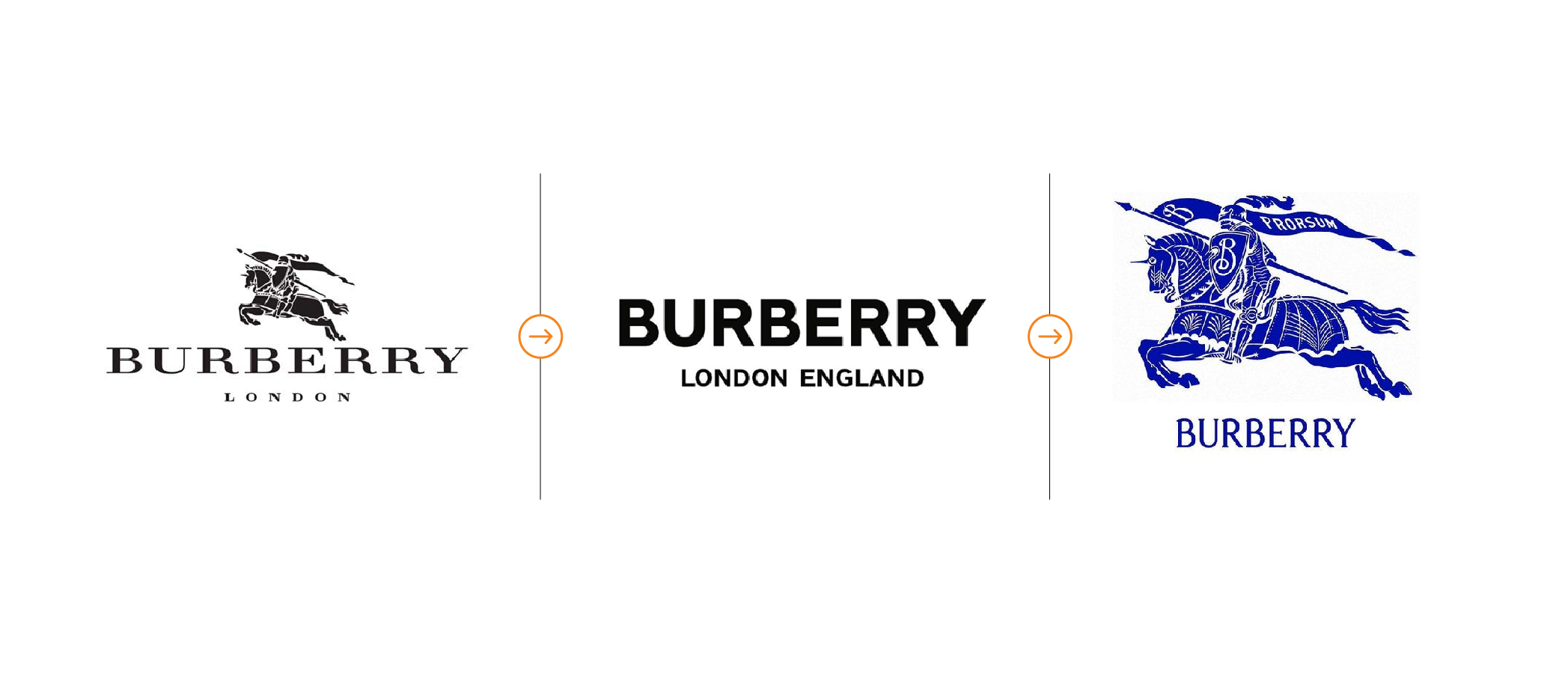
Near the end of 2018, we saw many brands unveil new logos that looked extremely similar, with most saying goodbye to the serif! This shift was to communicate a fresher, simpler look. This rebranding technique was meant to create distinctiveness, simplicity, and readability, but instead, it has created a sea of sameness. Looking into the future, we may see brands rebranding back to a serif style that has more personality and allows them to stand out.
We’ve recently seen serif logo transformations from major brands like Gap, and Chobani. After only a few years with its simplified look, Burberry, a luxury fashion house, has redefined its image once again. Their new custom-designed serif font is the focal point of their brand identity. The new look is fresh and modern with touches of sophistication and confidence! This change allows Burberry to stand out and will most likely be the inspiration for many other luxury brands.
3. Prominent photography
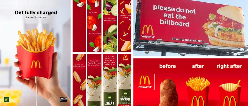
In the past, designers often relied on stock imagery which could make it hard to stand out. Looking into 2024, designers are finding more creative ways to use photography.
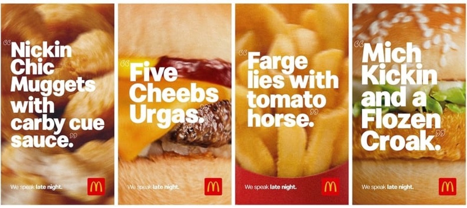
Mcdonald’s has always been on its photography game with large, detailed images that get their customers wanting more. In one of their latest advertisements, they used full-bleed images with a smudgy, blurry effect to reflect the 2023 campaign. This campaign makes light of the late-night drunk orders by mixing up the words in the ads. This image treatment reflects the campaign perfectly and ties the whole thing together.
4. Nostalgia / retro illustration
The popularity of nostalgia design lies in its ability to evoke emotions, create a sense of connection, and offer a unique and memorable aesthetic experience. Having grown up online, Gen Z can use nostalgia to escape the stress and pandemic-related issues they may have and relate to a simpler time. With a strong desire to escape, younger people will push nostalgia design into the future.
Retro cartoon character illustration is about creating cartoon characters in a style reminiscent of past eras, specifically the mid-20th century. These cartoon characters have been used to elevate branding and advertising and sometimes are created as “mascots”. These designs allow brands to tap into a sense of familiarity and charm, bringing in a touch of nostalgia.
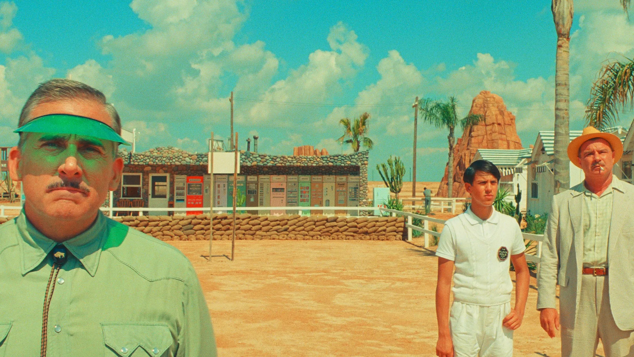
Some brands that we have seen embrace nostalgia lately are Adobe with their “Joy of Sketching” campaign, Pepsi, which celebrated its 30th anniversary of Crystal Pepsi, and Igloo by launching a line of coolers featuring a funky 90s aesthetic. Asteroid City, directed by Wes Anderson, captures retro interiors, minimal settings, and comforting colours that are inspired by the 1950s. The editing and colour grading used in the movie create a comfortable and calm feel. With a desire to experience the past, we can understand why Asteroid City performed as well as it did!
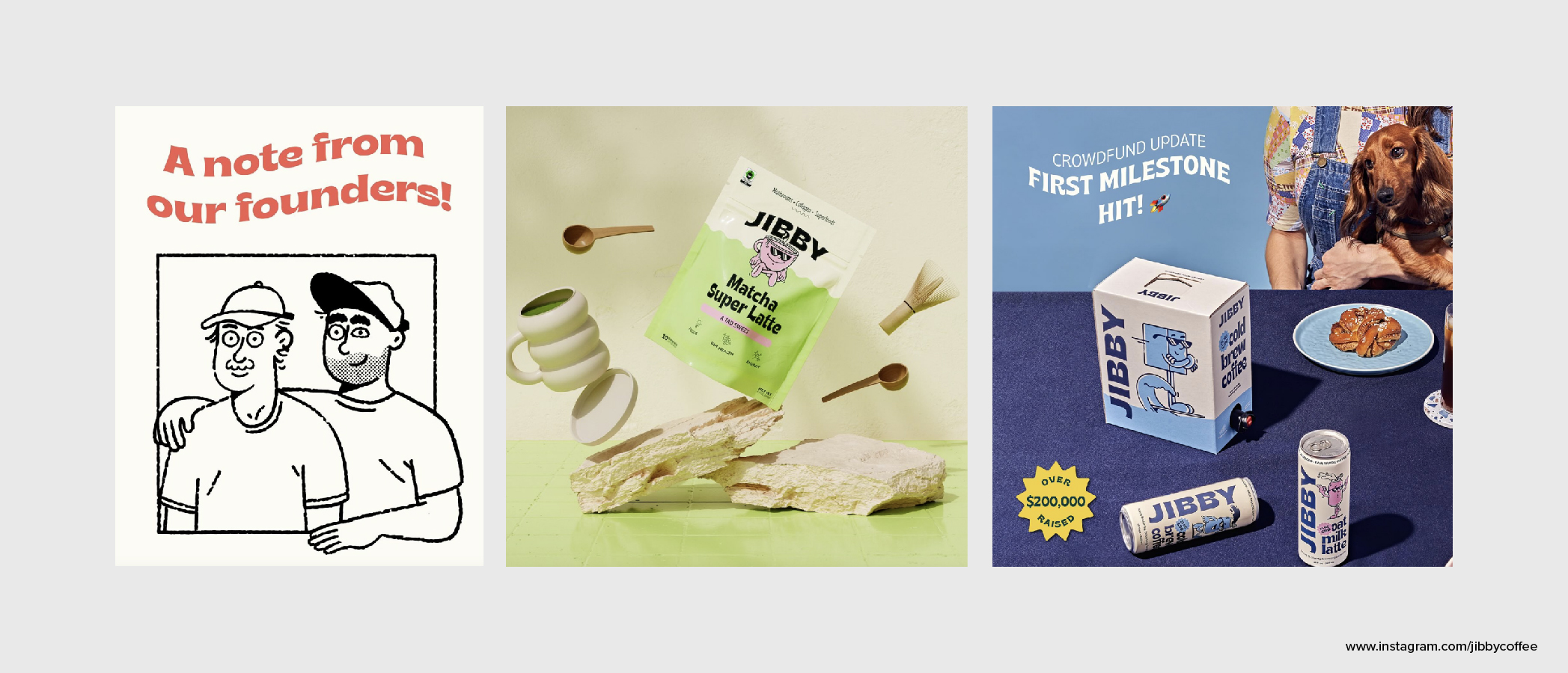
Jibby Coffee transforms your morning routine into a wellness ritual. They create beverages that support your body, mind, and spirit—while having a pretty kick-ass branding identity. A mix of nostalgia, retro characters, and simple line drawings brings this brand to life. Similar to Jibby, you can find many local businesses around the world embracing this style in their designs and merchandise.
5. Brand illustrations
Using illustrations in your brand can offer several advantages: it provides brand personality, visual differentiation, and engagement. Brand illustrations can sometimes go hand in hand with bold minimalism where brands use bold and colorful contrast.
Over the past few years, we’ve seen brand illustrations come alive for some of our favourite brands! Slack showcases visually stunning illustrations that represent where work happens, Salesforce provides beautiful full-screen illustrations that create an impact and make their website memorable, and Mailchimp packs a punch with quirky hand-drawn illustrations and bright yellow backgrounds.
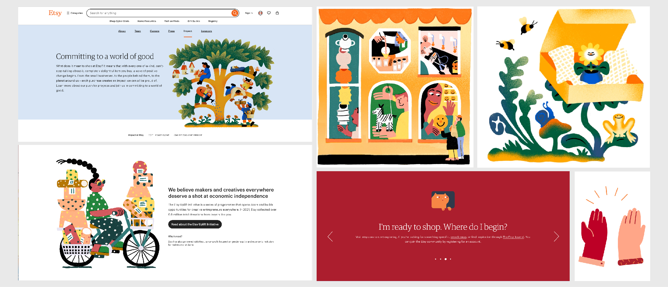
Etsy is a global marketplace for creative goods creating a beautiful brand identity by incorporating whimsical, quirky illustrations that reflect the handmade nature of the products that are listed on their website. The overall effect of this illustration style is friendly and inviting, and emphasizes that Etsy is a safe and trusted place for artists to sell their work.
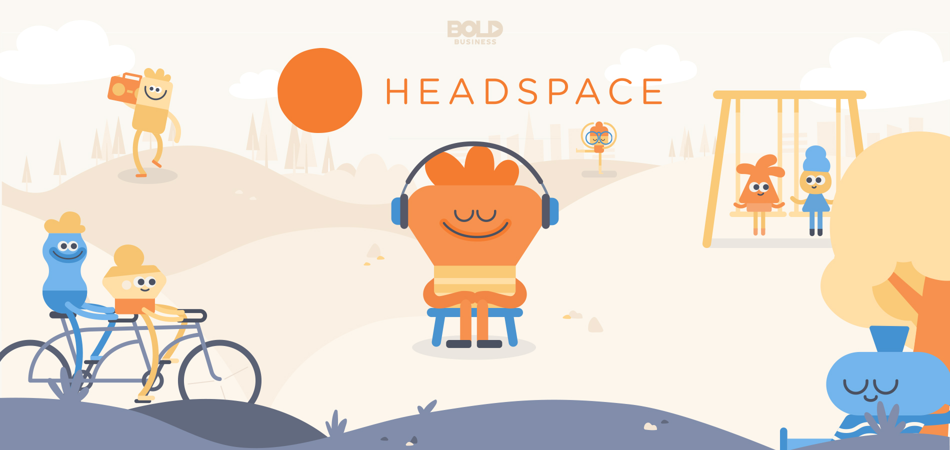
Headspace is a guided experience that introduces users to meditation, mindfulness tools, therapy, and much more. The website and interactive app are full of colourful illustrations and characters that make the user feel welcome and excited to work with the brand. Headspace does a great job at making some hard topics easily digestible and engaging.
6. AI-assisted graphic design
AI has been used to enhance various aspects of the design process, from generating ideas and layouts to automating repetitive tasks. These tools complement human creativity and efficiency rather than replacing it entirely, allowing designers to achieve the best result!
As Artificial intelligence gets stronger and smarter, designers will continue to reap the benefits. With constant updates to popular editing/design software, we can grow with AI and stay relevant. AI allows designers to save time, create exceptional work, and improve overall skills.
With platforms boasting more AI features, it’s only natural we shift towards using these new features. Adobe is amplifying human abilities with the integration of Sensei in all of our favourite Adobe products. For both creatives and marketing specialists, Sensei can organize and manage assets for better ROI, engage audiences, make essential quick edits, and achieve photorealistic effects. For designers, Sensei provides content-aware fill-in After Effects to remove unwanted objects, creates vector graphics with ease in Illustrator, helps with auto selection and content-aware fill in Photoshop, and quickly identifies and suggests similar fonts in Indesign. With many other features, Adobe Sensei is the perfect tool for designers.
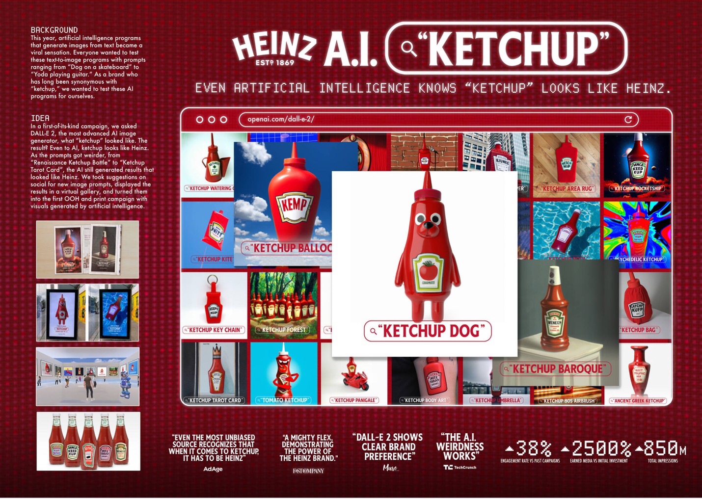
AI is even being used to create brand experiences. Heinz Ketchup dove straight in and created a campaign about what AI thinks Ketchup looks like. The overall goal of the campaign was to show that AI image sourcing associates the word “Ketchup” with Heinz. They went as far as displaying the images in a Metaverse art gallery and printing the images on actual ketchup bottles. Heinz turned the results into a global campaign—making it the world’s first campaign generated by AI.
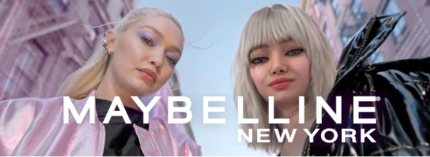
In a similar vein, Maybelline New York created their first avatar named May to help roll-out a campaign for their new Falsies Surreal Extensions Mascara. This campaign included both real-world and virtual elements to follow the growing interest in virtual influencers.
7. Barbie Pink
Hi Barbie! The “Barbie Pink” trend in graphic design refers to the use of vibrant and bold pink shades that are reminiscent of the iconic colour associated with Barbie Land. With the extreme success of the Barbie movie and the endless marketing collaborations we saw with many popular brands, we are sure to see the Barbie Pink trend extend into 2024 because it is so recognizable and relevant.
Mattel partnered with over 100 brands and retailers on Barbie collaborations that surrounded the movie’s release. These collabs brought light to some iconic brands and showered them in pink! Some notable brands who took on the trend are Crocs, NYX Cosmetics, Airbnb, Xbox, and Vans.

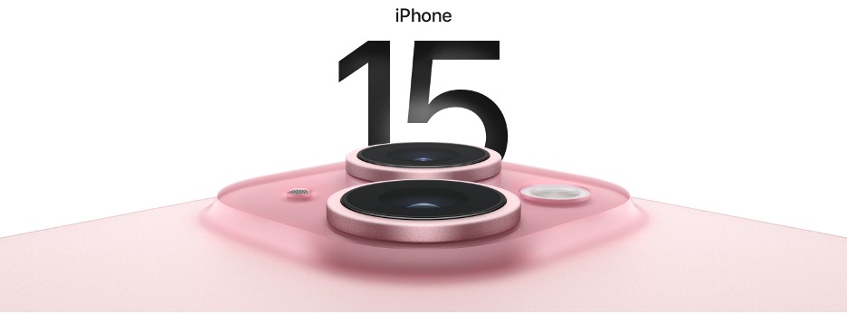
This year we got the release of the new iPhone 15 in pink! People have been asking for a pink iPhone for years and with the explosion of Barbie pink marketing, this couldn’t have come at a better time. Even Apple is not immune to Barbie’s influence because of its huge cultural impact this year, and Barbie Pink doesn’t seem to be slowing down anytime soon.
8. Candy colour palettes
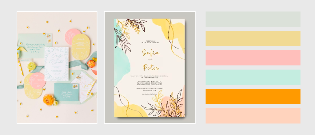
Candy colour palettes are bright, vibrant, and reminiscent of the colours commonly found in sweets. They range from pastels to saturated colours and create a visually appealing and playful aesthetic. These colours are popular in design areas like branding, packaging, and web design because it is cheerful and lighthearted.
Aside from branding and marketing, graphic designers carry design trends into other areas through stationery and events. Candy colours are very popular in the world of wedding stationery because they create a beautiful and memorable wedding experience.
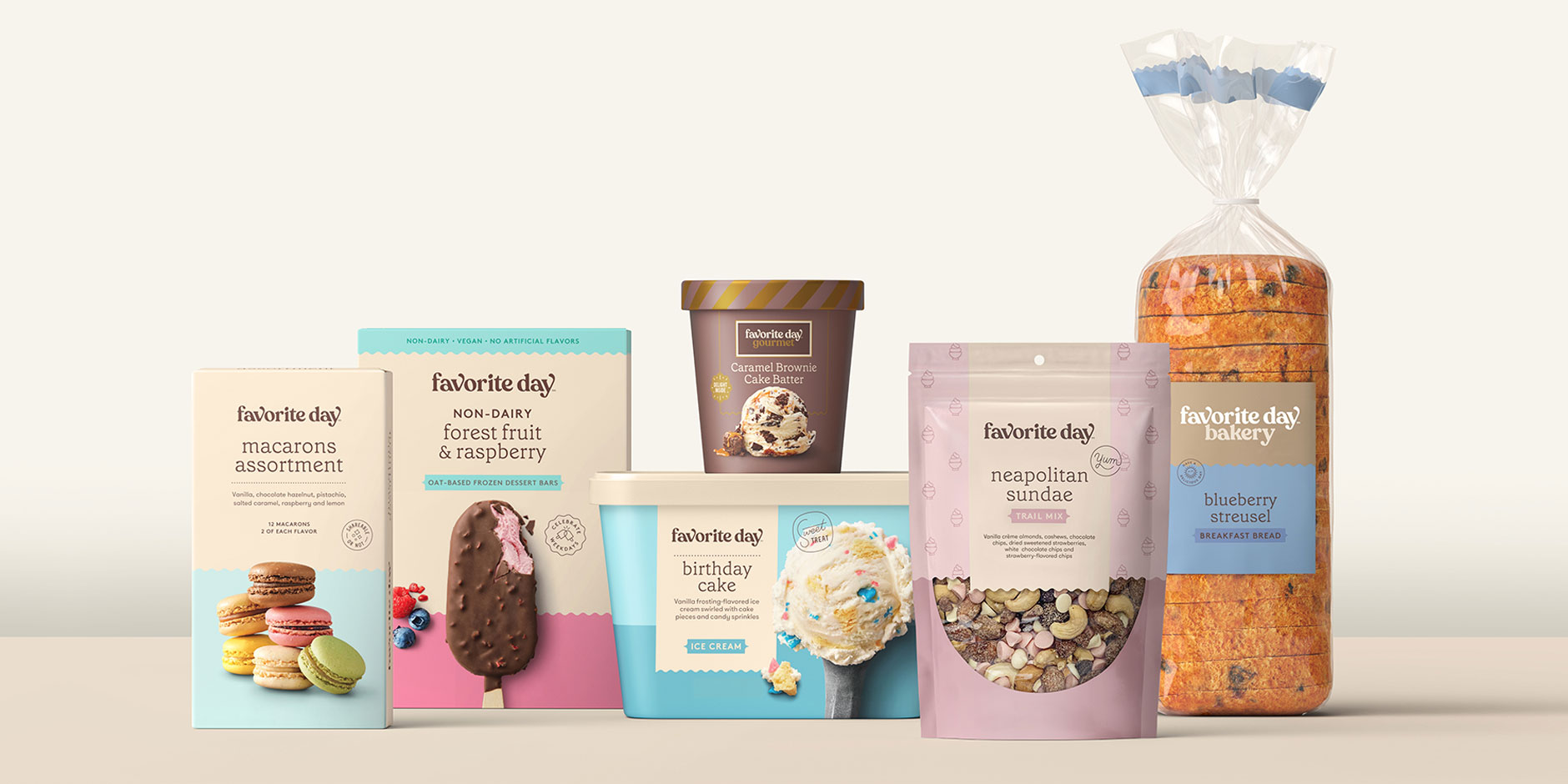
Target launched their newest owned brand “Favourite Day” which features more than 700 high-quality items from ice cream, to mocktails. The branding highlights soft candy colours that pop and catch the eye of consumers in the shelves. With soft blues and vibrant pinks, Target’s Favourite Day brand is sure to steal the hearts of their loyal customers.
9. Abstract gradients
2024 may be the year that we break some rules. Gradients have been a trend for a few years now, but they are starting to look more artistic by experimenting with unpopular colour pairings. This creates a more abstract and interesting look that can make brands stand out! This trend requires a lot of skill because the design still needs to be visually pleasant even with unconventional colour gradients.
We may start to see more abstract gradients being used in packaging for beauty and tech products. Gradients can be used to convey a sense of luxury and showcase a range of colours while conveying innovative and dynamic energy. Gradients are a perfect way to create visual fluidity and movement to packaging and add a futuristic feel that makes you packaging pop!
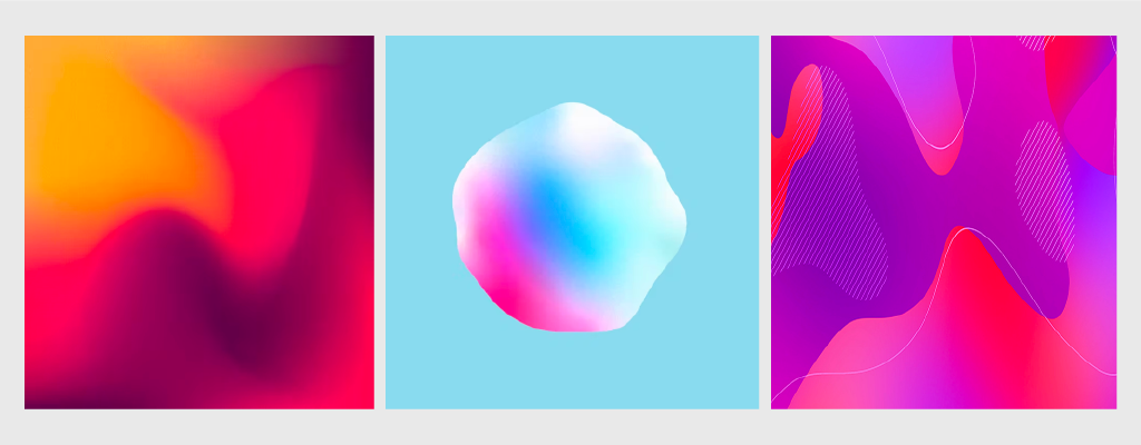
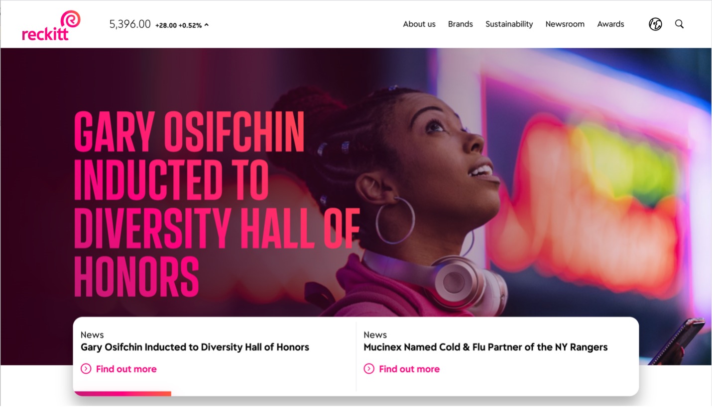
Reckitt is home to some of the world’s most trusted hygiene, health, and nutrition brands. They use strong pink, orange, and red in their branding to create dynamic gradients that make their visual identity stand out. Hygiene and cleaning products can seem very boring, but adding the element of abstract gradients allows them to have fun and create a much more exciting look!
10. Risographs
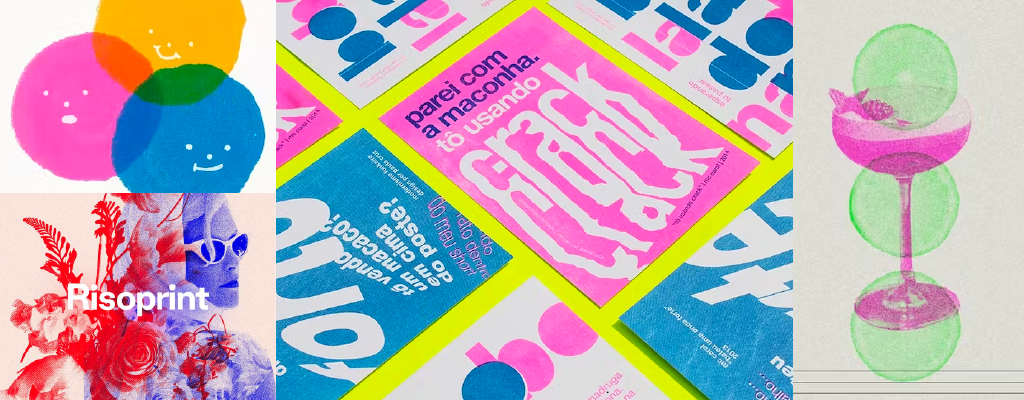
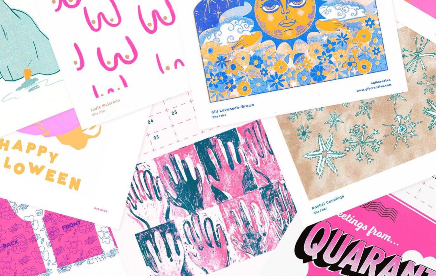
Again, here’s a blast from the past! The risograph printing technique from the 80s is making a huge comeback because of its grainy, vintage, and double exposure effects. The grainy texture gives depth to a minimalistic design and adds a warmer, human touch. This technique offers a unique aesthetic because of its imperfections, which is appreciated because it sets brands apart from the competition.
Wild Press is a risograph print studio in Scotland that creates vibrant, quirky prints, anywhere from landscapes to typographic pieces. Offering designs for calendars, business cards, and posters, they perfectly represent how traditional art can be incorporated into digital design. If risographs interest you, there are Photoshop brush packs available to create your own designs!
Embrace the trends but stay true to you
As we stare off into the creative horizon and anticipate the design trends of 2024, one thing is certain—change is the only constant. The predictions laid out here are invitations to explore, innovate, and redefine our design experiences. For B2B brands, it’s all about balancing brand consistency with opportunities to play with trends when it feels appropriate. Not every trend or emerging style may be relevant to your values, audience, or brand but it’s always a great source of inspiration.
