Get more clicks on your ads with these design tweaks
By: Brent Morrison
July 24, 2019 | Reading Time: 5 mins
So you’ve decided to step into the ring of online advertising. You’ve set up your keywords and schedule, hit ‘launch’, and all that’s left to do is kick back and watch the wave of leads roll in. You wait and you wait, but that wave ends up being more of a trickle than a tsunami. What gives? Is it your budget? Maybe you’re targeting the wrong people?
In these situations, we often look for a technical error or bad link, but what about the ad itself? What do you really know about design, anyways? It doesn’t matter how much budget you put behind your campaign or how clear-cut your targeting is if your ad is an aesthetic dumpster fire.
Whether it’s Facebook ads, LinkedIn ads, or the ad platform of the future, if you’re not getting the results you want, your design could be the problem.
Step up your photo game

There’s a lot of noise on the internet. Whether it’s fake news, memes, other ads, or Karen’s constant posts about her nephew, you need to make sure your ad stands out. When someone is browsing a website or scrolling through their feed, you only have a few seconds to grab their attention. Your ad should be bright, compelling, and easy to understand if you want those precious clicks.
Instead of using generic stock photography with fake smiles and lens flares, try using photos that are more authentic and unique. Find photos with interesting perspectives and lighting. The less staged, the better.
Take the example above. The photo on the left is your classic stock photo in all its cheesy glory. Filed under the keyword “teamwork”, it shows a group of smiling, thumbs-upping white people all staring directly into your soul the camera. On the other hand, the photo on the right shows people actually working together. It’s warm, it appears candid, the people seem authentic, and as a result, the image is more appealing.
When choosing a photo, make sure it compliments your message. Try to include elements of people in your shot, as audiences better connect with images they can put themselves in. Bonus points if the person in your image can make eye contact with the audience or look towards your written message.
Use colour and lots of it
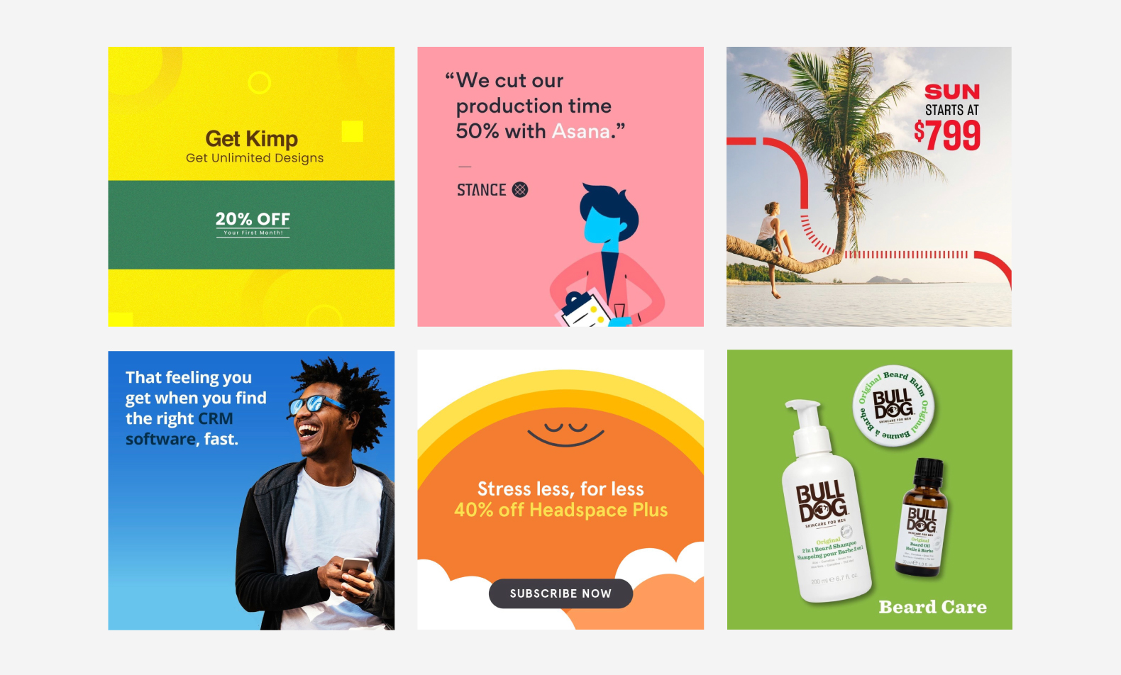
Eye-catching photography is a great way to stand out, but it’s not the only way. Using splashes of bright colour is a tried-and-true way to get noticed, especially amongst corporate looking content that generally skews white, blue, and grey.
While dropping some white text in a big colourful box may sound simple, you’ll need to think long and hard about the colour you use. Corporate blue, eco-friendly green, dangerous red… all of these colours influence how people perceive your brand and messaging. Sure, yellow is going to stand out, but paired with black text it’s going to be seen as a caution or warning. For more information on how colour can influence your brand perception, check out this article by Hubspot on colour psychology in marketing.
Colour is important, but the whole thing falls apart if it isn’t legible. When it comes to text size, try not to go below 14px. Some fonts will display better at smaller sizes than others, so make sure to view your ad at 100% to see if it’s clear before launching. Another factor in this is the colour contrast between your text and background. Black on black may work in the fashion world, but not in functional design. When putting together your next Facebook ad, check your colour compatibility with this simple and easy tool to measure legibility.
Tweak your CTA buttons
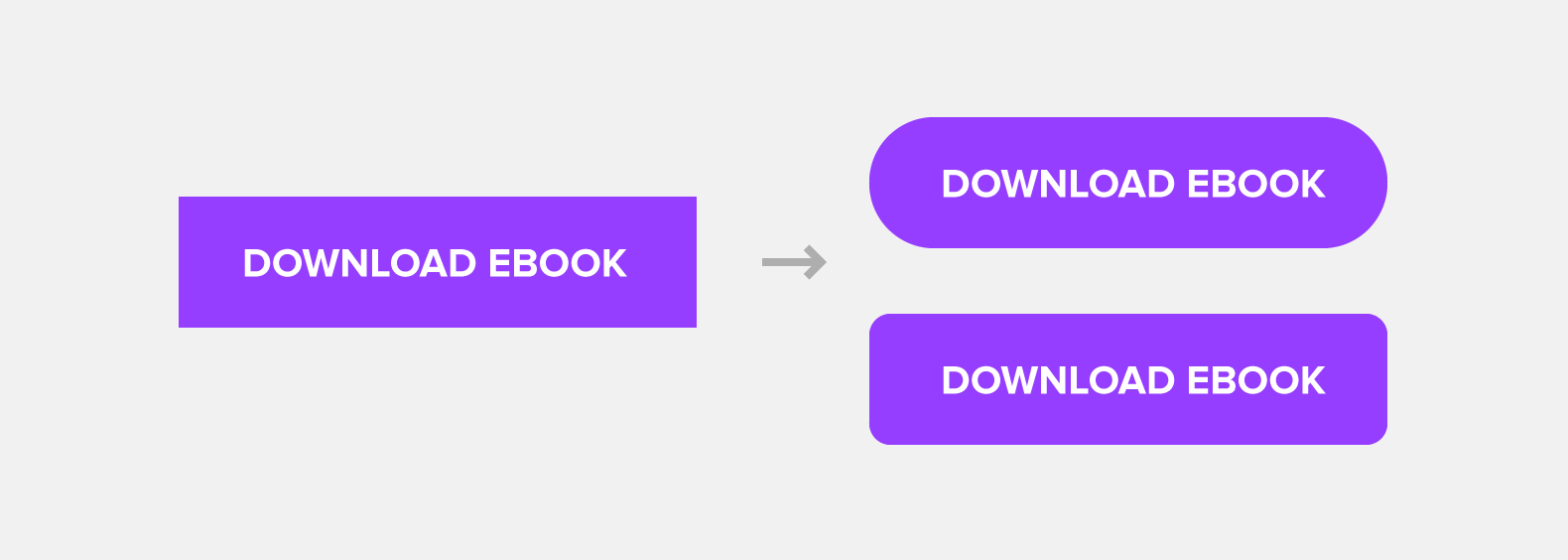
This might seem obvious, but your button needs to look like a button. So first things first, run a Google image search for “button” and tell me what shape they are. Do they have sharp corners or rounded edges? Aside from real-world representation, a button with rounded corners will evoke a sense of trust and warmth, fuelling the nickname, “friendly rectangles”. The best CTA’s use this principle to make customers feel safe about their decision.
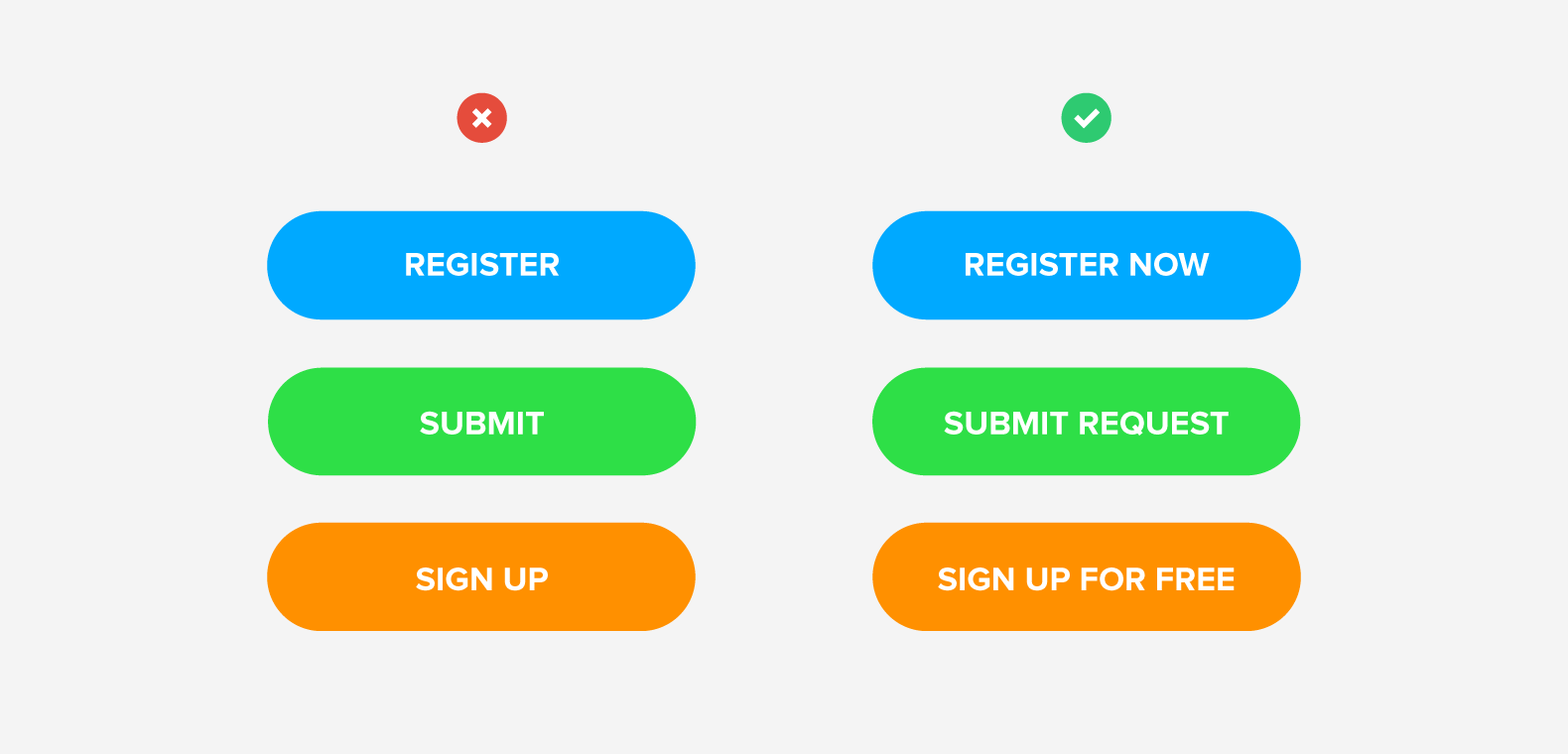
Text matters, too. By changing just one word in your button, you could dramatically increase your click percentage. Buttons with a strong command verb are more definitive and tell the reader exactly what to do, bringing them closer to a decision. With the examples above, the buttons on the right are more specific and direct in communicating their CTA.
An interesting tip that Hubspot research discovered was that buttons labelled with “submit” tended to have lower conversion rates than those with different wording. For example, “Click Here” buttons performed better because they feel much less committal and imply a lower investment of time and effort.
Get things moving!

A big trend in web lately has been the use of interactions, animations, and video. With the introduction of HTML5 to the banner game, PPC ads with movement can substantially outperform static banner ads by as much as 267% according to a study from Adform. It’s no wonder why they’re gaining popularity. It’s pretty hard for a static image to be as eye-catching as something that moves.
While there is a definite reward, creating animated ads takes more heavy lifting. These dynamic ads may call for your designer to have a more extended skillset and toolbox, not to mention the additional time they take. Luckily for you, there are some free resources to help you with simple movements like Svgator or Bannersnack.
What would George do?

When all else fails, embrace your inner George Constanza and try doing the opposite of your competitors. If you really want to stand out, going against what’s trending is a surefire way to keep your Instagram and Facebook ads from getting lost in the noise.
If blue is the dominant colour in your industry, consider trying yellow or orange. Seeing the same bold font everywhere? Try going with something thin with a little more personality. There are plenty of free Google fonts you can choose from to change up your ad. Sometimes going against the grain won’t always work, but thinking outside the box is where new trends begin.
