There are approximately 300 million people in the world who struggle with some form of colour blindness. People with colour deficiency (CVD) every day are unable to distinguish the difference between colours, and often see colours in a limited range of hues. Because of this, the colour blind struggle with websites, apps or anything else containing colour. Since most designers aren’t colour blind themselves it’s common for the colour accessibility of a design to be overlooked. If that’s the case, at least one in ten of your website visitors could be engaging and experiencing your content differently. To make sure you don’t miss out on these users, we’ve gathered some insights and advice to consider when designing.
First, let’s go through the different types of colour deficiencies:
Red/green colour deficiency
- Dichromacy (protanopia and deuteranopia)
- Anomalous trichromacy (protanomaly and deuteranomaly)
Blue/yellow colour deficiency
- Dichromacy (tritanopia)
- Anomalous trichromacy (tritanomaly)
Total colour blindness
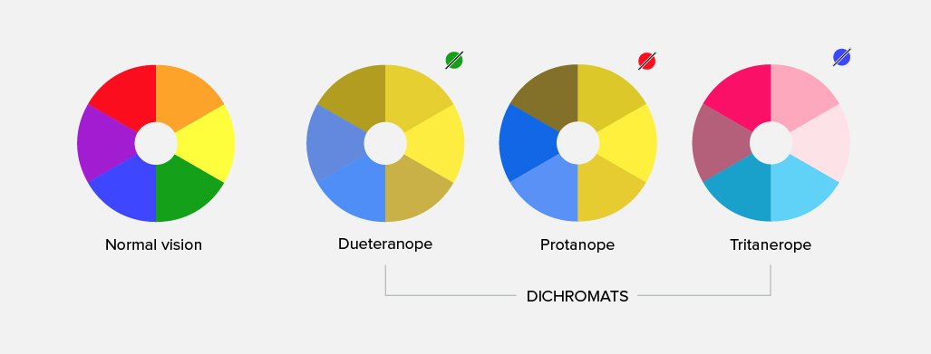
Red/green colour deficiency is the most common colour blindness, where a person is unable to distinguish the difference between shades of reds, pinks, oranges, browns, or greens and blues. While blue/yellow deficiency is less common. Complete colour blindness is the rarest of them all and is when a person can only see in shades of black, grey, and white.
For a more in-depth explanation of the different types of colour deficiencies, visit the website colour blindness.
Colour combinations to avoid
Now that you have a better understanding of the different types of colour deficiencies, you’re probably wondering what colours you can and can’t use. Unfortunately, there isn’t a one-size-fits-all solution because colour blindness affects people in different ways. But there are some colour combinations that are particularly difficult to see and should be avoided when possible:
- Green & Red
- Green & Brown
- Blue & Purple
- Green & Blue
- Light Green & Yellow
- Blue & Grey
- Green & Grey
- Green & Black
Use lots of contrast
High contrast has always been an important design element but is especially important in the accessibility of your website. Visitors with colour blindness can see the difference between bright colours better than they can between dull colours, which tend to blur into one another. According to WCAG2 (Web Content Accessibility Guidelines), the best contrast ratios for legibility is a minimum of 4.5:1 for text under 18px, and 3:1 for text larger than 18px. There are several online resources such WebAIM and Contrast Ratio that you can use to ensure your website meets these standards.
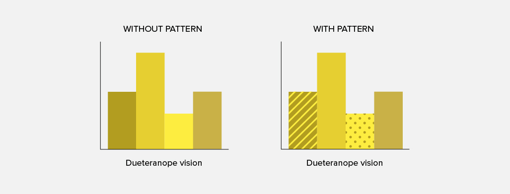
Another way to enhance your design’s contrast is by adding different patterns to elements that require emphasis. For example, most infographics that rely on colour and can be difficult to understand. Adding contrasting textures can help break up similar colours and make graphs, charts, or maps easier to interpret.
Use icons and colours cohesively
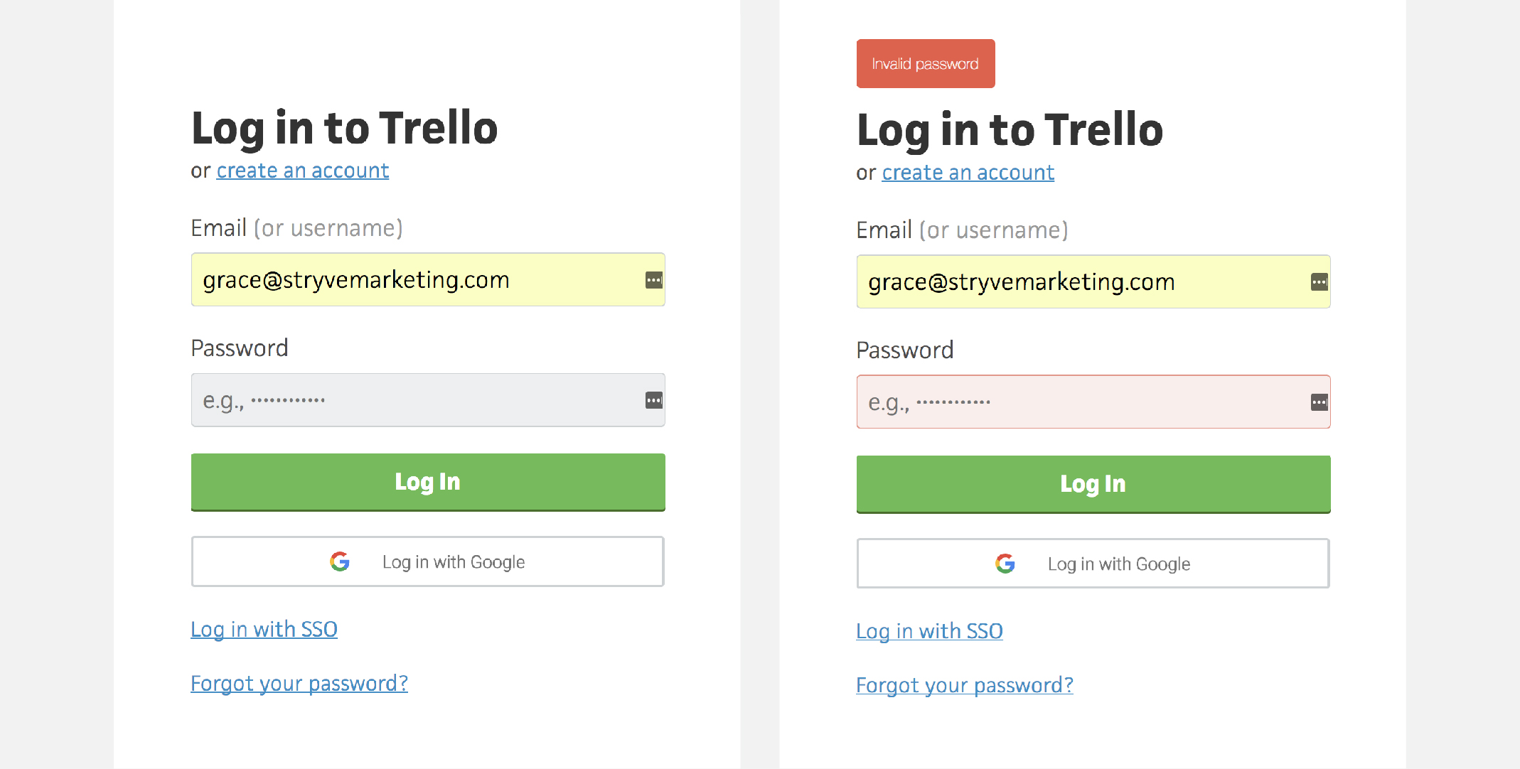
We have been brought up to associate different colours with different messages, like how red is for “error”, or how green is for “go”. But for certain types of colour deficiencies, these colours can be difficult or impossible to tell apart, and shouldn’t be relied upon to convey a message. Colour-coded messages should be paired with an icon, label or explanation to clearly communicate a point and grab attention. Trello’s sign in form below is a great example of colour and symbols used in conjunction.
Go minimal
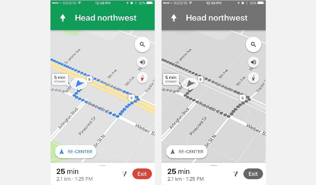
Minimal design is more than just a current trend but an effective design solution for colour accessibility. By limiting the colours and elements of your design, you are limiting the possible confusion. A common misconception about minimal design is that it is monochromatic. While you should be limiting your colour palette to 2-3 colours, they don’t necessarily need to be black and white. By first designing your website or app in greyscale, you can determine whether or not your colours will have enough contrast. Then once you are satisfied with this version you can convert into full colour using identical hues and temperatures. A successful example of this approach is Google Maps interface.
Designing for a colour blind demographic can be hard when you can’t relate. By educating yourself on problematic colours and elements, you can better ensure a user-friendly design for everyone. Try taking it a step further with Google Chrome’s new developer tool that allows you to view your design through their eyes (Firefox has it, too!).


