From presentation decks to websites and everything in between, “Can you make the logo bigger?” is one of the most requested design edits we receive from our clients. We know you take pride in your logo—and you should. After all, you’ve invested a lot into its creation and the credibility it represents. So it’s normal to fear the thought of it being overlooked! However, your logo shouldn’t be the first thing people see, and this might be hard to hear, but it’s not the priority. Let me explain why.
Your logo isn’t important, your message is
Don’t get me wrong. I’m a big fan of logos; they’re the face of your company. You should invest in having one designed that accurately reflects your values and services. They do hold an essential role in the grand scheme of your marketing and brand efforts. However, your logo’s size and visual weight shouldn’t be more significant than your message when it comes to your touchpoints, like your website, sales deck, packaging, and more.
Your target audience is more interested in learning about your product or service and how it can benefit them. This messaging takes priority over your logo and needs to catch and hold their attention, while your logo’s purpose is to identify the company and its reputation. To put this in context, let’s look at the below mockups of our website’s homepage with different logo sizes:

In the first layout, I emphasized the main statement, “Your partner in all things digital”, and in the second, I made the logo two times its original size. As you can see, when the logo is increased in size, it begins to compete with the main statement and is uncomfortable to look at because your eye doesn’t know where to rest. This is because the layout now lacks hierarchy, which is the organization of elements based on importance or significance in a design.
Hierarchy is achieved through various design principles such as size, colour, contrast, and spatial relationships to direct the viewer’s attention and influence their actions or comprehension. Therefore, when approaching your company touchpoints and deciding whether the logo should be bigger, start by defining the overarching goal of the piece and use this as your decision filter.
Your brand is not your logo
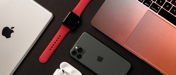
Branding is the essence of how your company presents itself to the world. It’s not just about a logo; it encompasses many design elements and messaging that collectively define your brand identity. Take Apple; their product is known for its sleek and minimalist design and metallic colours that allow someone to easily identify one of their devices without seeing the logo.
To further understand branding, think of your brand as a person. What would they do, say, wear, or spend their time with? Much like how individuals have distinct traits and behaviours, your brand should also have unique characteristics:
What they do
This would be your company’s product and service. It’s what your brand is passionate about and invests time in perfecting, discussing, and excelling in. It’s the heart of what you talk about and exude passion for like that person who corners you at a party to show videos of the tricks they just taught their dog. It’s all about where your brand finds its pride and joy. For Apple, that’s in its sleek design, usability, and integration across devices.
What they say
Building on the points above, what your brand says is not just about the topic but also how and in what tone of voice it speaks to its audience. It can range in formality, seriousness, humour and optimism. For example, think of Batman. Many superheroes share his expertise in fighting crime but he does so with a cool, calm, collected demeanor and a deep voice which differentiates him from Spiderman and Superman. For Apple, it’s concise messaging that’s easy to understand which is an extension of the ease of use they want to demonstrate.

What they wear
This is your brand’s chance to show its personality through colour and aesthetics that become what it’s known for, much like the Apple example we used above. Think of it like recognizing a friend by their favourite outfit in a crowd. For instance, my husband always sticks to simple t-shirts in neutrals or shades of blue. Even though his family and friends tease him about his lack of exploration, it’s become his trademark style. When you build a strong identity around a specific style, then you’re increasing brand awareness and defining your brand in ways that transcend the logo.
Who they spend their time with
This is your target audience and the people you want to interact with or get in front of with your product or service. It’s also partners, employees, philanthropic efforts, and community. All the people your brand engages and builds relationships with will be a reflection of what it stands for and values Think back to “what they do” and “what they say” because these can further determine who they spend their time with.
By now, I’m sure you’re getting the point that your brand is much more than a logo and is in everything you do and every touchpoint you have with your audience or consumers. The consistency in which you employ all of the elements that make up your brand is how you will gain brand recognition and retention that people remember and trust. If we have to consistently make the logo bigger for brand recognition then there’s a deeper branding challenge that we should face. So, let’s take the pressure off our logos!
Bigger isn’t better
When it comes to a slice of chocolate cake or a pay cheque, bigger is better. Oversized logos, on the other hand, are aggressive and can come across as tacky or self-serving. Think of it as the equivalent of visually shouting at your consumers, ‘Look at me!’. In a world where more buyers want more authenticity, it’s helpful to think twice about your logo application. Again, I’m not knocking your logo, and you should be proud of it, but at the same time, a well-designed logo is simple, clever, and easy to understand. That alone, in combination with your product and service and marketing and branding efforts, should make it memorable enough. If you rely heavily on its size to ensure its effectiveness, it’s time to consider a redesign altogether because your logo should successfully pass the Piccolino test. Named after the Italian word for “tiny,” this assessment ensures that your logo maintains clarity and legibility even in small sizes. Your designer should test your logo at sizes as small as 1 inch to 3/4 inch wide, depending on its future applications.

Your customer’s experience is the priority
It’s easy to get caught up in minor details, like the size of your logo, and lose sight of the bigger picture. Instead, focus on enhancing the customer or user experience across every interaction with your service, product, and marketing efforts. Your customers likely already know about your brand and offerings; they’re just seeking more information to solidify their decision to convert. Placing a large logo in their way can complicate their journey and serve as a distraction.
Authentic and non-promotional content is what consumers desire most from brands on social media, according to Sprout Social’s 2023 index report. While 51% said, the most memorable brands on social media actively engaged and responded to their customers. Therefore, think of your logo as reassurance to customers, confirming they’re in the right place or selecting the correct product, rather than the main focus. By prioritizing customer and user experience, we promise your brand will earn trust and loyalty, ensuring repeat business, not the size of your logo.
So, can we make the logo bigger?
Sure, we can, but the real question is, should we? Before giving this dreaded feedback, ask yourself the following questions to help you decide if that’s what’s best:
- Is my logo the first thing I want people to see?
- Is my logo more critical than my service, product, or message?
- Does my logo size influence brand recognition and retention?
- Is my logo more important than my consumer’s experience with my product, service, or brand?
If you’re saying no to all of these questions (and we hope you are), it’s best to leave your logo’s size alone.
